How to Create a Slider Widget in Flutter?
Overview
Slider in Flutter is a highly interactive UI widget that allows users to choose a single value from a set of options. It has a lot of features, such as numeric and date values, labels, ticks, dividers, and a tooltip. It is an input widget that allows us to specify a range of values by dragging or pushing on the desired spot. This tutorial will demonstrate how to utilise the slider widget in Flutter to specify the range of values and customise the appearance of a slider.
Introduction
A slider is a widget in the program that allows you to pick a value from a specific range. We may scroll through the values and choose the desired one. To implement a slider in Flutter, we do not need to install any dependencies. A slider may be used to choose a value from a set of continuous or discrete values. It employs a continuous range of numbers by default. We must supply a non-null value for divisions if we wish to use discrete values. The number of discrete intervals is shown by this discrete division. Before we can acquire the value, we must first specify the minimum and maximum values. Slider has min and max parameters for setting the minimum and maximum limits.
Basic Slider in Flutter
In its most basic form, a Flutter Slider devoid of any custom design looks like this.
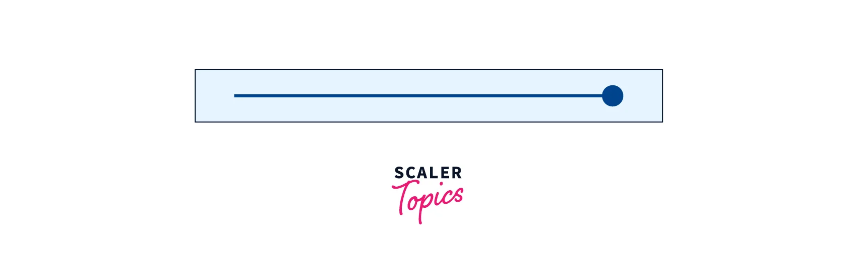
The slider widget may be constructed by just utilising the slider widget and specifying the range values. This widget requires two parameters:
- value: When the app is launched, we must supply the default value, which must be of type double.
- onChanged: This method is called anytime the slider value is changed, and it returns a double value that we may utilise for further processing.
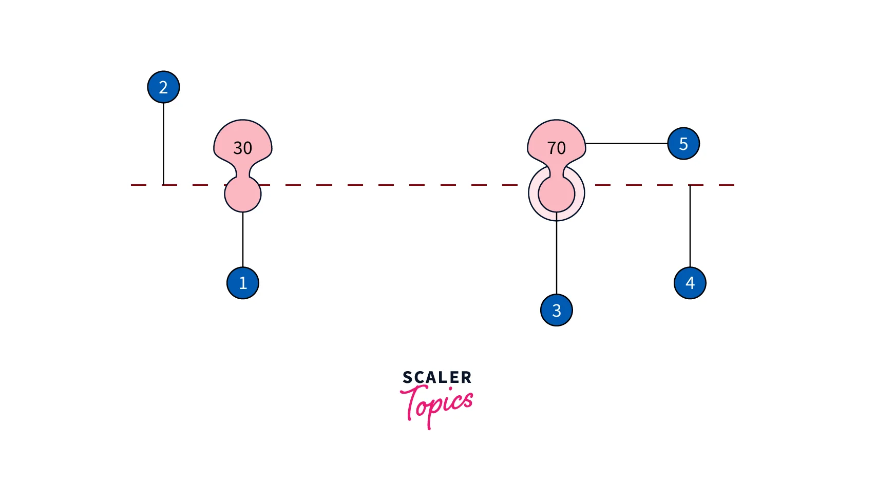
The slider in Flutter itself does not maintain any state. Instead, when the slider's state changes, the widget invokes the onChanged function. To change the visual look of the slider, most widgets that employ a slider will listen for the onChanged callback and rebuild the slider with a new value. Flutter's slider use the following terms:
- Thumb: It is a circular shape that glides horizontally as we drag values.
- Track: A horizontal line down which we may glide our thumb.
- Overlay: While dragging, an overlay appears around the thumb.
- Tick marks: Tick marks are used to indicate the discrete values of a slider.
- Value indicators: When we define the labels, it will display the labels for the thumb values.
- Active: It is the side of the slider that is between the thumb and the minimum value that is active.
- Inactive: The side of the slider between the thumb and the maximum value that is inactive.
Slider's syntax is as follows.
Slider in Flutter has a number of functionalities, including:
- It accepts custom widgets such as an icon or text within the thumb.
- The slider displays a tooltip that clearly displays the selected value. You may also change the format of the text displayed in the tooltip.
- In addition to the extensive collection of built-in capabilities, the control is entirely configurable via its extensive set of settings.
- It may be used in both horizontal and vertical configurations.
Customizing The Slider
Slider in Flutter provides a number of options for customising the slider. We may change the colour, shape, and size of the slider, as well as add labels and tick marks, among other things. Let's take a closer look at them.
Changing the Slider Color
All of the slider widgets covered above provide a few settings that may be used to change the colour of the sliders.The basic Slider widget provides you with three color-setting options:
- activeColor: Colourizes the slider track's active part.
- inactiveColor: Colourizes the slider track's inactive area.
- thumbColor: Colourizes the slider thumb.
Here's an example of code for changing the colour of the slider.
Shapes in Flutter Slider
Sfslider will be used to change the form and size of the slide. The trackShape property in the SfSlider allows you to adjust the size and form of the track.
- getPreferredSize() - Returns the size depending on the arguments.
- paint() - Used to modify the geometry of the track.
Similarly, SfSlider may also be used to customise the shape and size of the thumb.
Labels
The showLabels property is used to display the labels at the specified interval. The showLabels property's default value is false.
Tick
The major ticks on the track can be enabled. It is a form that is used to depict the track's important interval spots. The showTicks property's default value is false. For example, if the min and max values are 0.0 and 10.0, respectively, and the interval is 2.0, the slider will display the main ticks at 0.0, 2.0, 4.0, and so on. The number of minor ticks between two main ticks can also be shown.
Slider With Range Selector
The RangeSlider is created by using the RangeSlider widget. Range sliders feature two determination focuses that take into account an adaptive adjustment in lowest and maximum value points. Based on a continuous or discrete collection of values, a slider component can enable single or numerous options. To alter the selection in one direction, we must first identify either a minimum or maximum value. In contrast to sliders, range sliders include two selection points that allow for flexible modification to determine the maximum and minimum value. This modification gives it a helpful tool for controlling a certain range, such as specifying the length of time or pricing points. Because of its versatility, it is a beneficial segment, for example, when a customer wants to regulate a certain range, such as showcasing value focuses or a period. This widget requires two parameters:
- values: We must pass the RangeValues data type, which has a start and a finish.
- onChanged: This function is called anytime the range values change and a RangeValue value is returned.
Range Slider is made up of five parts:
- When the client drags the thumb, it slides along a level plane.
- The track is the line along which the slider thumb moves. It has a working active side and an inactive inert side.
- The corona impact that appears when the thumb is pressed while dragging is the overlay.
- The tick marks are constantly separated impressions made with defined divisions.
- When the client drags the thumb to demonstrate the value being selected, the value indicator appears.
Range Slider's syntax is as follows.
Advanced Features
Using a Custom Thumb Shape

SliderTheme simply enables you to change the slider component shapes from the pre-existing Flutter designs. You may develop your own designs for the different slider components (such as the tick marker, slider thumb, slider track, and so on) and assign them to these components as shapes. To begin, create a class that will extend from the SliderComponentShape class to construct the shape:
You must provide two method overrides while extending the class from SliderComponentShape:
- getPreferredSize(): this function should return the slider thumb shape's size.
- paint(): this technique produces the slider thumb shape design.
You may now use this custom slider thumb shape in the SliderTheme:
Adding tooltips to the Slider in Flutter

Enable tooltip: The enableTooltip command can be used to enable a tooltip for the thumb. It is used to clearly display the current value chosen during interaction. Tooltip text is formatted by default with either numberFormat or dateFormat.
Tooltip shape: The tooltipShape attribute allows you to display a tooltip in a rectangular or paddle form. The tooltipShape property's default value is SfRectangularTooltipShape.
Haptic Feedback When the User Interacts With the Slider
Flutter includes a HapticFeedback service with multiple static methods for various kinds. Flutter supports five modes of haptic feedback: vibrating, lightImpact, mediumImpact, heavyImpact, and selectionClick. These static methods produce a Future<void>. To initiate haptic feedback, simply call one of the static methods, and Flutter handles the behaviour on Android and iOS.
Flutter Image Slider
Carousel Slider in Flutter is a common image slider that is used in many apps nowadays. In our app, an image slider is a handy method to show photos, movies, or graphics. On our app screen, it will often display one large image at a time. It contributes to making our screen more attractive. These Carousel Sliders are commonly found on eCommerce sites such as Amazon, Flipkart, Myntra, and others. The use of a slider to display the photographs provides an appealing User Experience. Because these sliders are automated, you can see a variety of images and content in them.

Carousel Slider has various features, such as item, which allows us to define Asset Images or Network Images that are utilised in our programme. It gives an options method with numerous attributes such as:
- height: Overall card height for displaying the picture
- autoplay: Cards are automatically shuffled one at a time.
- autoplaycurve: Determines the aspect of the animation curve
- aspectRatio: The height is declared using the Aspect Ratio.
- autoPlayAnimationDuration: Used to specify the time for an automatic slide.
It is possible to implement it by adding the carousel_slider dependency to the code's pubspec.yaml file. The following is the syntax for creating a simple caraousel slider widget in flutter.
Example Application
Let's make a Slider application in Flutter using the three types of sliders explained above. This application includes a simple slider, a range slider, and an image slider. The application's source code may be seen below.
Output: The user interface of the program will look like this.

Slider Properties
| Property | Type | Description |
|---|---|---|
| value | double | It is a mandatory input that specifies the current value of the slider. |
| onChanged | double | It is a necessary parameter that is called when the user drags the slider to a new value. The slider is disabled if it is null. |
| onChangedStart | double | It is an optional parameter that is called whenever we have finished picking a new slider value. |
| max | double | It is an optional input that specifies the maximum value that the user may use. It is set to 1.0 by default. It must be more than or equal to the minimum. |
| min | double | It is an optional input that specifies the smallest value that the user can use. It is set to 0.0 by default. It must be less than or equal to maximum. |
| divisions | int | It is responsible for determining the number of discrete divisions. If it is not present, the slider is continuous. |
| label | string | It defines the text label that will appear above the slider. It shows the position of a separate slider. |
| activeColor | class Color | It determines the colour of the slider track's active segment. |
| inactiveColor | class Color | It determines the colour of the slider track's inactive part. |
| SemanticFormatterCallback | none | A callback is used to generate a semantic value. It is a percentage by default. |
Conclusion
- A slider is a widget in the program that allows you to choose a value from a specific range.
- It employs a continuous range of numbers by default, and requires two parameters: value and onChanged.
- The slider has a number of functionalities, such as custom widgets, a tooltip, and a configurable control.
- Range sliders allow two selection points that provide flexible adjustment to set the maximum and minimum value.
- It can be used in both horizontal and vertical configurations, and can provide single or multiple selections based on the continuous or discrete set of values.
- Range sliders are useful when you want to control a specific range, like indicating the length of time or price points.
- Carousel Slider is a common image slider used in many apps, such as eCommerce sites such as Amazon, Flipkart, Myntra, and others.
- Carousel Slider has various features, such as item, autoplay, autoplaycurve, aspectRatio, autoPlayAnimationDuration, and SliderTheme.
- SliderTheme enables you to change the slider component shapes from the pre-existing Flutter designs.
- Tooltip text is formatted with either numberFormat or dateFormat, and the tooltipShape attribute allows you to display a tooltip in a rectangular or paddle form.