R Strip Chart
Overview
When we have a dataset with only a few observations, standard visualization methods like box plots or scatter plots may not clearly show all the important information. Identifying outliers or hidden patterns using these methods becomes challenging as they might not capture the small details or variations existing in the data. However, the strip chart in R overcomes this limitation by representing each data point in a clear manner, which makes them a great choice for analysing small datasets and revealing important patterns in the data.
What are Strip Charts in R?
A Strip Chart in R is a simple way to show data on a graph. It's like a line of dots or short lines along a single line. Each dot or line represents a data point, and its position on the line is based on its value. The stripchart() function in R is commonly used for creating basic strip charts.
To create a strip chart in R, we can use the following syntax:
In this syntax of the stripchart() function, the different parameters are:
- x: This is a required argument representing the data to be plotted.
- method: This parameter specifies the method used to separate data points with identical values. The default method is "overplot", with other methods available: "jitter" and "stack".
- jitter: This parameter is used when the method is set to "jitter" and provides the amount of jittering to be applied.
- main: This parameter sets the title of the chart.
- xlab: This parameter sets the label for the x-axis.
- ylab: This parameter sets the label for the y-axis.
- col: This parameter sets the color of the points in the plot.
- pch: This parameter sets the shape of the points in the plot.
- vertical: When this parameter is set to "TRUE," the plot is drawn vertically instead of the default horizontal orientation.
- group.names: This parameter is used when plotting multiple numeric vectors.
In our upcoming examples of strip charts in R, we'll use the available built-in ChickWeight dataset. Let's display the first few rows of the dataset to get a glimpse of its contents.
Output:
Different Methods in the Stripchart function
The stripchart() function in R offers three different methods to handle data points in strip charts:
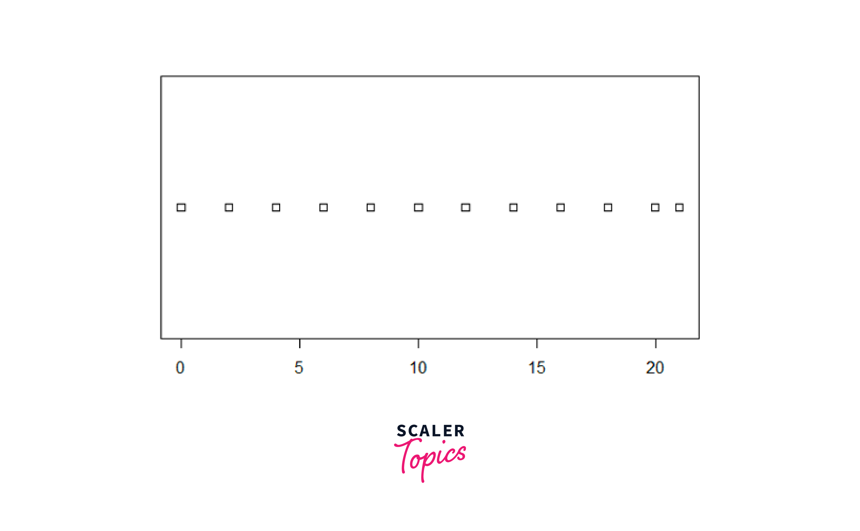
1. Overplot
The default method of the stripchart() function is the Overplot method. When using the overplot method, multiple data points with the same values are shown on top of each other, like a stack of points. It can make it hard to see individual points when there are many overlapping points. However, the advantage is that it accurately shows how the data is distributed and keeps all the original data points visible.
For Example:
Output:
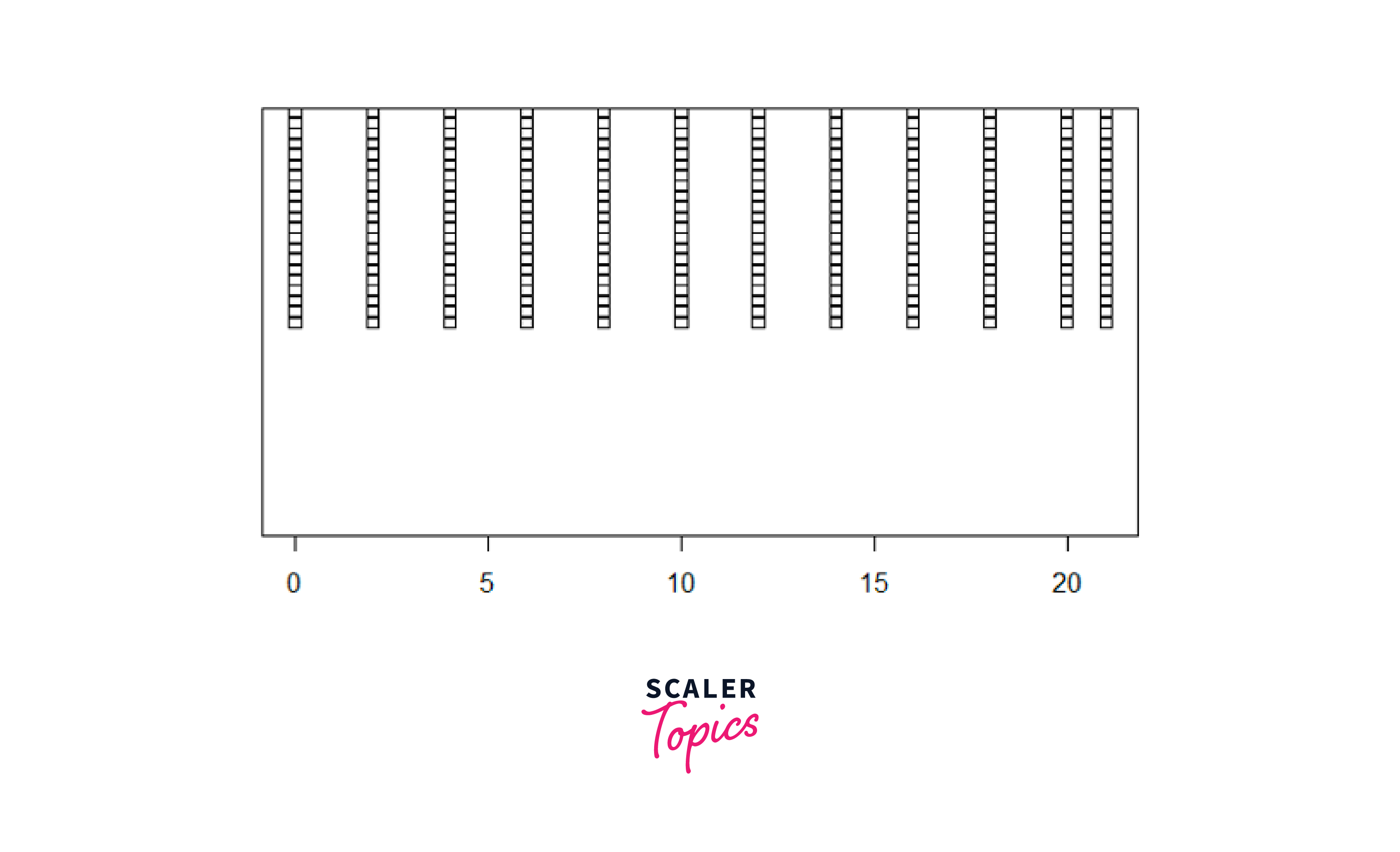
2. Stack
The Stack method is an alternative to the Overplot method. In this method, the data points are stacked on top of each other. However, to avoid complete overlap, each point is slightly shifted. It makes it easier to see the distribution of the data, and it prevents points from hiding from one another. With stacking, we can observe the density of points at different positions along the chart.
For Example:
Output:
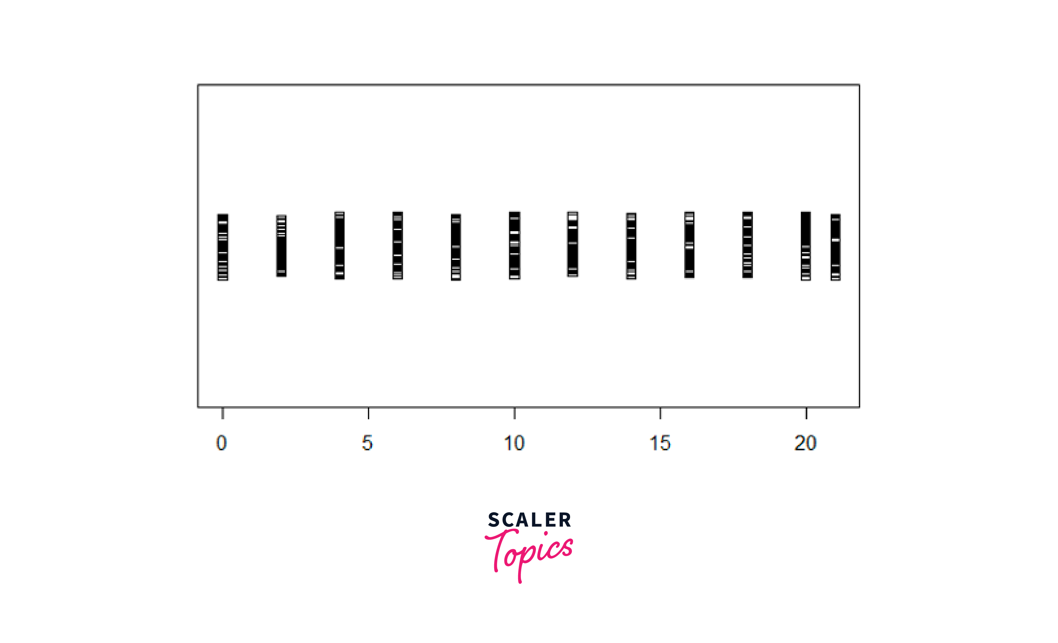
3. Jitter
The Jitter method adds some random movement to each data point. Using the "jitter" parameter inside the stripchart() function, we can control how much movement happens. Note that the best amount of jitter may change depending on our data and how many points we have. So, we might need to try different amounts to find the best one for our specific situation.
For Example:
Output:
Different ways to create Strip Charts in R
Next, we will discuss the different ways to create a strip chart in R, for which we first create a numeric vector 'x' containing 120 random values between 0 and 10 using the round() and runif() functions, as shown below.
Output:
Note: Here, we used the set.seed() function to ensure that the random numbers generated will be the same each time when we run the code.
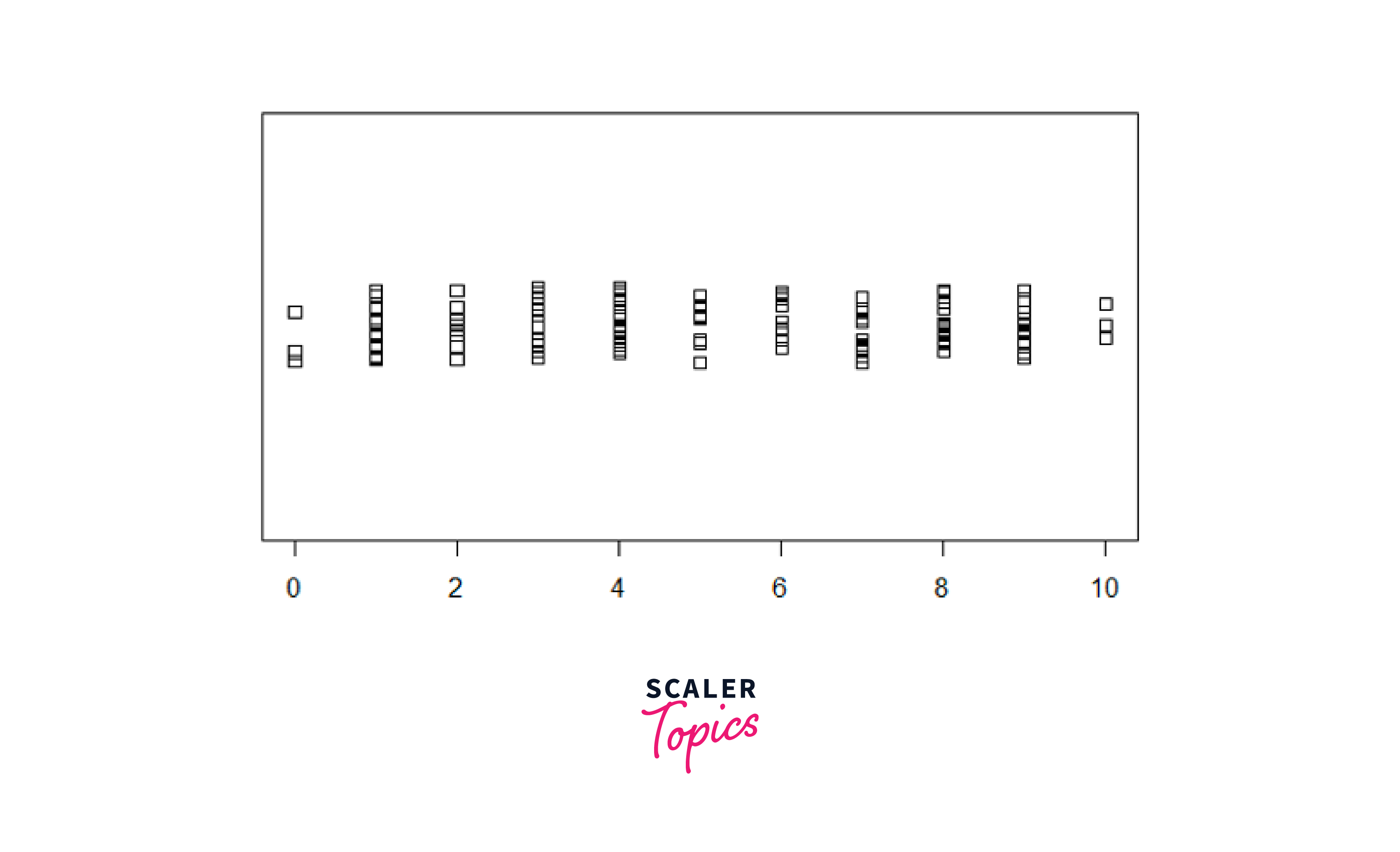
Method 1: Create a Strip Chart of the Numeric Vector
In this method, we will use the stripchart() function to create a strip chart in R to visualize the data points in the vector x.
For Example:
Output:
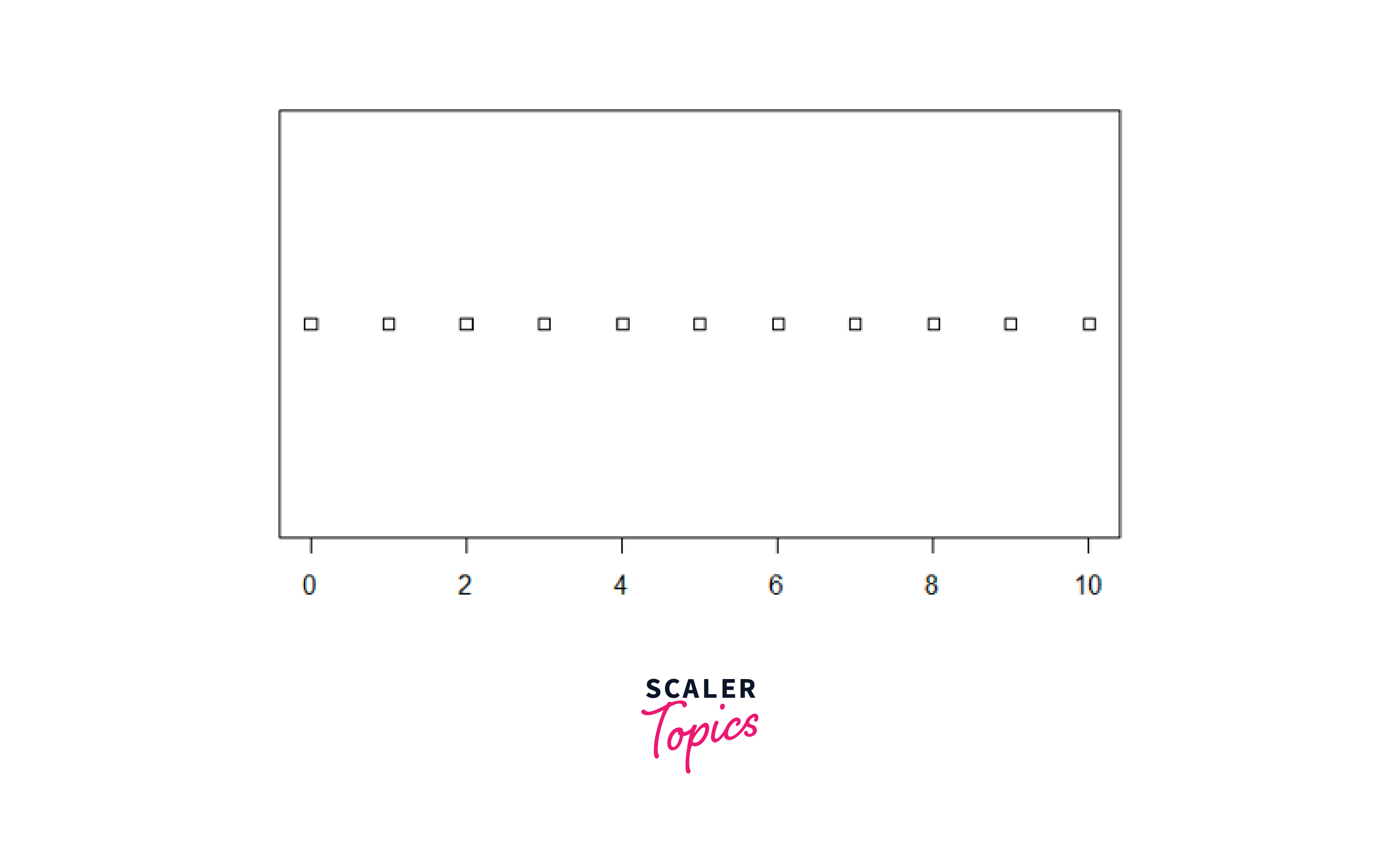
By default, the strip chart will be plotted horizontally. Each point on the chart represents a value in the vector x.
Method 2: Create a Strip Chart without Overlapping Points
In the next method, we will use the "jitter" method to avoid overlapping points to create a strip chart in R.
For Example:
Output:
In this example, we set the jitter parameter inside the stripchart() function to 0.5, which means the points will be randomly shifted within a range of ±0.5.
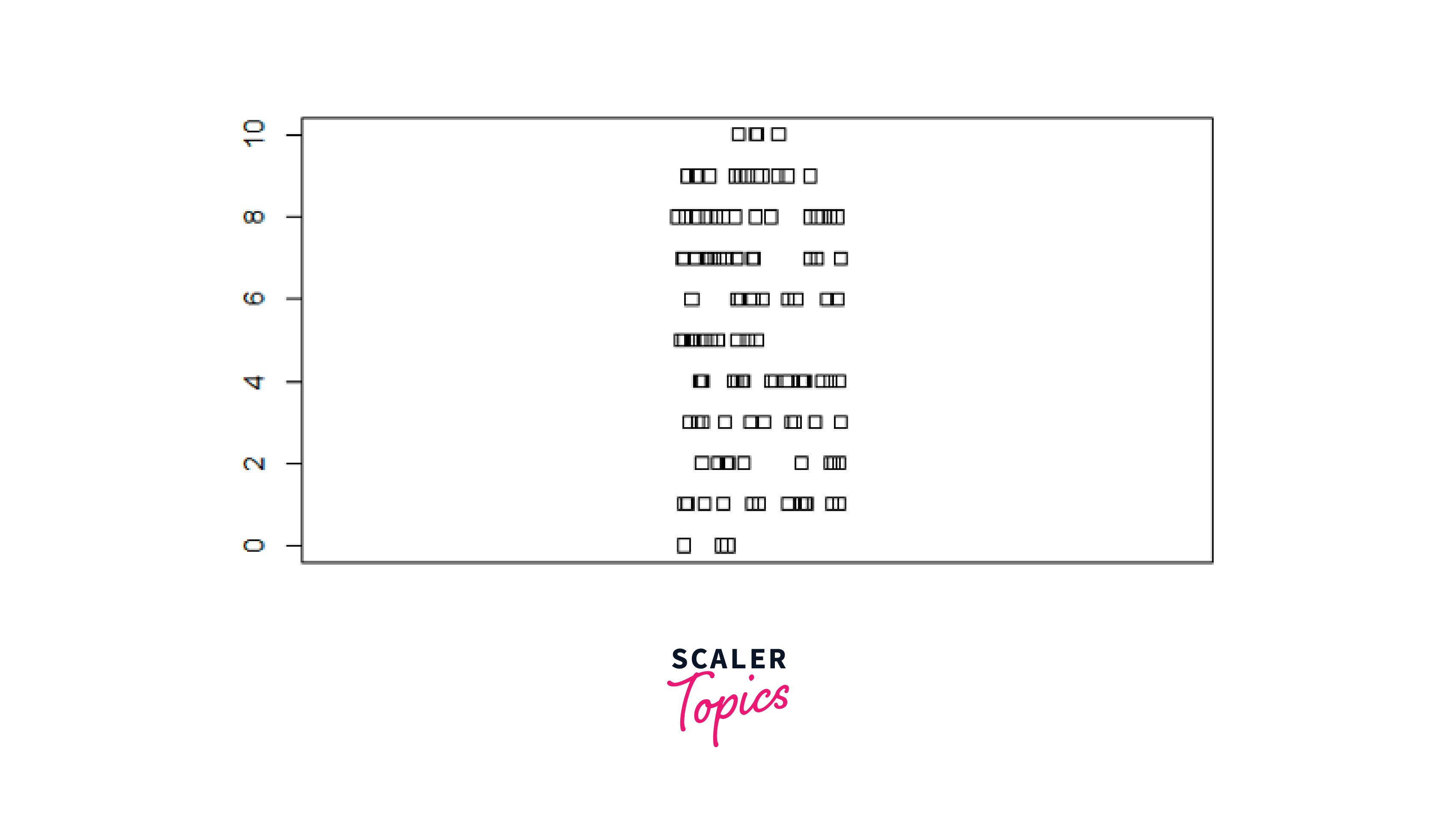
Method 3: Create a vertical strip chart
By default, the stripchart() function creates a horizontal strip chart, but we can create a vertical one by specifying the vertical parameter inside the stripchart() function as TRUE.
For Example:
Output:
Method 4: Create a Strip Chart for Multiple Data
In this method, we will pass multiple numeric vectors to the stripchart() function for creating a strip chart in R for multiple data.
For Example:
Output:
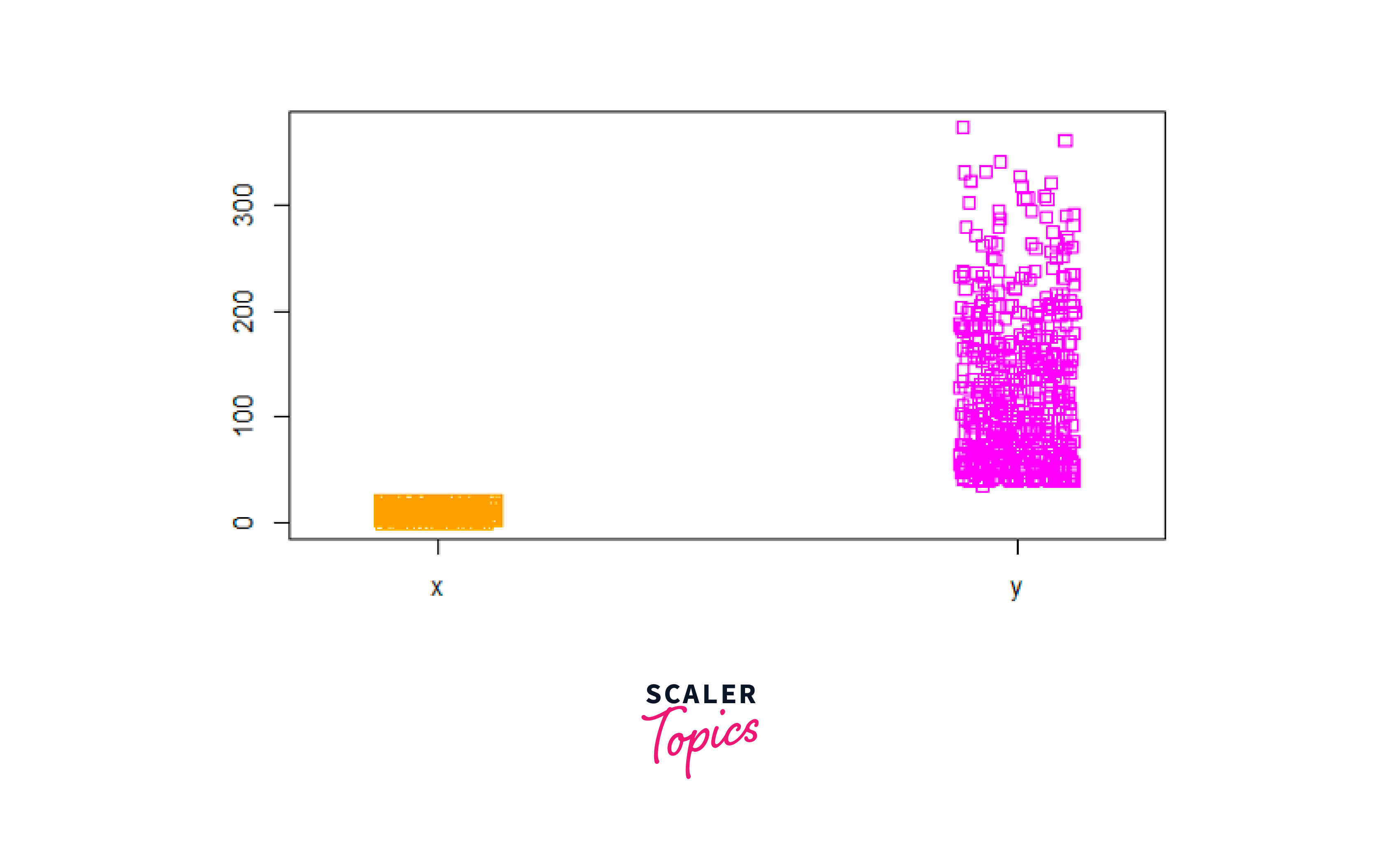
Here we created a new list named list_new with two elements. The 'Time' variable from the ChickWeight dataset is stored in list_new$x, and the 'weight' variable is stored in list_new$y. Then we created a vertical strip chart using the stripchart() function with the list_new list as the input. We also used the col parameter inside the stripchart() function to set the colors for the two strip charts.
Customising Strip Charts in R
In this section of our article, we will discuss different ways of customization to make our strip charts visually appealing.
Customizing Marker Styles and Colors
Let us create a simple strip chart using the R built-in dataset "morley" and customize it.
For Example:
Output:

Here the strip chart displays the "Speed" column from the dataset using blue stars to represent each data point in the strip chart.
Adding Labels and Titles
Next, we will add the title to our strip chart and give the x and y-axis labels to the plot.
For Example:
Output:
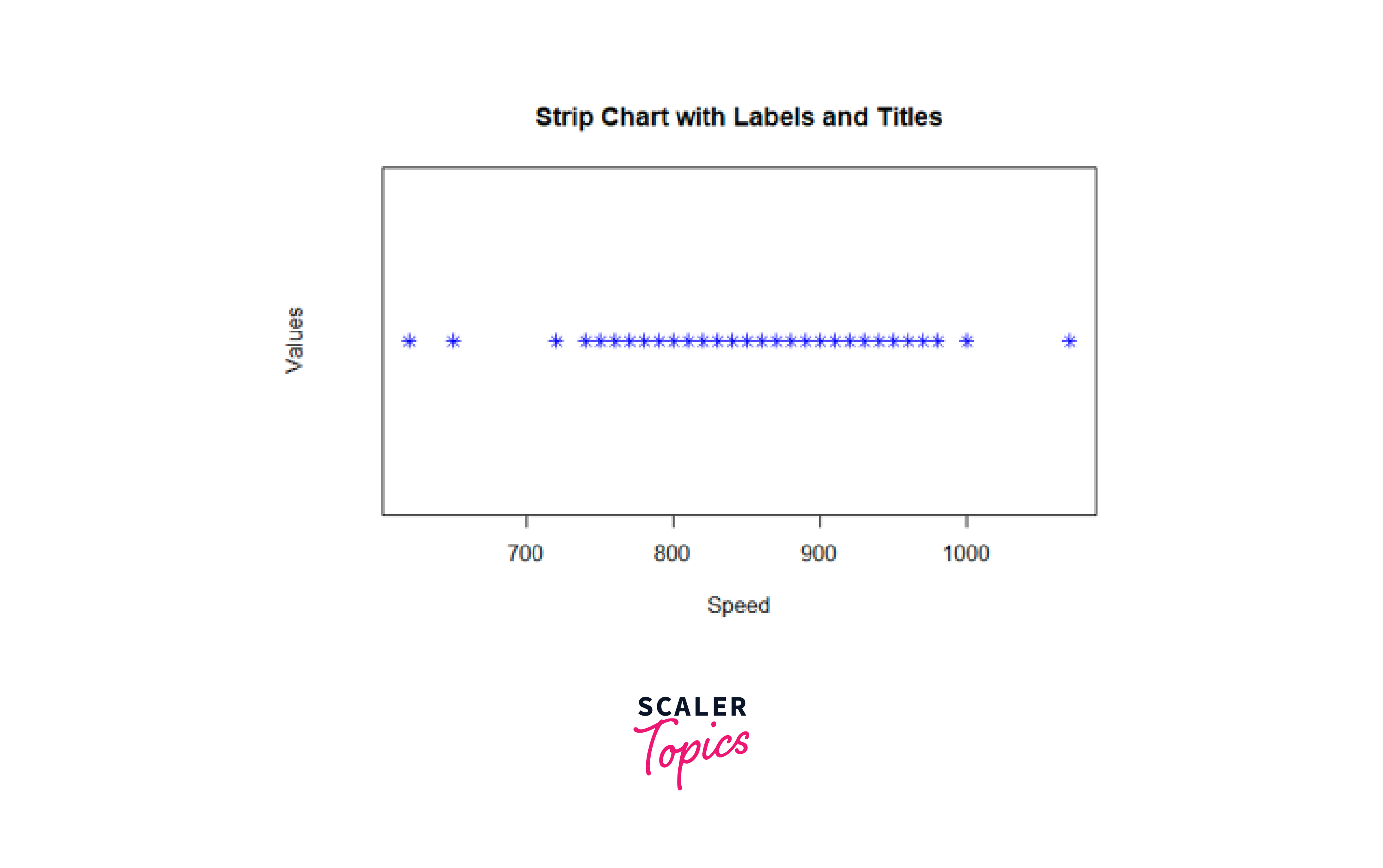
Here we used the main, xlab, and ylab arguments inside the stripchart() function to add title, x-axis, and y-axis labels to the strip chart.
Handling Multiple Categories
We will create a list containing the Run and Speed columns from the Morley dataset and then customize it.
For Example:
Output:
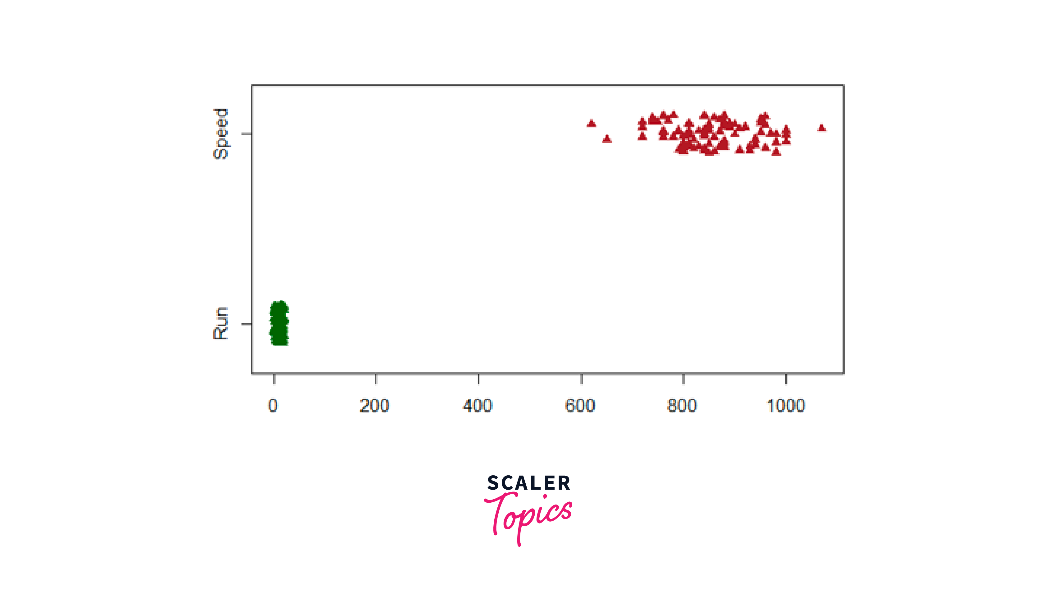
Here we used the pch parameter inside the stripchart() function to change the plotting character or point symbols. Also, we changed the colors such that the data points from the Run column will be displayed in dark green, and the data points from the Speed column will be in brown.
Add Mean to R Stripchart
Next, we will create two side-by-side strip charts with jittered points to compare a random sample from the exponential distribution visually. Also, we will add indicators for the mean of the data in each plot.
First, let us create a data frame sample_data, where we will have 100 random data points as shown in the code below:
Output:
We have generated the random data points using the rexp() function.
Let's create the strip charts to display the mean of the data.
Output:
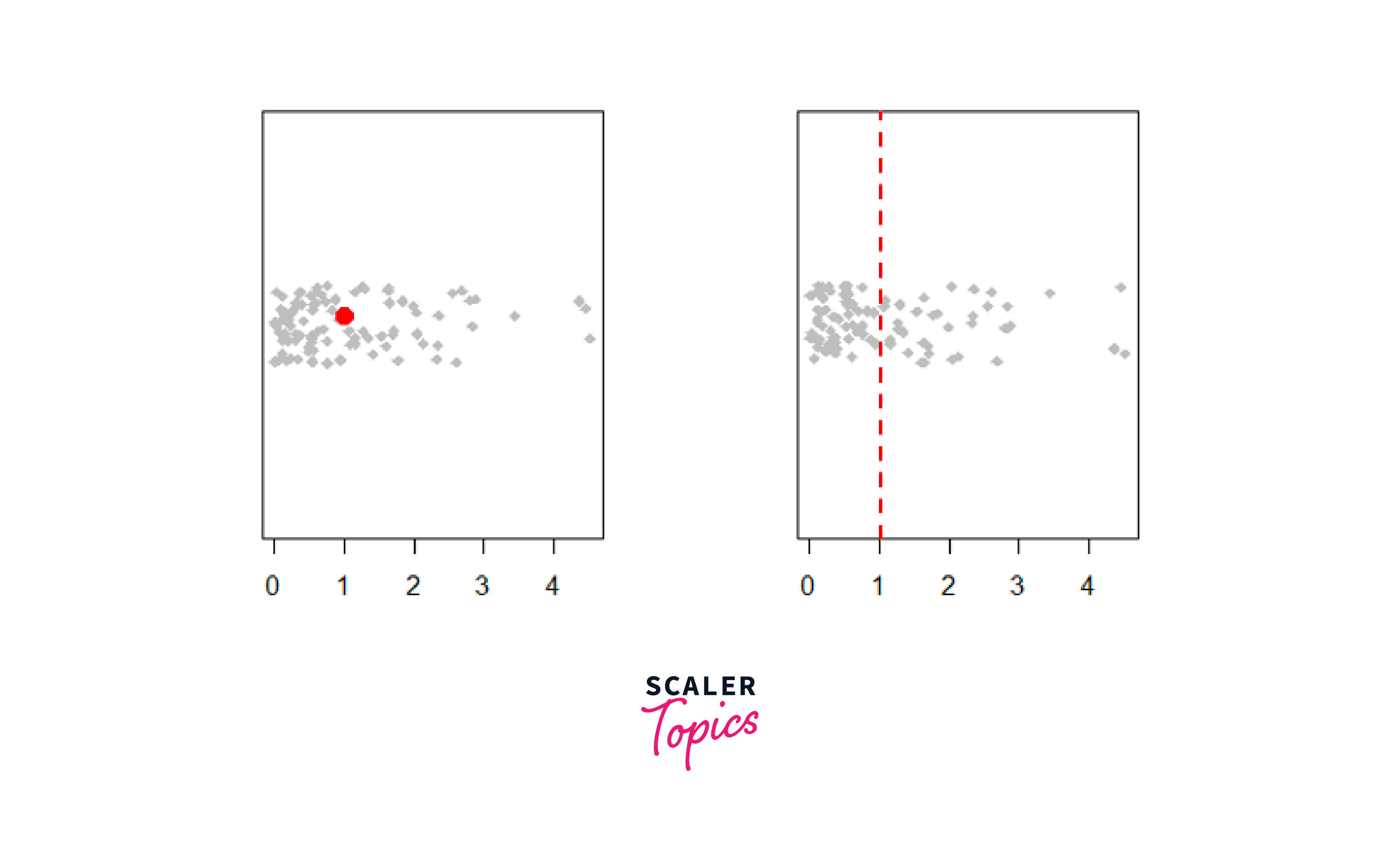
Here, we have set the plotting layout to 1 row and 2 columns using the par() function. Next, we created the two strip charts by specifying the data and customization arguments inside the stripchart() function. Also, we used the points() function to add a red-filled circle at the position of the mean in the first chart and the abline() function to add the mean with a red dashed line in the second chart.
Add a Stripchart to a Boxplot
Adding a stripchart to a boxplot is a helpful way to show data in graphs. The boxplot gives a quick overview of how the data is spread out, while the stripchart shows each data point, helping us understand the data's distribution in more detail. Let us use the sample_data data frame created above.
For Example:
Output:

In this example, the box plot displays the data distribution in the sample_data data frame, and the stripchart overlays jittered blue points on top of the boxplot. We have set the add argument inside the stripchart() function to TRUE to add the stripchart to the existing plot, and the vertical argument, which is also set to TRUE, indicates that the jittered points should be displayed vertically. This combination of boxplot and stripchart helps us to visualize the central tendency and spread of the data points in the "sample_data" data frame.
Conclusion
- Strip charts in R help us visualize small datasets easily and understand data patterns.
- The stripchart() function in R provides methods like Overplot, Stack, and Jitter for creating the strip charts.
- We can easily customize strip charts by changing marker styles, and colors as well as adding labels and titles.
- Combining strip charts with other plot types, such as boxplots, can provide deeper insights into the data, making it easier to identify trends and outliers.