Subplot in Python

Overview
Matplotlib, Python's most popular visualization package, supports numerous essential data visualization techniques for successful data analysis, including subplots. Subplots are important in data visualization for showing dense information. Subplots allow numerous plots to be displayed on the same matplotlib figure. They are useful for comparison by aligning comparable properties and arranging columns side by side for easy display. I hope you got a sense of what the subplots are. In this article, we'll look at this function much more deeply.
Introduction
A graphic is worth a thousand words, and thanks to Python's matplotlib package, creating a production-quality graphic takes significantly less than a thousand words of code.
When working with data, whether large or tiny, it is common to wish to compare things side by side or plot distinct traits or features independently. A single figure is insufficient in such circumstances. As a result, you must master the technique of working with subplots in python.
Let us go over a quick overview of Subplots.
- Subplots are important in data visualization for displaying dense information.
- Subplots allow numerous plots to be displayed on the same matplotlib figure.
- They are useful for comparison by aligning comparable attributes and arranging columns side by side for easy display.
- It demonstrates how comparable data properties differ, even when using the same horizontal axis and scale. However, the subplots do not have to be connected.
- Subplots can also be used to arrange unrelated plots in a compact column and row style.
- It can be used to create complicated and advanced charts, such as longitudinal studies.
Before proceeding, we assume you have successfully installed Python on your PC and have a basic grasp of how to deal with NumPy arrays.
Now that you have a fundamental knowledge of Subplots in Python, let's dig into some practical applications and explore how we can generate subplots in Python.
Before we proceed, let us take a step back and load any libraries that we may require while working.
Note : Run the following code in your Jupyter Notebook code cell
Code Cell
Congratulations if you did not encounter any errors. This signifies that all of the libraries were successfully loaded. If you received an error such as "No module named 'numpy'" or "No module named 'matplotlib'," try performing the underlying instructions again.
Run the preceding code in the terminal
Note : " %matplotlib inline " guarantees that the graphs are presented with the code in the notebook.
In matplotlib, there are at least three ways to produce plots (called axes). They are as follows:
- plt.axes ()
- figure.add axis ()
- plt.subplots ()
The plt.subplot() is the most often used of them. However, the first two options are more versatile and allow you to decide where each plot appears in the picture.
Let's start by making a plot within a plot using axes() method.
Create a Plot Inside Another lot Using axes()
Before we begin, let's look at the syntax.
Syntax :
This requires the following parameters, which are mentioned below:
| SrNo. | Parameter Name | Parameter Description |
|---|---|---|
| 1 | rect | This option specifies the dimensions of the new axis (left, bottom, width, and height). |
| 2 | projection | This field specifies the Axes' projection type. |
| 3 | sharex and sharey | Use sharex and/or sharey to share the x or y axis. The axis will have the same bounds, ticks, and scale as the shared axes axis. |
| 4 | label | This argument specifies the label for the returned axes. |
We begin by building a figure and axes for all Matplotlib graphs. A figure and axes can be made in their most basic form as follows:
Code Cell:
Output :
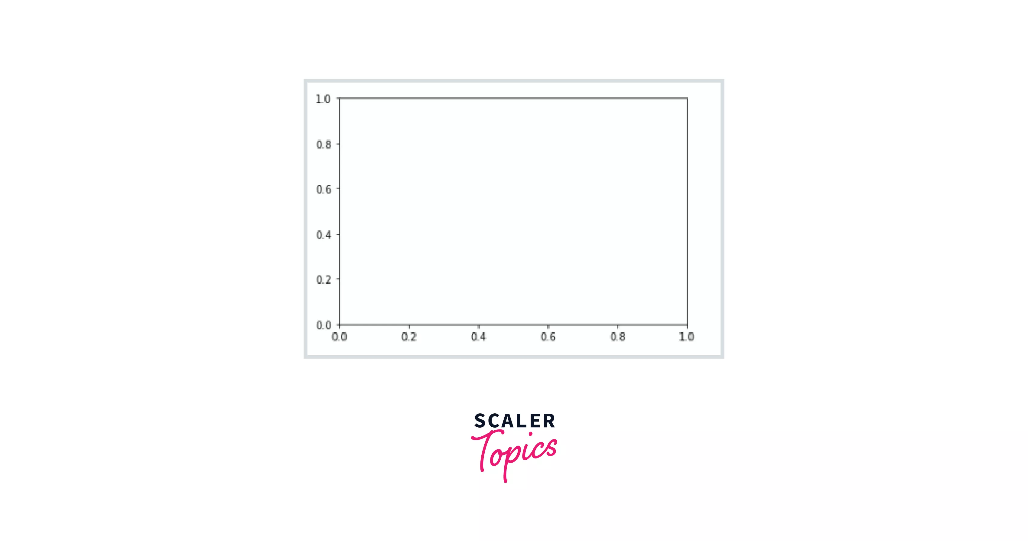
The figure (an instance of the class plt.figure) in Matplotlib may be thought of as a single container containing all of the objects representing axes, images, text, and labels. What we see above is the axes (an instance of the class plt.axes): a bounding box with ticks and labels that will ultimately hold the plot elements that make up our display.
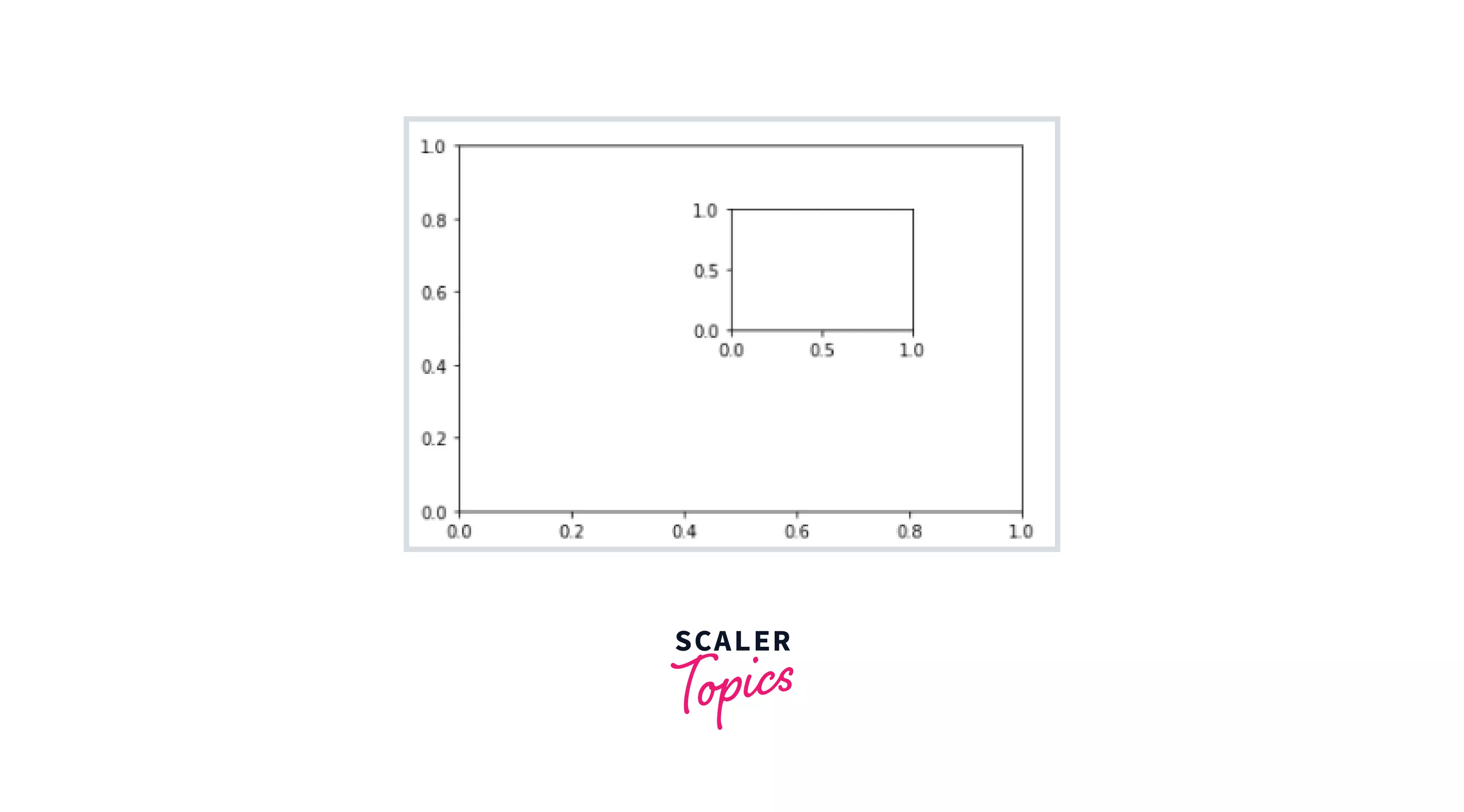
We already observed that if no parameters are specified (in plt.axes() function), we would obtain only one plot that spans the whole figure. However, if we need to add a subplot that exists within another plot, we may use the [bottom, left, width, height] to construct an axes that cover that region.
Let's go through an example to assist you to understand better.
Code Cell :
Output :
Explicitly Create The Figure and Then Do add_axes()
The figure object's add_axes() function is used to add axes (plots) to the figure based on the coordinates you specify.
Let us now examine its syntax.
Syntax :
This takes the following parameters, which are listed below:
| SrNo. | Parameter Name | Parameter Description |
|---|---|---|
| 1 | rect | This option specifies the dimensions of the new axis (left, bottom, width, and height). |
| 2 | projection | This field specifies the Axes' projection type. |
| 3 | sharex and sharey | Use sharex and/or sharey to share the x or y axis. The axis will have the same bounds, ticks, and scale as the shared axes axis. |
| 4 | label | This argument specifies the label for the returned axes. |
This function returns the axes class, which is determined by the projection used.
Let's draw two separate graphs in the same picture in the example below.
Code Cell :
Output :

Let's have a look at " plt.subplot() ", which is the most often used method for plotting many images in a single picture.
matplotlib.pyplot.subplots() Function
The basics of the subplot in Matplotlib will be covered in this section. "pyplot.subplots" generate a figure and a grid of subplots with a single call, while still allowing sufficient control over how the individual plots are generated. Some of the examples I'll provide you aren't actual plots, but they'll help you comprehend the subplot.
Let's have a look at its syntax first.
Syntax :
It is also time to look at some of its main parameters.
| SrNo. | Parameter Name | Parameter Description |
|---|---|---|
| 1 | nrows, ncols | The number of rows and columns in the subplot grid. |
| 2 | sharex, sharey | Controls the sharing of attributes between the x (sharex) and y (sharey) axes. It accepts a boolean value that may either be True (all x- or y-axis are shared by all subplots) or False (each subplot's x- or y-axis is independent). It may also take two string values as input: 'row' implies that each subplot row will share a common x- or y-axis, whereas 'col' means that each subplot column will have its own x- or y-axis. When subplots share an x-axis along a column, only the bottom subplot's x tick labels are produced. Similarly, when subplots share a y-axis along a row, only the first column subplot's y tick labels are constructed. |
| 3 | squeeze | Extra dimensions are squeezed out of the resulting array of Axes if True. |
- A figure with just one subplot Let's begin with something easy. Commencing with a single Figure and Axes.
Without any parameters, subplots() return a Figure and a single Axes. This is the ideal method for constructing a single Figure and Axes.
Code Cell :
Output:

- Stacking subplots in one direction
Let's start by defining some data to visualize. For x(0, 3𝜋), we apply our sine and cosine curves.
Code Cell :
The number of rows and columns of the subplot grid is defined by the first two optional parameters of pyplot.subplot(). Let's make our first two subplots, each with a single row and two columns. Because the axis object has two subplots, you may access them with indices [0] and [1], as indexing in Python begins at 0.
Note :
When just one direction is stacked, the resulting axes is a 1D numpy array holding the list of produced Axes.
Code Cell:
Output:
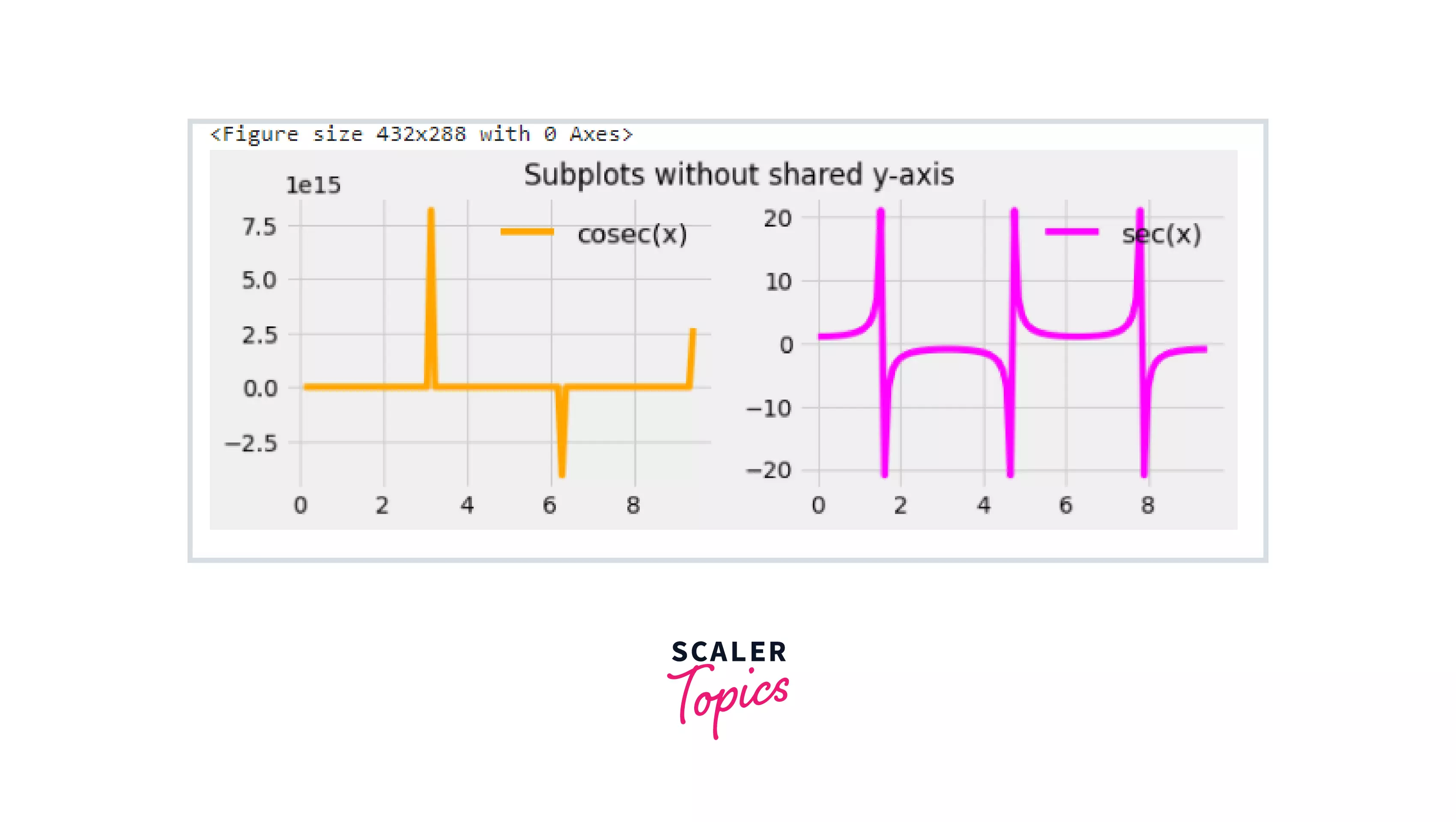
Note: You may also use names for your axes instead of the indices notation, as is seen below, and then use them directly for plotting if you like. The axes handles to separate subplots are represented by the tuple (ax1, ax2) below. Because the y-axis limits in all of the preceding subplots are the same, you may delete the superfluous y-axis values from the right-hand side subplot by using the phrase sharey=True.
Code Block:
The subplots were plotted in a columnar manner in the previous illustration. To plot them in a row-by-row mode, use nrows=x, ncols=1 (where x denotes number of rows of subplots you might require). You must now use the term sharex = True, if all of the subplots have the same x-axis bounds, thus the unnecessary x-axis values can be removed.
- Stacking subplots in two directions
It takes two indices to access each individual subplot when there are more than one row and one column, as seen in the code below. The indices begin at 0. As a result, the indices for two rows and two columns will be 0 and 1. The row (i) and column (j) numbers are represented by the first and second indices in the slice notation [i, j].
Code Cell :
Output :
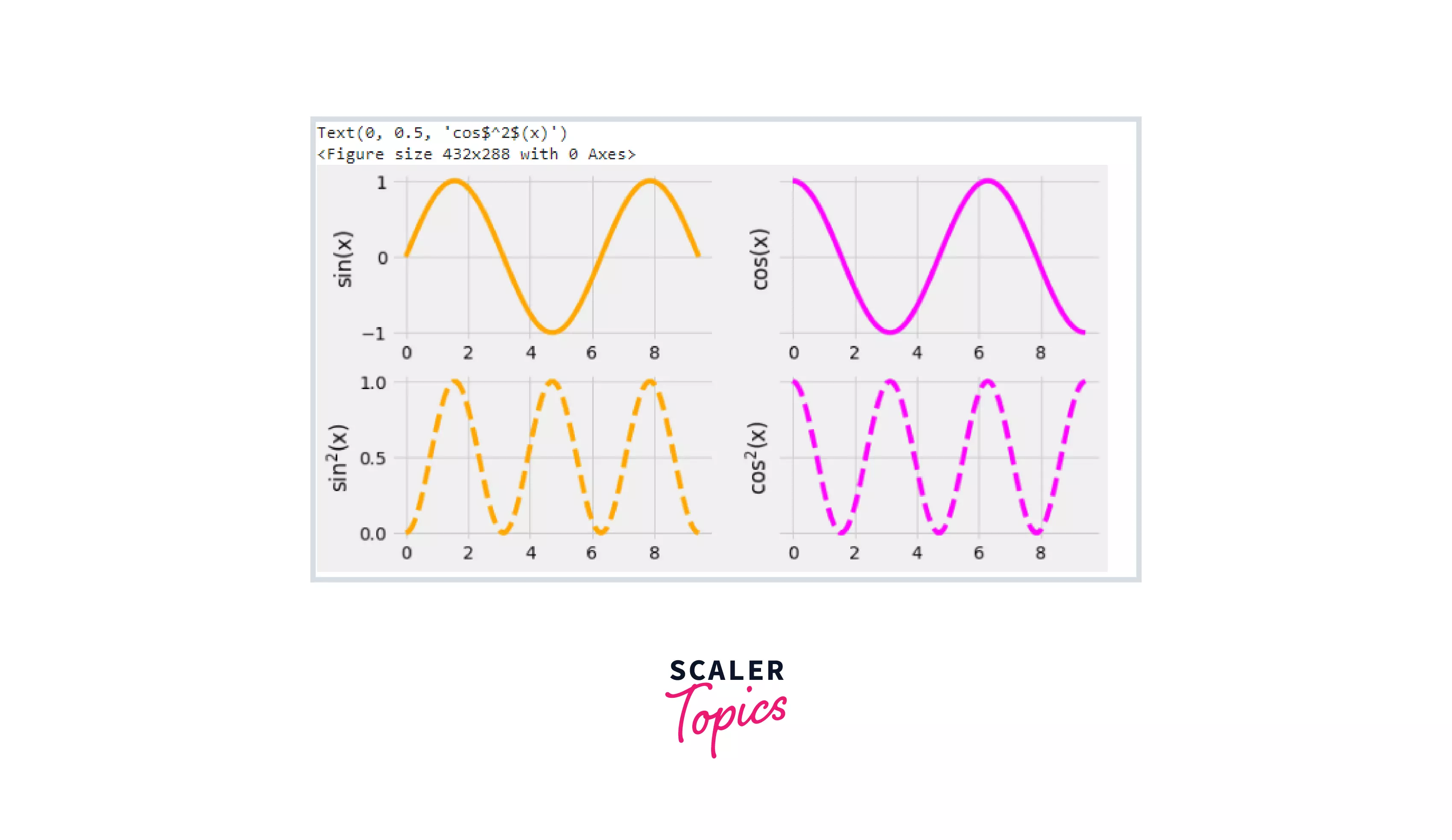 You may pick how the x and y axes are shared in the diagram above. I've set sharex='col' and sharey='row,' which implies that the x-axis is shared across all columns and the y-axis is shared across all rows. To make sense of this, look at the different axis boundaries in the accompanying diagram.
As previously stated, tuples may be used to name your axes instead of index notation. The first tuple (ax1, ax2) represents the row subplots. Similarly, (ax3, ax4) represents the second row.
Code Block :
- Sharing axes
You might have figured by now that we can share the axis label between subplots. You may have noticed how I shared the axis label horizontally and vertically among several subplots in the previous two sections. In this part, we shall delve considerably further into it.
To align the horizontal or vertical axis, we can use sharex or sharey (the other two optional parameters). When sharex or sharey is set to True, global sharing is enabled throughout the whole grid, i.e. the y-axes of vertically stacked subplots have the same scale when, sharey=True. In addition to True and False, sharex and sharey accept the variables 'row' and 'col' to share values only per row or column.
Now consider an example.
Code Cell :
Output :
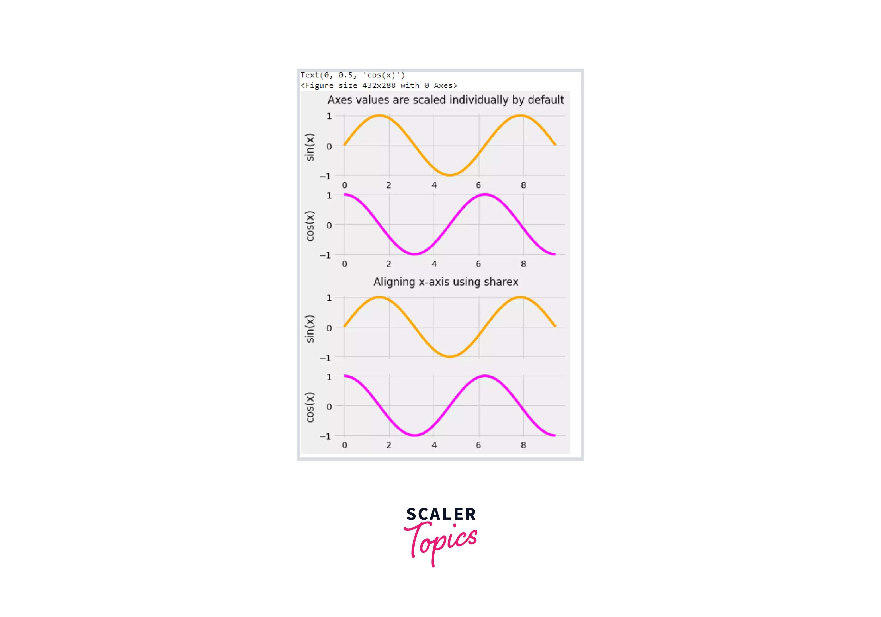
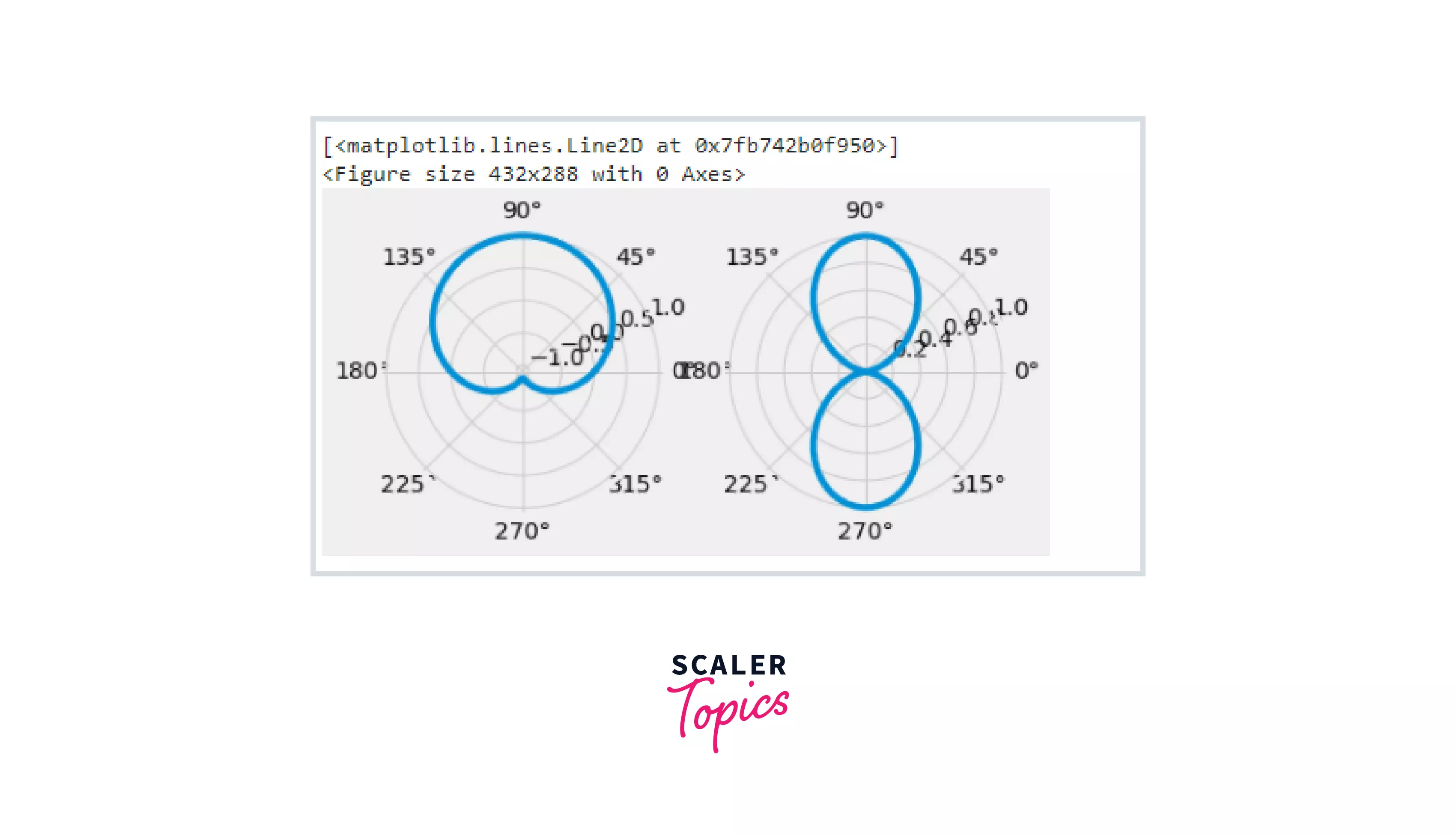
- Polar axes The subplot properties are managed using the pyplot.subplots() property subplot_kw. subplot_kw ='polar' is used to plot curves in polar coordinates.
In polar coordinates, a point is represented as (r, theta). Here, r is the distance from the origin, and theta denotes the angle at which r must be measured from the origin. The polar coordinates may be used to depict any mathematical function in the Cartesian coordinate system.
Code Cell :
Output :
Using GridSpec() Function to Create Customized Axes
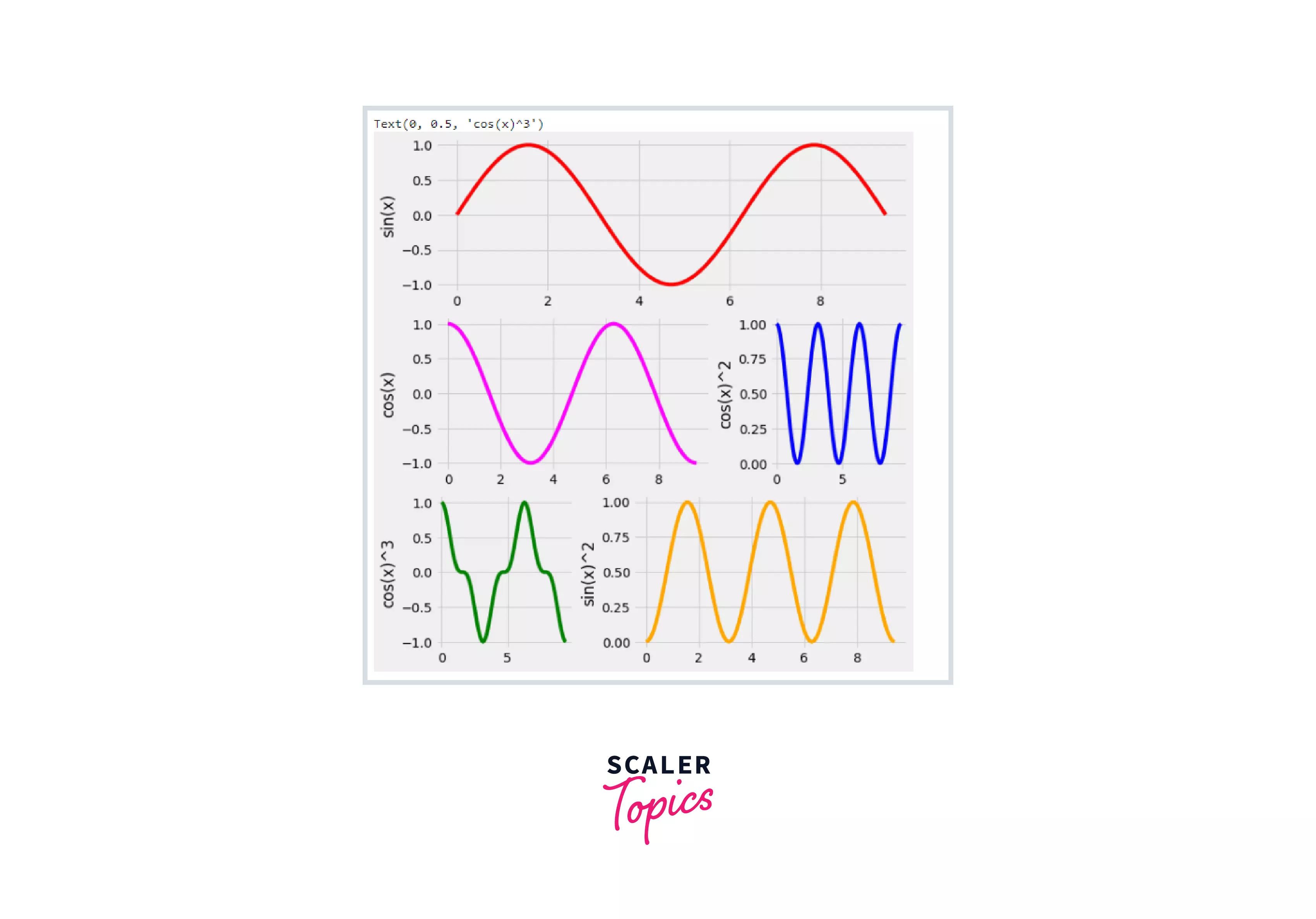
If you wish to construct grids of different widths in the same plot, use plt.GridSpec(). This approach may also be used to generate complicated grids. As inputs to the function, you must give the number of rows and columns, as well as the height and width space. If you want to construct a grid specification for a grid with two rows and two columns with a defined width and height, look like this:
Code BLock :
We may unite two grids to produce one large grid by using, GridSpec() function within the subplot() method.
Note :
To use this approach, you must have a basic grasp of NumPy array slicing and indexing notation. For instance, the slice [0,:] denotes the first row (index 0) and all of the columns, whereas the slice [1,:-1] denotes the second row (index 1) and all of the columns except the final one.
Code Cell :
Output :
Tight_layout
Matplotlib tight_layout() automatically resizes the subplot to fit within the figure area. This is an experimental feature that may not always function properly. It just looks at the ticklabels, axis labels, and titles. You may use this tool to generate dynamic graphs that can be seen on any device.
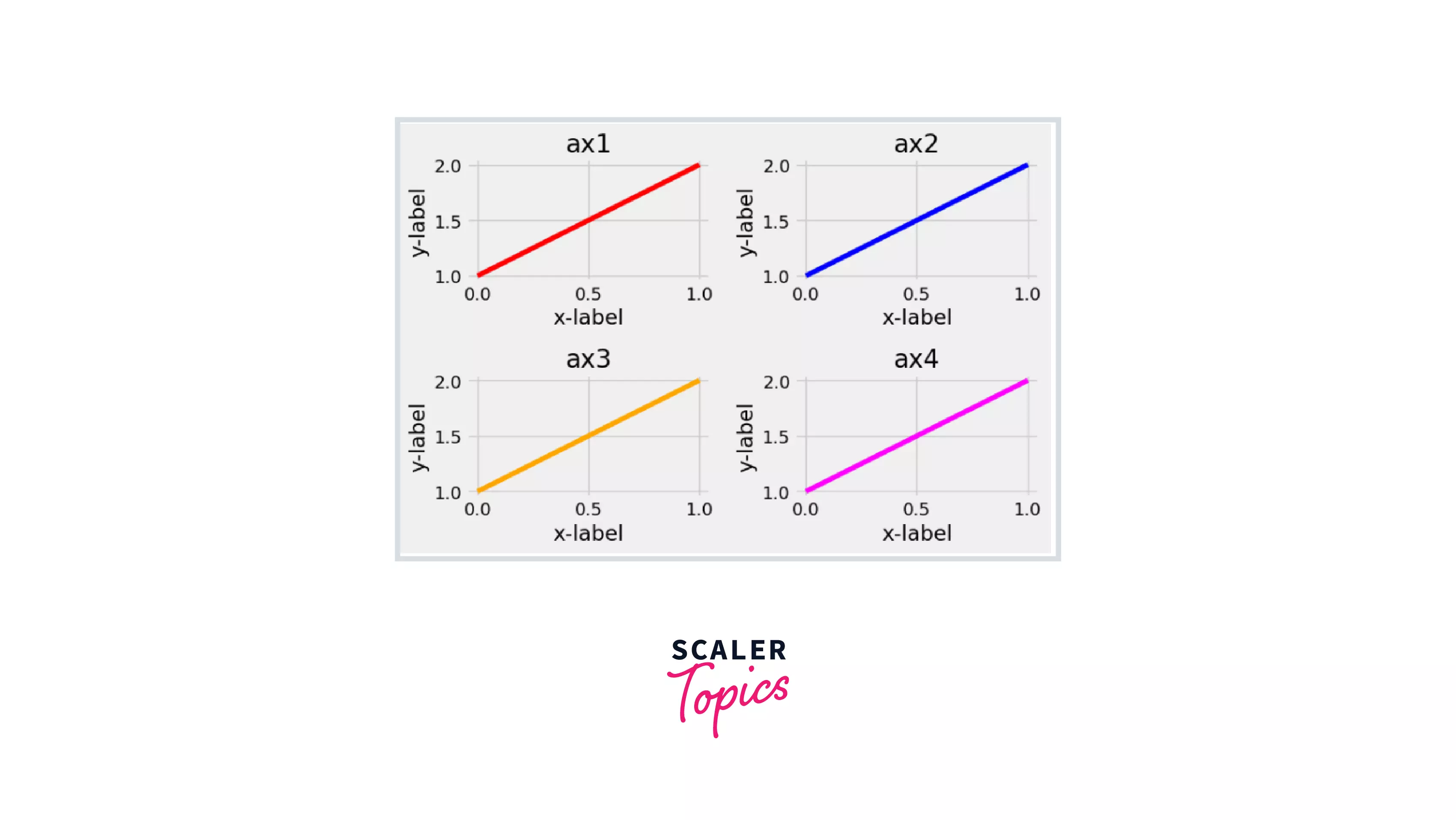
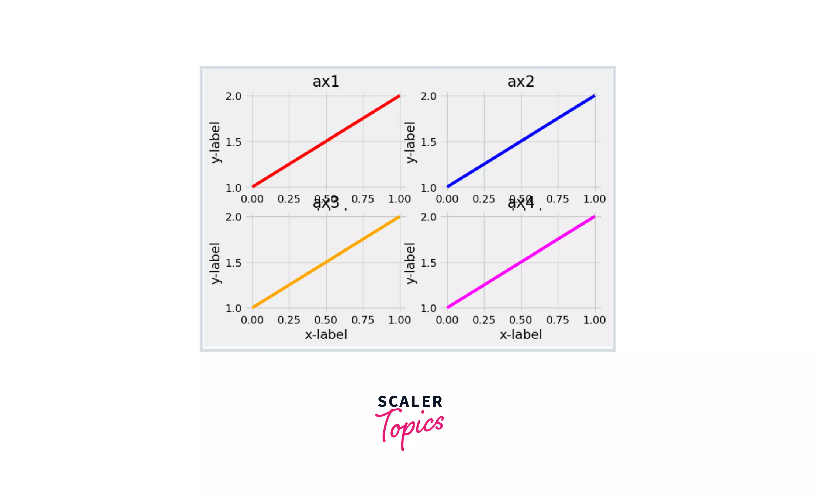
Let me illustrate this with an example. I'll make four grids in the same plot without using the tight layout function at first, then include it to see the difference.
Code Cell :
Output :
 Notice how the axis names and the titles of multiple plots overlap in the above plot. To correct this, use the tight_layout() method.
Code Cell :
Output :
 Kudos!:tada: You are well-versed in Python Subplots. There are so many creative options with subplots that there's absolutely no excuse not to use them!
Conclusion
This blog taught you about:
- The core ideas behind Python subplots.
- There are several methods for creating subplots when viewing data.
- Learned how to build a figure and a grid of subplots with a single call, while maintaining decent control over how the individual plots are generated.
- We also looked at the GridSpec() method and the tight_layout() function to get more control over our subplots and make them more adaptable.
