Tableau for Data Visualization
Overview
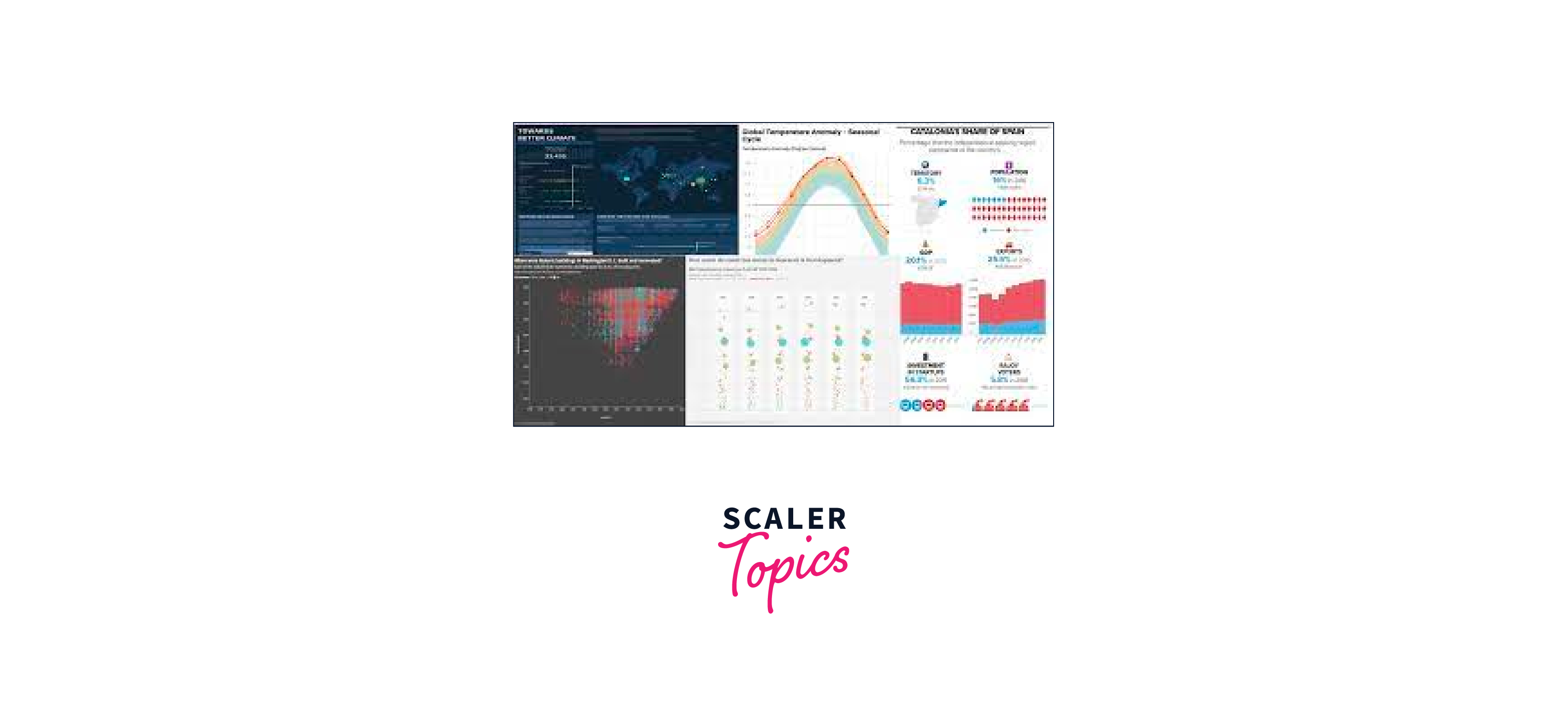
Tableau is a powerful data visualization tool that empowers users to transform complex datasets into meaningful insights. With its user-friendly interface and extensive functionality, Tableau simplifies the process of creating interactive and visually compelling charts, graphs, and dashboards. Users can connect to various data sources, including spreadsheets, databases, and cloud services, making it versatile for different data needs. Tableau offers a wide range of visualization options, enabling users to choose the best representation for their data, from bar charts and scatter plots to maps and heatmaps. s. Its drag-and-drop functionality and robust calculation capabilities make it accessible to both beginners and experienced data professionals.
What is Data Visualization?
Data visualization in Tableau is the process of representing data graphically to gain insights, identify patterns, and communicate information effectively. Tableau is a leading data visualization tool that simplifies this process, allowing users to create interactive and visually appealing charts, graphs, maps, and dashboards.
Tableau and Data Visualization
Tableau is a leading data visualization and business intelligence tool that enables users to transform raw data into visually compelling and interactive representations. Data visualization in Tableau involves several key aspects:
- Data Connection: Tableau can connect to a wide range of data sources, including spreadsheets, databases, cloud services, and more. Users can extract, transform, and load (ETL) data into Tableau or establish live connections for real-time data analysis.
- Data Preparation: Tableau provides data preparation tools to clean, reshape, and transform data. Users can join, blend, pivot, and filter data to make it suitable for visualization.
- Visualization Types: Tableau offers a vast array of visualization options, such as bar charts, line graphs, scatter plots, maps, heatmaps, and more. Users can choose the most appropriate visualization type for their data to effectively convey insights.
Installing Tableau
System Requirements: Before you begin, ensure that your computer meets the system requirements for Tableau Desktop. You can find these requirements on the Tableau website.
Installation Steps:
- Download Tableau Desktop:
- Visit the Tableau website (www.tableau.com) and navigate to the "Products" or "Downloads" section.
- Select "Tableau Desktop" and choose the appropriate version for your operating system (Windows or macOS).
- Click the "Download" button to start the download.
- Run the Installer:
- Once the download is complete, locate the installer file (usually in your computer's Downloads folder) and double-click it to run the installation.
- Accept the License Agreement:
- Review the Tableau Desktop End User License Agreement (EULA) and accept the terms and conditions.
- Choose Installation Options:
- You will be prompted to choose installation options, such as the installation directory. You can typically leave the default settings as they are.
Charts, Tooltips and Maps
Tableau is a powerful data visualization tool that allows you to create various types of charts, tooltips, and maps to explore and communicate your data effectively. Here's a brief overview of how you can use Tableau to create these elements:
-
Charts: Tableau supports a wide range of charts, including bar charts, line charts, scatter plots, pie charts, and more.
-
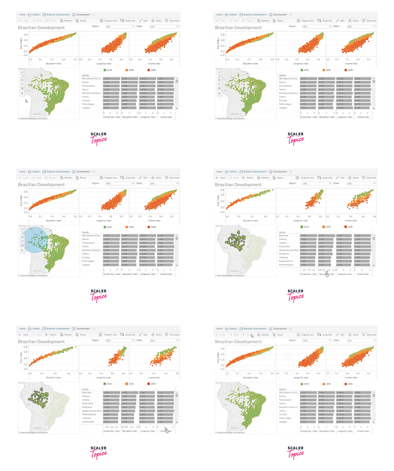
Tooltips: Tooltips in Tableau are interactive pop-up boxes that provide additional information when you hover over a data point in a chart.
-
Maps: Tableau has robust mapping capabilities that allow you to create interactive maps to visualize geographical data.

Colors and Formatting
Colors and formatting play a crucial role in Tableau for data visualization, as they help convey information, emphasize insights, and make your visualizations more engaging. Here are some key aspects of using colors and formatting effectively in Tableau:
- Color Palette Selection:
- Choose an appropriate color palette based on the nature of your data. Sequential color palettes work well for ordered data (e.g., heatmaps), diverging palettes are useful for highlighting extremes (e.g., performance above or below a benchmark), and categorical palettes work for distinct categories (e.g., different product types).
- Be mindful of colorblindness. Use tools or resources to ensure your chosen colors are distinguishable by individuals with color vision deficiencies.
- Color Encoding:
- Map data to colors effectively. For example, in a heatmap, use a gradient where lighter colors represent lower values and darker colors represent higher values.
- Utilize color legends to provide context for your audience. Legends help viewers understand the relationship between colors and data values.
- Highlighting and Emphasis:
- Use bold fonts, larger text sizes, or different font styles to emphasize important information like titles, labels, and annotations.
- Experiment with color saturation or brightness to highlight specific data points or areas of interest within your visualization.
Calculated Fields and Parameters in Tableau
Calculated Fields:
Calculated Fields in Tableau are user-defined fields that allow you to perform calculations on your data. You can create calculated fields by combining existing fields, using mathematical operators, functions, and logical expressions. Here's how to create and use calculated fields:
- Creating a Calculated Field:
- To create a calculated field, right-click on a data source in the Data pane, and select "Create Calculated Field."
- In the Calculated Field dialog box, you can enter your calculation using functions, operators, and fields from your dataset.
- Examples of Calculated Fields:
- Mathematical Calculations: You can create fields that perform operations like addition, subtraction, multiplication, and division on your data.
- String Manipulations: Use functions like CONCATENATE, LEFT, RIGHT, and MID to manipulate text fields.
- Date Calculations: Calculate the difference between dates, extract parts of dates, or perform date arithmetic.
- Logical Calculations: Create conditional statements using IF-THEN-ELSE logic to categorize or flag data based on certain criteria.
- Using Calculated Fields:
- Once you've created a calculated field, you can use it in your visualizations just like any other field. Drag it to shelves like Rows, Columns, Filters, or Marks to include it in your charts and calculations.
Analytics (Clustering and Forecasting)
Clustering in Tableau:
Clustering is a powerful data analysis technique that aims to identify groups or clusters of similar data points within a dataset. Tableau, a leading data visualization tool, provides robust capabilities for clustering that enable users to uncover hidden patterns, segment their data, and gain deeper insights into their datasets. In this article, we will explore clustering in Tableau, its benefits, and how to leverage this technique effectively.
Understanding Clustering:
Benefits of Clustering in Tableau:
- Pattern Discovery: Clustering helps in the discovery of inherent patterns, relationships, and similarities among data points. It's particularly valuable when dealing with large and complex datasets.
- Segmentation: Clustering allows for the segmentation of data into meaningful groups. This can aid in targeted marketing, customer segmentation, and tailoring business strategies to specific segments.
- Anomaly Detection: By identifying clusters of data points, it becomes easier to spot outliers or anomalies that don't belong to any cluster. This can be critical for fraud detection, quality control, or anomaly monitoring.
Leveraging Clustering in Tableau:
Tableau offers several ways to perform clustering and visualize the results:
- Built-in Clustering Algorithms: Tableau provides built-in clustering algorithms like k-means, hierarchical clustering, and DBSCAN (Density-Based Spatial Clustering of Applications with Noise). Users can choose the most suitable algorithm for their dataset.
- Clustering Fields: To cluster data, first, create a cluster field in Tableau. This field assigns each data point to a cluster based on the selected clustering algorithm and parameters.
Forecasting in Tableau:
Forecasting in Tableau refers to the capability of using historical data to predict future trends, values, or patterns within a dataset. Tableau offers a built-in forecasting feature that allows users to create forecasts for their data visualizations. Here's an overview of how forecasting works in Tableau:
- Data Preparation: Before creating a forecast in Tableau, it's essential to have a dataset that includes a time-based dimension, such as dates or timestamps, and a measure that you want to forecast, like sales, revenue, or stock prices.
- Creating a Visualization: Start by creating a visualization in Tableau that includes the relevant data fields. Typically, this involves creating a line chart or time series plot to visualize the historical data.
- Adding a Forecast: To add a forecast to your visualization, you can right-click on the measure axis (e.g., the Y-axis) and select "Add Forecast." Tableau will automatically generate a forecast based on the historical data.
Creating Dashboards
Creating dashboards in Tableau is an effective way to combine multiple visualizations, filters, and interactivity into a single, cohesive view. Tableau provides a user-friendly interface for designing dashboards, allowing you to present your data in a meaningful and interactive way. Here's a step-by-step guide on how to create dashboards in Tableau:
- Connect to Data:
- Start by connecting to your data source. Go to the "Data" menu and choose your data connection method, such as Excel, a database, or a web service.
- Load your data into Tableau.
- Create Worksheets:
- Before building a dashboard, create the individual worksheets (visualizations) you want to include in the dashboard.
- Drag and drop dimensions and measures onto the Rows and Columns shelves to create charts, graphs, maps, or other visualizations.
- Customize each worksheet by adjusting marks, colors, labels, and other formatting options.
- Organize Your Worksheets:
- Rename your worksheets to make them more descriptive (right-click on the tab and select "Rename").
- Ensure that each worksheet focuses on a specific aspect of your data.
- Create a Dashboard:
- To create a new dashboard, go to the "Dashboard" tab at the bottom of the Tableau interface.
- Click "New Dashboard."
FAQ
Q. What is Tableau?
A. Tableau is a powerful data visualization tool that allows you to create interactive and insightful visualizations from your data.
Q. What are the key benefits of using Tableau for data visualization?
A. Tableau offers intuitive drag-and-drop functionality, real-time data connections, a wide range of visualization options, and the ability to share interactive dashboards.
Conclusion
- Powerful Data Visualization Tool: Tableau is a powerful and widely-used data visualization tool that enables users to transform complex data into interactive and insightful visualizations.
- User-Friendly Interface: Tableau's user-friendly drag-and-drop interface makes it accessible to both technical and non-technical users, allowing for quick and efficient creation of visualizations.
- Data Integration: Tableau seamlessly integrates with various data sources, including databases, spreadsheets, cloud services, and more, making it versatile for analyzing diverse datasets.

