Types of Tableau Charts & Which One is Right for You
Overview
Tableau offers a diverse range of chart types, enabling effective data visualization and analysis. Bar charts present categorical data comparisons, while line charts depict trends over time. Pie charts display part-to-whole relationships, and scatter plots reveal correlations between variables. Heat maps exhibit data density, and area charts emphasize cumulative data patterns. Histograms provide distribution insights, and maps offer geographic analysis. Gantt charts track project timelines, and treemaps represent hierarchical data. Box plots show statistical summaries, and bullet graphs illustrate performance against targets. With these versatile chart types, Tableau empowers users to convey insights clearly and make informed decisions from a variety of data perspectives.
What is a Tableau Chart and How to Use It?
A Tableau chart is a graphical representation of data that allows users to visually analyze and interpret complex information. It is a fundamental element of data visualization, enabling users to transform raw data into meaningful insights and trends. Tableau offers a wide array of chart types, each designed to effectively convey specific types of information, making it an indispensable tool for business intelligence, data analysis, and decision-making.
Understanding Tableau Charts: Tableau charts are designed to represent data visually, making it easier for users to comprehend patterns, comparisons, distributions, and relationships. These charts range from simple options like bar charts and line graphs to more complex choices such as heat maps, treemaps, and scatter plots. Each chart type is chosen based on the nature of the data and the insights you want to convey.
Using Tableau Charts: Creating and using a Tableau chart involves a series of steps that enable users to harness the power of visualization for data analysis:
- Connect to Data Source: Begin by connecting to your data source within Tableau. This could be an Excel spreadsheet, a database, a cloud-based data warehouse, or other sources.
- Drag and Drop Data: Once connected, drag and drop the relevant dimensions and measures from your data source onto the appropriate shelves in the Tableau canvas. Dimensions are categorical data (e.g., dates, categories), while measures are quantitative data (e.g., sales, quantities).
- Select Chart Type: After placing data on the canvas, choose the chart type that best suits your analysis. This decision depends on the insights you seek to derive from the data. For instance, you might choose a bar chart to compare sales across different product categories.
- Customize and Format: Customize your chart by adjusting properties such as color, labels, titles, and axes. You can also format data points to display decimals, percentages, or currency symbols.
- Interactivity and Filters: Add interactivity by including filters and parameters. Filters allow users to dynamically control which data is displayed in the chart. Parameters enable users to input values and alter calculations on the fly.
- Annotations and Tooltips: Enhance your chart's clarity by adding annotations or tooltips. Annotations provide explanations or context for data points, while tooltips offer additional information when users hover over data elements.
- Dashboard and Story Creation: Combine multiple charts on a dashboard to create a cohesive story or analysis. Dashboards allow you to present a holistic view of your data, helping users make connections and draw conclusions.
- Publish and Share: Once your charts, dashboards, or stories are ready, you can publish them to Tableau Server or Tableau Online for broader access. This enables users to interact with and explore the visualizations remotely.
- Iterate and Refine: Effective use of Tableau charts often involves iterative refinement. Continuously review, tweak, and optimize your visualizations to ensure they effectively communicate the intended insights.
In essence, Tableau charts empower users to uncover patterns, trends, and anomalies that might remain hidden in raw data. The ability to transform data into interactive, visual representations enhances decision-making by enabling users to quickly understand and interpret information. By leveraging the diverse range of chart types and tools provided by Tableau, individuals can turn data into actionable insights that drive informed choices and strategies.
Types of Charts in Tableau
Data visualization is a crucial aspect of modern business intelligence and analytics. In the world of data visualization, Tableau stands out as a powerful tool that offers a diverse array of chart types to help users gain insights and make informed decisions. Each chart type serves a unique purpose, allowing data to be presented and analyzed in various ways. In this comprehensive guide, we'll delve into the different types of charts in Tableau, explaining each one in detail along with its applications and best practices. The different types of charts are:
- Bar Chart
- Line Chart
- Pie Chart
- Scatter Plot
- Heat Map
- Area Chart
- Histogram
- Map
- Treemap
- Box Plot
- Bullet Graph
- Gantt Chart
Bar Chart
A bar chart is a fundamental and widely used visualization type in Tableau, known for its simplicity and effectiveness in representing categorical data. It's particularly useful for comparing data points across different categories or groups. Bar charts consist of rectangular bars that vary in length or height based on the values they represent. In Tableau, creating a bar chart is intuitive and can offer valuable insights into your data.
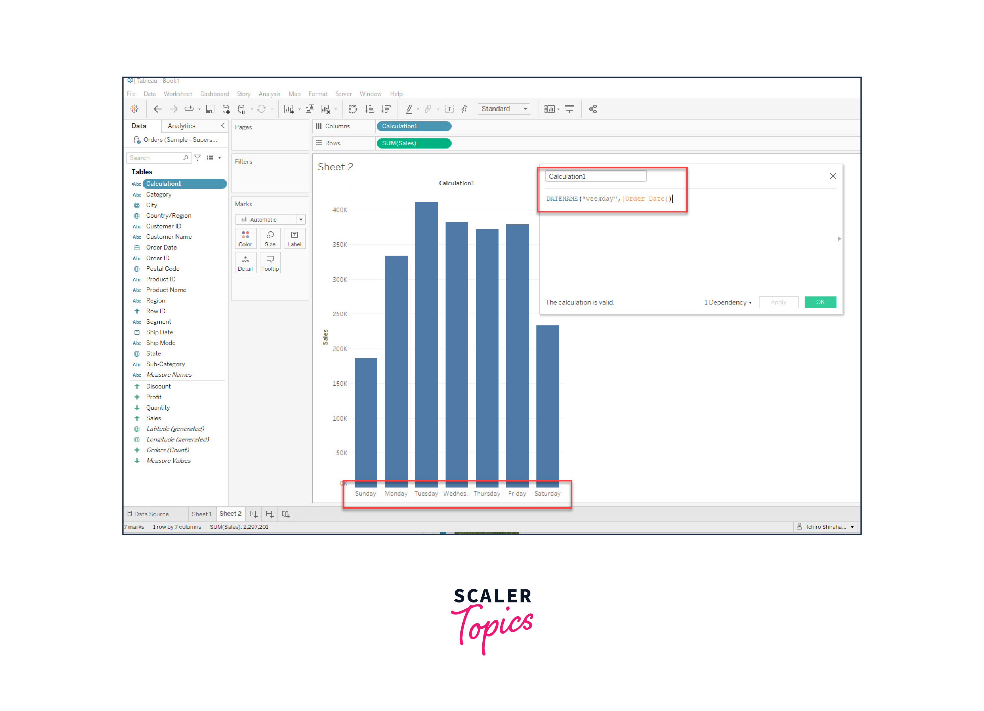
Creating a Bar Chart: To create a bar chart in Tableau, follow these steps:
- Connect to Data Source: Open Tableau Desktop and connect to your data source, such as an Excel spreadsheet or database.
- Drag and Drop Fields: Drag a categorical dimension (e.g., Product Category) to the Columns shelf and a quantitative measure (e.g., Sales) to the Rows shelf. Tableau will automatically aggregate the data.
- Choose Bar Chart Type: In the "Show Me" pane on the right, select the "Bars" option to create a basic bar chart.
- Customize and Format: Customize the chart by adding labels, changing colors, adjusting axis titles, and formatting values as needed.
- Sort and Filter: Sort the bars by value or apply filters to focus on specific categories or data points.
Interpreting a Bar Chart: A bar chart's visual representation makes it easy to interpret data and draw conclusions:
- Comparisons: Bar charts excel at visualizing comparisons between categories. Longer bars indicate higher values, allowing quick assessments of performance or quantities across different groups.
- Ranking: Bar charts help rank categories based on their values. Categories with taller bars are higher ranked.
- Distribution: You can observe the distribution of values across categories, identifying outliers or areas of concentration.
Use Cases: Bar charts find applications in various scenarios:
- Sales Analysis: Compare sales figures across different product categories, regions, or time periods to identify top performers.
- Survey Results: Display survey responses for different options or ratings, making it easy to see which choices are more popular.
- Budget Allocation: Visualize how funds are allocated among various departments or projects.
- Market Share: Illustrate the market share of different products or companies within an industry. Best Practices:
- To maximize the effectiveness of bar charts:
- Limit Categories: Avoid overwhelming the chart with too many categories, which can make it hard to read. If necessary, group categories to make the chart more manageable.
- Consistent Units: Ensure that the quantitative measure on the y-axis is consistently labeled and that units are clear.
- Color Choice: Use colors that are easy to distinguish and meaningful. Avoid overly complex color schemes.
- Axes Labels: Label both the x and y axes clearly to provide context for your audience.
- Annotations: Add annotations or data labels to highlight specific values or trends.
Line Chart in Tableau
A line chart is a powerful visualization tool in Tableau for showing trends and patterns in data that change over time. It uses connected data points, forming lines that help users understand the trajectory and behavior of a metric. Line charts are widely used for visualizing time series data and making comparisons between different data series.
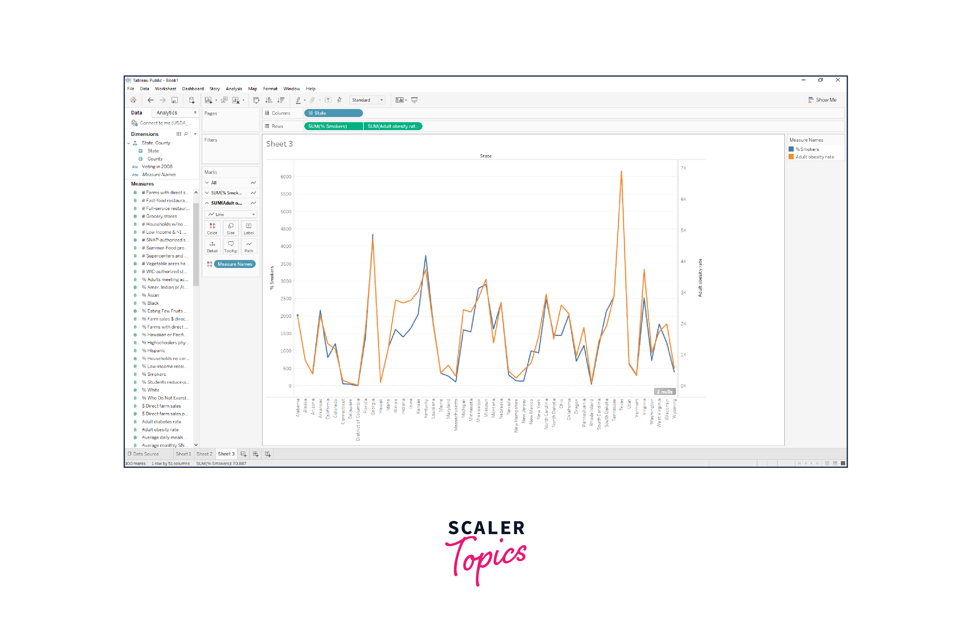
Creating a Line Chart: To create a line chart in Tableau:
- Connect to Data Source: Open Tableau Desktop and connect to your data source containing time-related data.
- Drag and Drop Fields: Drag the date or time dimension to the Columns shelf and a quantitative measure (e.g., Sales) to the Rows shelf.
- Choose Line Chart Type: In the "Show Me" pane, select the "Lines" option to create a basic line chart.
- Customize and Format: Customize the chart by adding labels, changing colors, adjusting axis titles, and formatting values as needed.
- Multiple Lines: To visualize multiple data series, drag additional measures to the Rows shelf, creating multiple lines on the same chart.
Interpreting a Line Chart: Line charts are valuable for understanding trends and relationships:
- Trends Over Time: Line charts are ideal for observing how a metric changes over a period. Rising or falling lines indicate trends.
- Comparisons: When multiple lines are present, you can compare the trajectories of different data series. Lines that follow similar patterns suggest correlations.
- Seasonal Patterns: Line charts can reveal repeating patterns or seasonality in the data.
Use Cases: Line charts are particularly suitable for:
- Sales Trends: Visualize how sales figures have changed over months or years to identify seasonal trends or overall growth.
- Stock Price Analysis: Track the movement of stock prices over time to assess investment opportunities.
- Website Traffic: Display website traffic metrics to analyze visitor behavior and identify peak usage times.
- Temperature Changes: Illustrate temperature fluctuations throughout the year to understand climate patterns.
Best Practices: To create effective line charts:
- Data Quality: Ensure that your time-based data is accurate and consistent. Gaps or irregularities can affect the interpretation of trends.
- Smooth Lines: Use smoothed lines (curved) or straight lines based on the nature of your data. Smoothed lines can help reveal underlying patterns.
- Multiple Series: When comparing multiple data series, use distinct colors or patterns to make lines easily distinguishable.
- Annotations: Add annotations, markers, or reference lines to highlight specific events or data points.
- Time Axis Formatting: Format the time axis with appropriate intervals and labels for better readability.
Pie Chart in Tableau
A pie chart is a circular visualization in Tableau that represents parts of a whole. It's useful for illustrating how individual components contribute to a total, displaying the relative proportion of different categories. However, while pie charts are widely used, they have certain limitations and should be used judiciously to effectively convey insights.
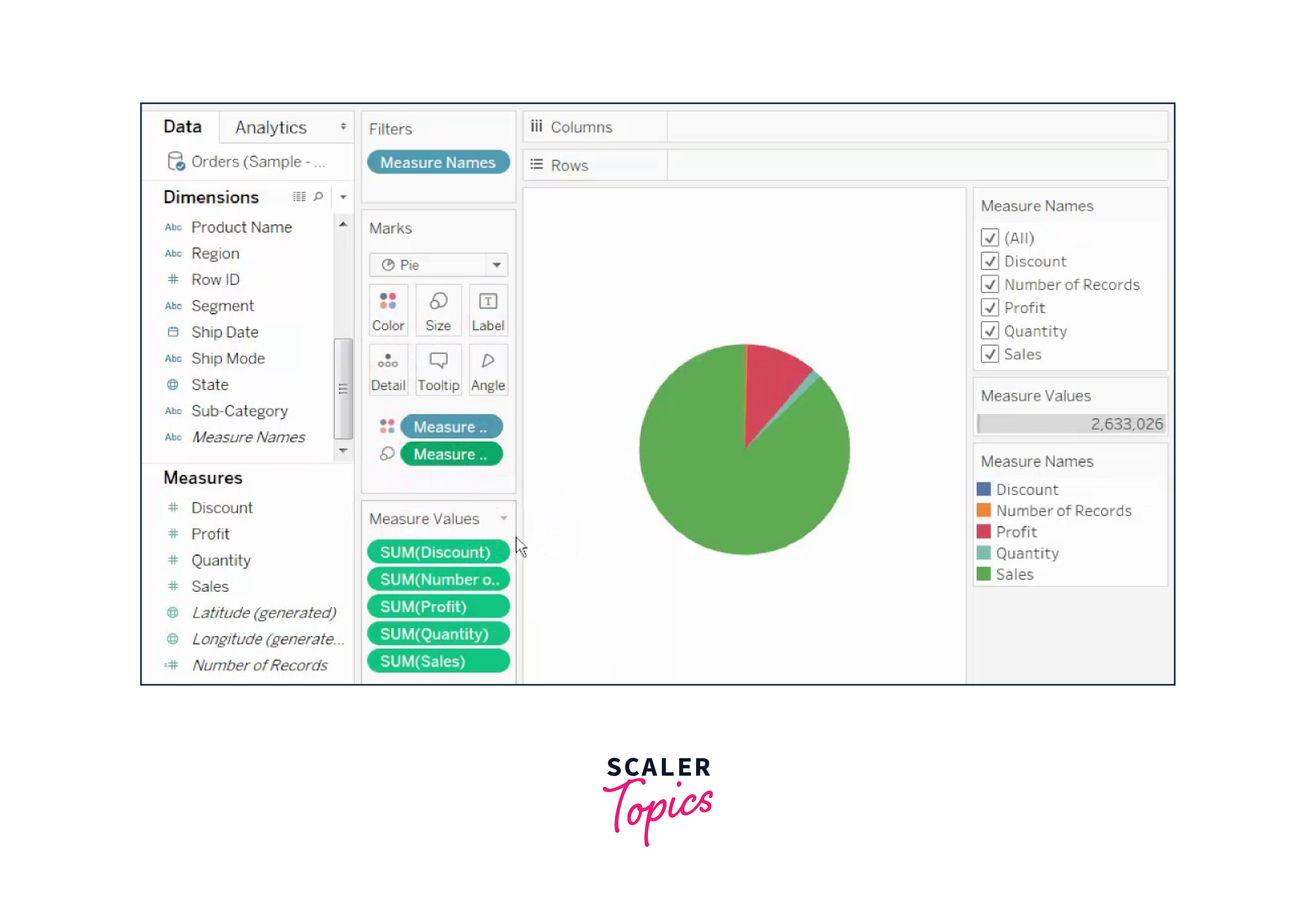
Creating a Pie Chart: To create a pie chart in Tableau:
- Connect to Data Source: Open Tableau Desktop and connect to your data source containing categorical data.
- Drag and Drop Fields: Drag a categorical dimension (e.g., Product Category) to the Color shelf and a quantitative measure (e.g., Sales) to the Angle shelf.
- Choose Pie Chart Type: In the "Show Me" pane, select the "Pie" option to create a basic pie chart.
- Customize and Format: Customize the chart by adding labels, changing colors, adjusting labels, and formatting values as needed.
Interpreting a Pie Chart: Pie charts help viewers understand the composition of a whole:
- Proportions: The size of each slice represents the proportion of the whole that each category contributes.
- Comparisons: It's easy to compare the relative sizes of different categories at a glance.
- Part-to-Whole: Pie charts highlight the relationship between parts and the entire dataset.
Use Cases: Pie charts are appropriate for:
- Market Share: Illustrate the market share of different products, brands, or companies within an industry.
- Budget Allocation: Display how budget funds are distributed among various departments or expenses.
- Survey Responses: Visualize survey responses by category to understand preferences or opinions.
Best Practices: To effectively use pie charts:
- Limited Categories: Avoid too many categories, as it can make the chart cluttered and harder to interpret.
- Large Differences: Pie charts are most effective when there are clear differences in proportions. Avoid using them when the differences are subtle.
- Labeling: Label each slice with its percentage or actual value for clarity.
- Exploded Slices: Explode or emphasize specific slices to draw attention to particular categories.
- Use Other Chart Types: Consider using alternative chart types like bar charts for better visual comparison, especially when dealing with multiple categories.
Scatter Plot:
A scatter plot is a data visualization technique used to display the relationship between two numerical variables. In a scatter plot, each data point is represented as a point on a graph, with one variable plotted on the x-axis and the other on the y-axis. Scatter plots are invaluable for identifying patterns, correlations, clusters, and outliers within datasets. They provide insights into the nature of the relationship between variables, helping users understand how changes in one variable affect the other.
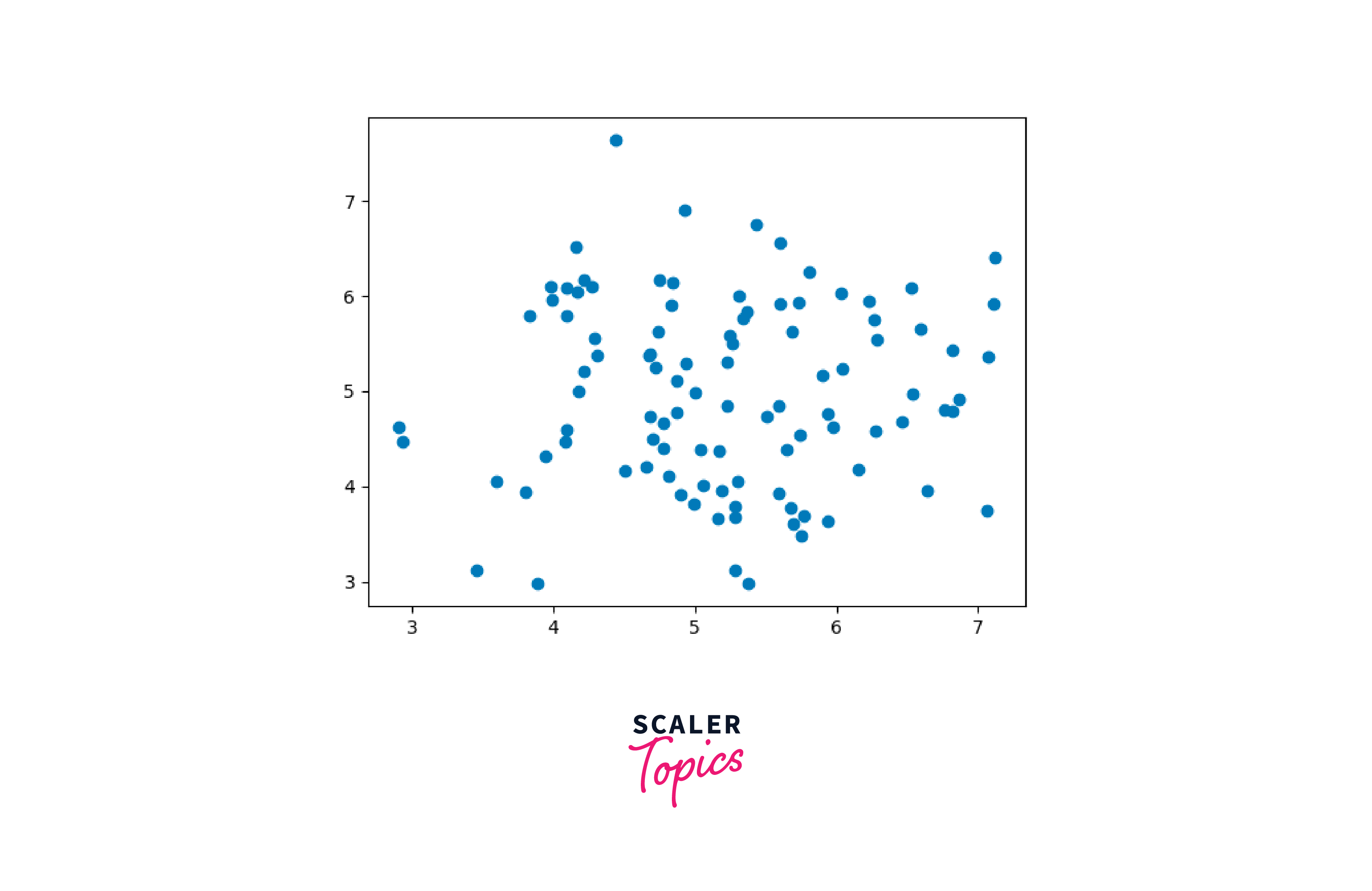
Applications:
- Correlation Analysis: Scatter plots are commonly used to examine the correlation between two variables. Positive correlations show an upward trend, while negative correlations indicate a downward trend.
- Outlier Detection: Outliers, or data points that deviate significantly from the general pattern, can be easily identified in a scatter plot.
- Cluster Identification: Scatter plots can reveal clusters of data points, indicating distinct groups within the dataset.
- Regression Analysis: Scatter plots can be used to visualize and assess the fit of regression models.
Best Practices:
- Use appropriate axis scales and labels to accurately represent the data.
- Utilize color and size to represent additional variables if needed.
- Add trend lines to help visualize the overall relationship between variables.
- Ensure data points are not overcrowded, as this can hinder interpretation.
Heat Map
A heat map is a graphical representation that uses color to depict the intensity of values in a matrix or table. In Tableau, heat maps are often used to visualize large datasets and identify patterns, trends, and correlations within the data. Heat maps use a color gradient to represent values, with lighter colors indicating lower values and darker colors representing higher values.
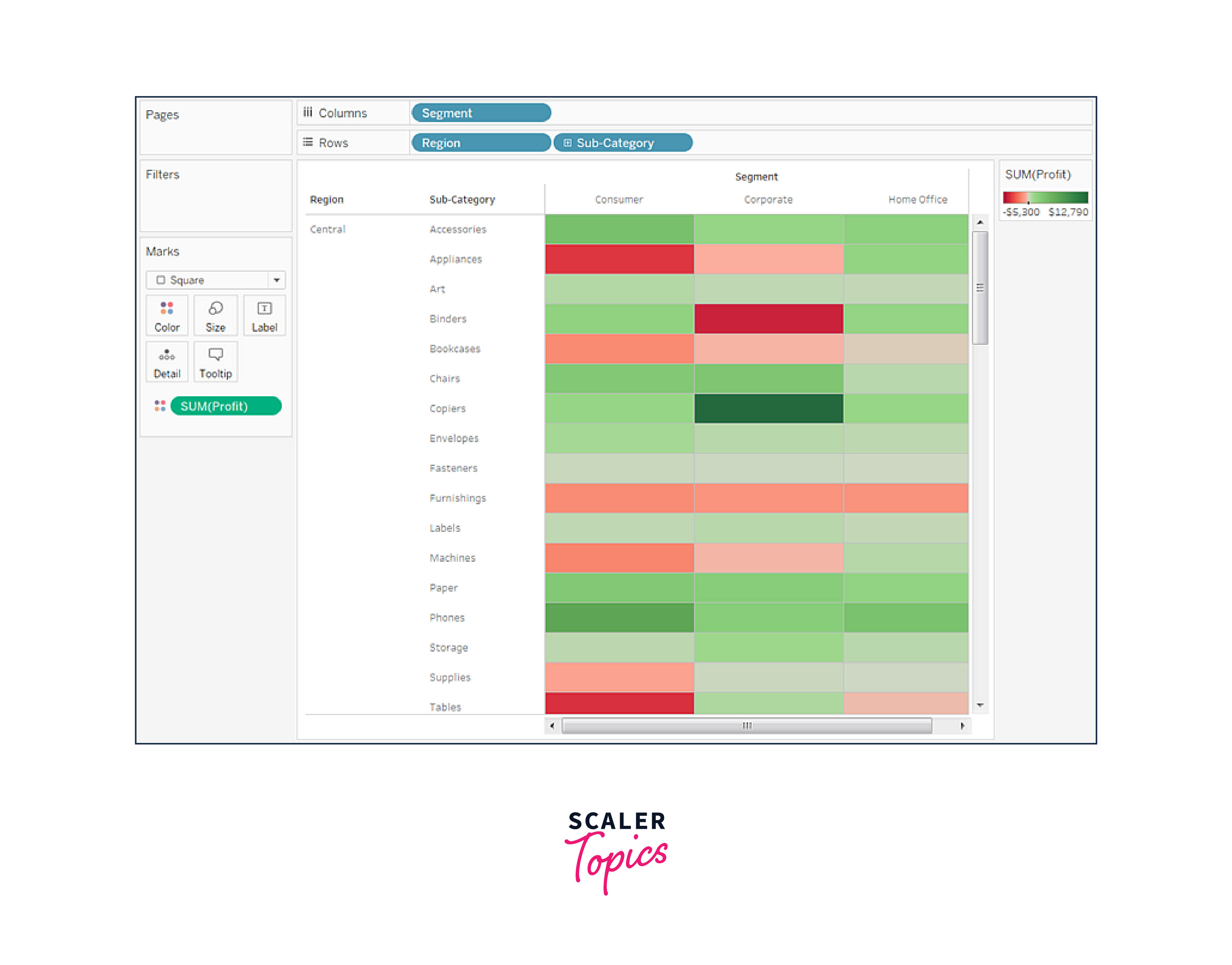
Applications:
- Data Density Analysis: Heat maps can help identify areas of high and low data density, enabling users to focus on specific regions of interest.
- Correlation Analysis: By visualizing the intensity of correlations between variables, heat maps reveal relationships between different data points.
- Time-Series Analysis: Heat maps can be used to analyze patterns over time, such as website traffic or sales data.
Best Practices:
- Choose an appropriate color palette to ensure clear visualization.
- Add labels and tooltips to data points for clarity.
- Use filters and interactions to allow users to explore specific sections of the heat map.
Area Chart:
An area chart is a type of graph that displays the cumulative values of multiple series over a continuous axis, typically representing time. Area charts are similar to line charts, but the area beneath the lines is shaded, making it easier to visualize the contribution of each series to the overall trend.
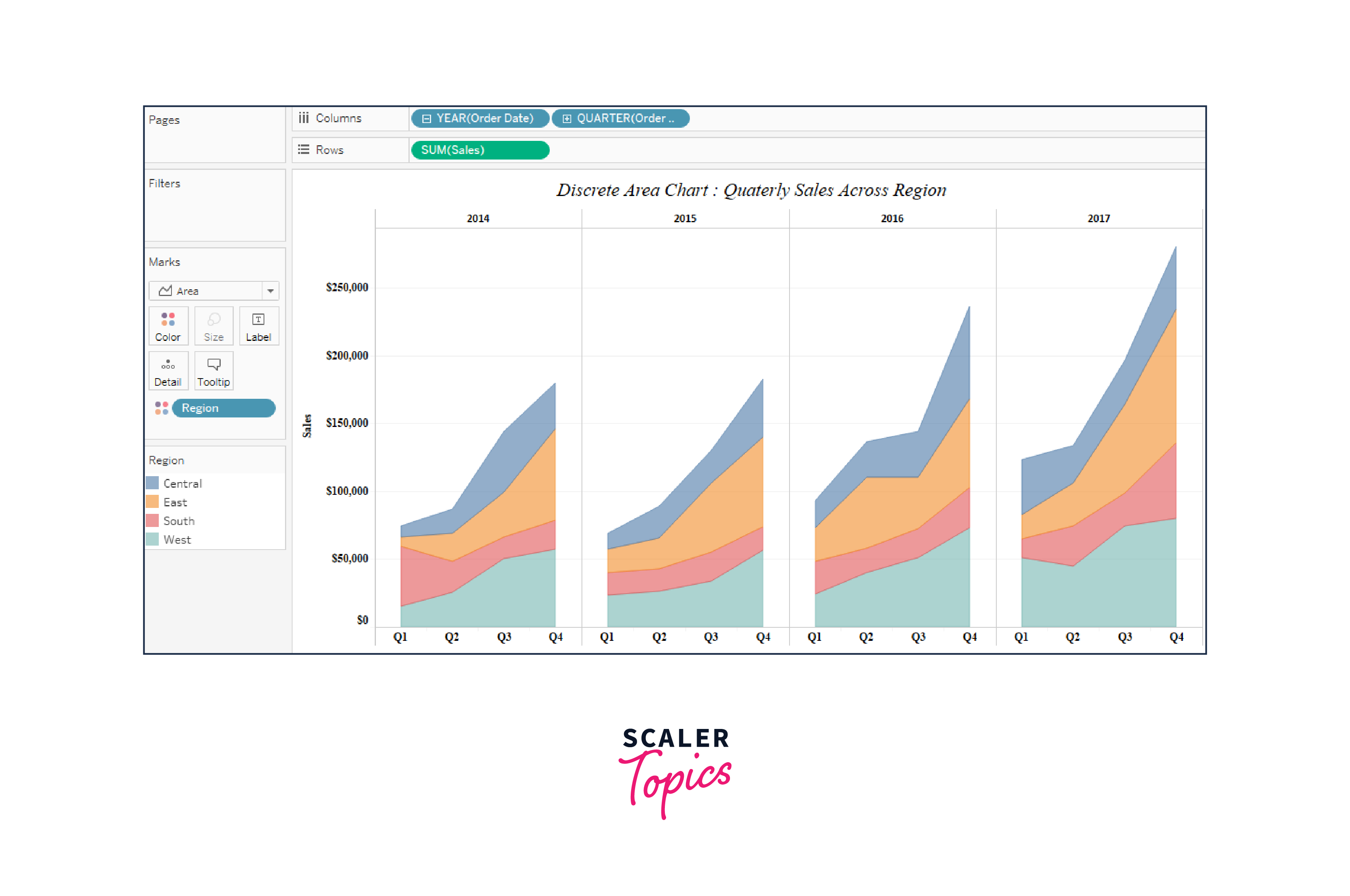
Applications:
- Cumulative Trends: Area charts are excellent for showing cumulative trends and changes over time.
- Comparison of Categories: They allow users to compare the distribution and contribution of different categories to the whole.
- Visualizing Proportions: Area charts can represent proportions over time, such as the distribution of market share.
Best Practices:
- Stack the areas to emphasize cumulative totals.
- Use contrasting colors for different series to enhance readability.
- Label key data points and provide context through tooltips.
Histogram:
A histogram is a graphical representation that displays the distribution of numerical data by grouping it into "bins" or intervals. Each bin represents a range of values, and the height of the bars in the histogram corresponds to the frequency or count of data points within each bin.
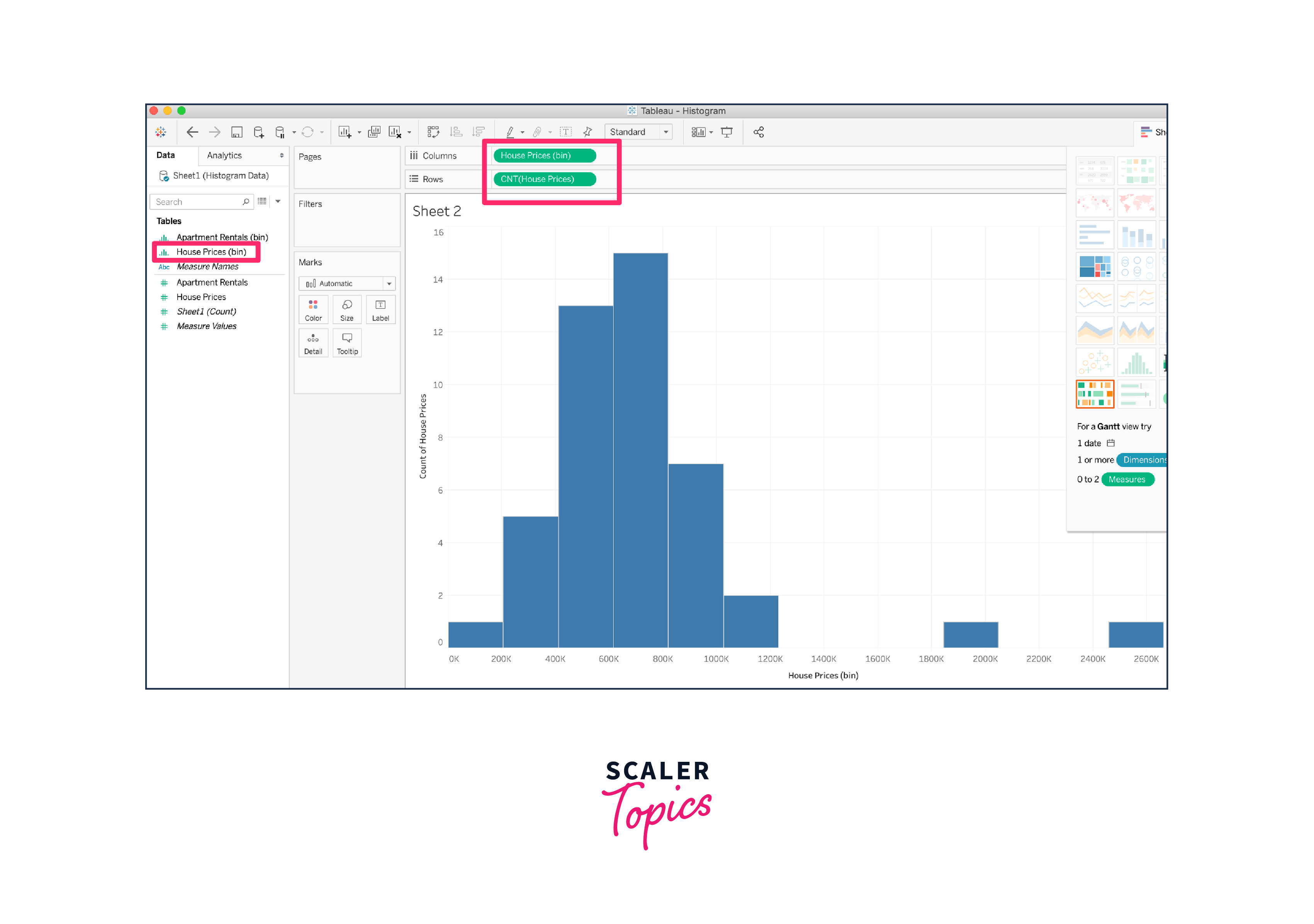
Applications:
- Data Distribution: Histograms help users understand the distribution and spread of data values.
- Identifying Patterns: Outliers, gaps, and clusters in the data can be easily identified through histograms.
- Frequency Analysis: Histograms reveal the frequency of values within specific ranges, aiding in analyzing patterns and trends.
Best Practices:
- Choose an appropriate number of bins to avoid oversimplification or overcomplication.
- Label axes and bins accurately to provide clear context.
- Use tooltips to provide additional information about the data within each bin.
Map in Tableau:
Maps in Tableau allow users to visualize geographic data by plotting data points on a map background. Tableau offers various mapping options, including symbol maps, filled maps, and density maps.
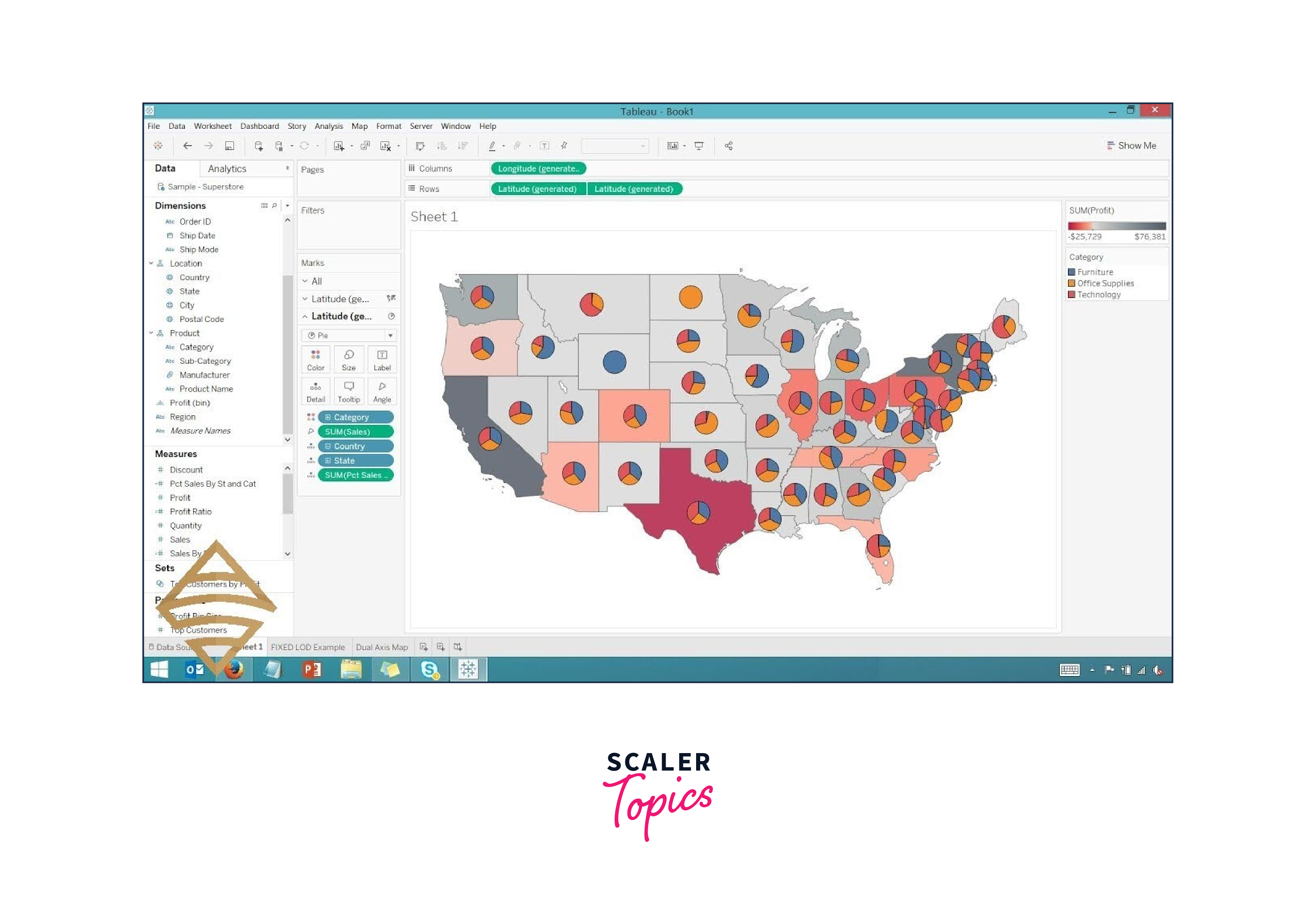
Applications:
- Spatial Analysis: Maps enable users to analyze data within a geographical context, such as sales by region or customer distribution.
- Location-Based Insights: Maps help uncover patterns and trends related to specific geographic locations.
- Data Exploration: Maps provide an intuitive way to explore data variations across different regions.
Best Practices:
- Ensure accurate geocoding of data points for accurate representation.
- Use appropriate map layers and background images to provide context.
- Customize color schemes and legends to enhance readability and understanding.
Treemap
A treemap is a data visualization technique that displays hierarchical data using nested rectangles, with each rectangle representing a category and its subcategories. The size and color of the rectangles are used to convey additional information about the data. Treemaps are effective for visualizing proportions, hierarchies, and patterns within complex datasets.
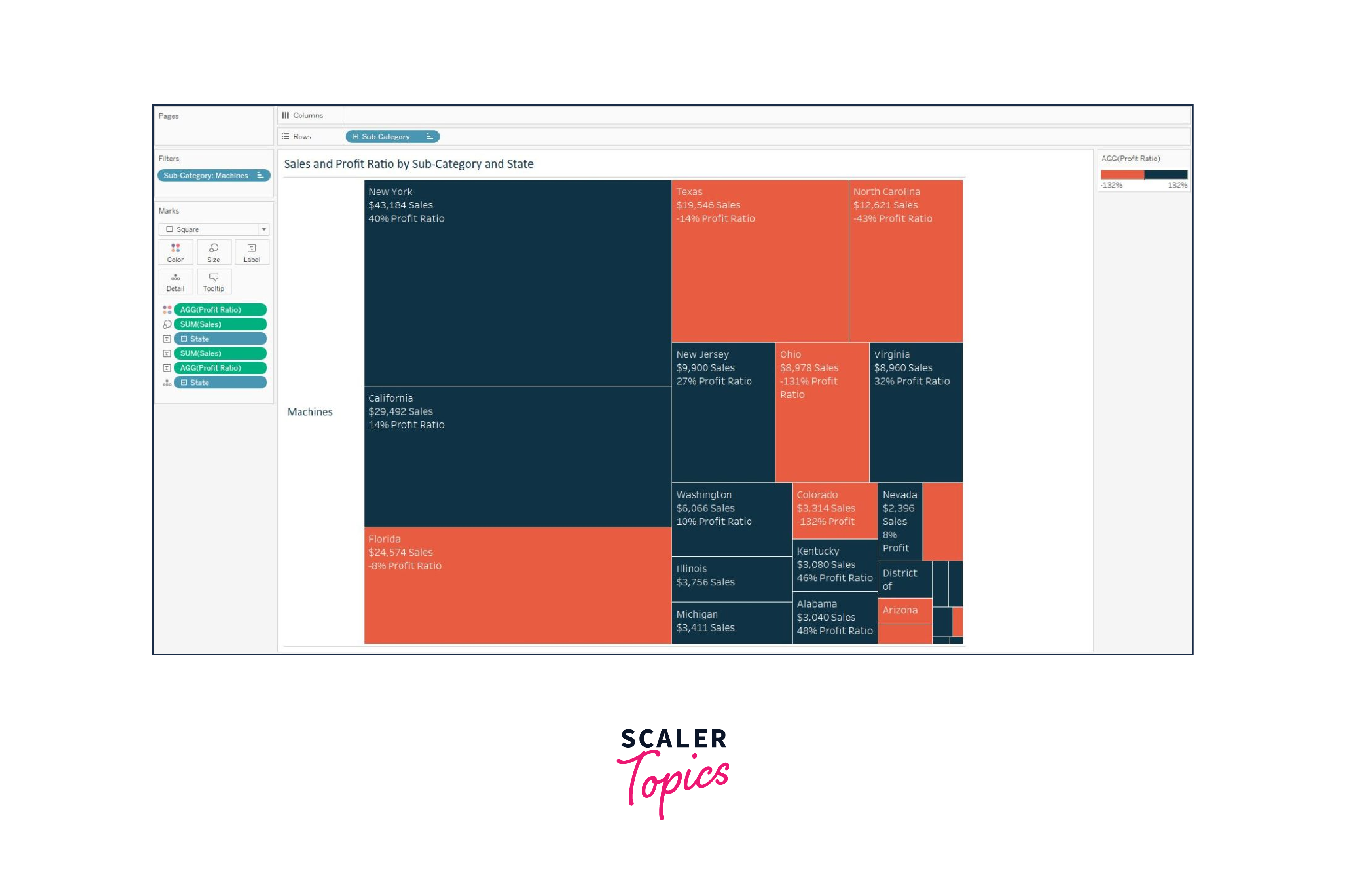 How to Create a Treemap in Tableau:
- Data Preparation: Load your data into Tableau, ensuring it includes hierarchical information. For example, you might have a dataset that includes product categories and subcategories.
- Drag and Drop Dimensions: In Tableau's workspace, drag the dimension that represents the main category to the "Columns" shelf and the dimension representing the subcategory to the "Rows" shelf.
- Size and Color Encoding: Drag a measure onto the "Size" shelf to determine the size of the rectangles. You can also drag another measure onto the "Color" shelf to encode information with colors.
- Adjust Layout: Customize the layout by adjusting the "Marks" card settings. You can choose different color schemes, adjust the size encoding, and customize labels.
- Hierarchy and Interaction: To allow users to interact with the treemap, you can enable drill-down functionality. By clicking on a rectangle, users can navigate deeper into the hierarchy.
Use Cases and Benefits of Treemaps:
- Portfolio Composition: Visualize the allocation of assets within a portfolio, from high-level categories to individual holdings.
- Organizational Structure: Display the hierarchy of departments, teams, and employees within an organization.
- Website Traffic: Analyze website traffic by breaking down visitors by country, region, and page views.
- Disk Space Utilization: Visualize the distribution of disk space usage across different directories and files.
Box Plot
A box plot, also known as a box-and-whisker plot, is a visual summary of a dataset's distribution. It displays key statistical measures, including the median, quartiles, and potential outliers. Box plots are useful for understanding the spread, central tendency, and skewness of data.
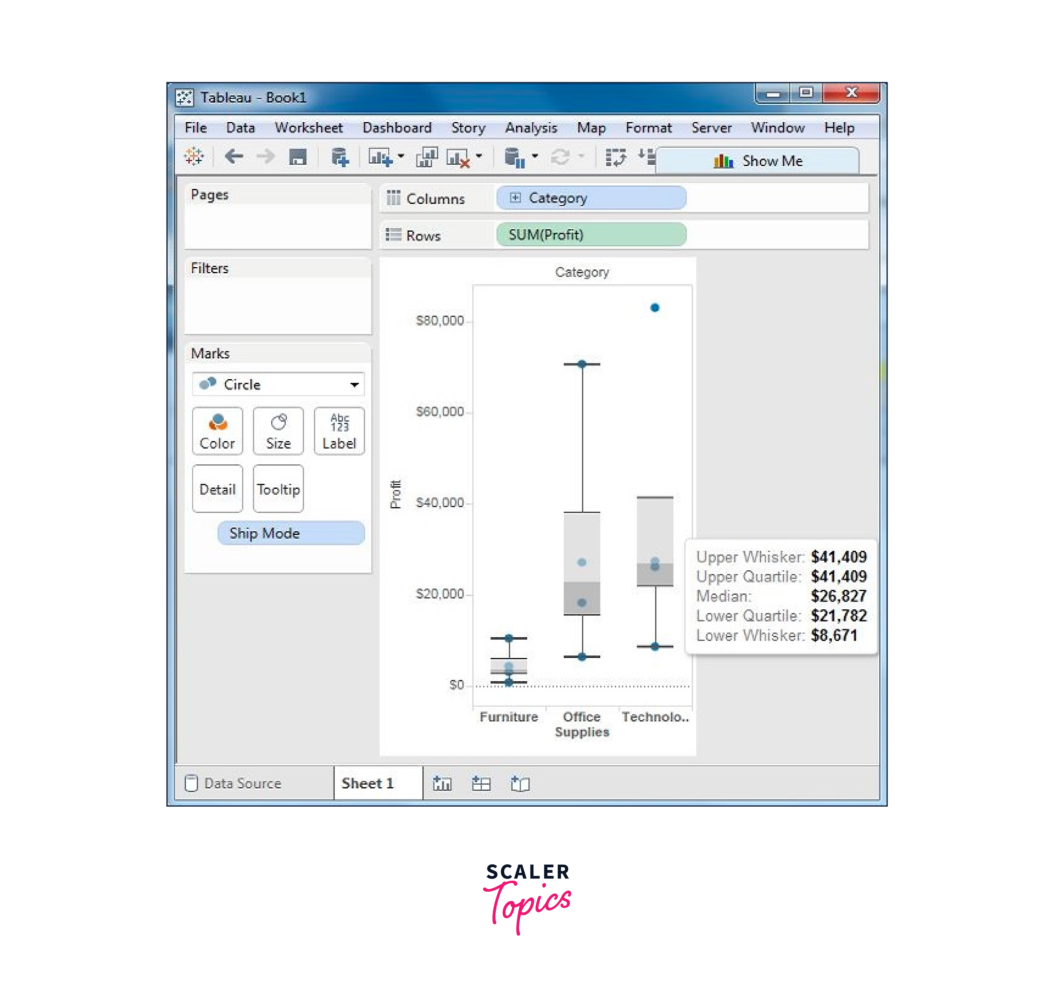
How to Create a Box Plot in Tableau:
- Data Preparation: Load your data into Tableau. A box plot requires a continuous measure and an optional categorical dimension for grouping.
- Drag and Drop: Place the categorical dimension on the "Columns" shelf and the continuous measure on the "Rows" shelf.
- Add Box Plot: In the "Marks" card, change the mark type to "Box Plot." Tableau will automatically generate the box plot based on the data.
- Customization: Customize the appearance of the box plot by adjusting options in the "Marks" card. You can add reference lines, change colors, and modify the level of detail.
- Interactivity: Enable interactivity by adding filters or parameters to allow users to explore the box plot based on different dimensions or subsets of data.
Use Cases and Benefits of Box Plots:
- Comparing Distributions: Compare the distribution of salaries across different job roles or departments.
- Identifying Outliers: Detect outliers in datasets, helping to identify potential anomalies or data quality issues.
- Skewness Analysis: Understand the skewness of data, indicating whether data is symmetrical or skewed.
Bullet Graph
A bullet graph is a data visualization that combines several elements to represent a single data point within a target or goal context. It includes a horizontal bar representing the main measure, reference lines for comparison, and color coding for quick understanding. Bullet graphs are effective for tracking progress and performance against benchmarks.
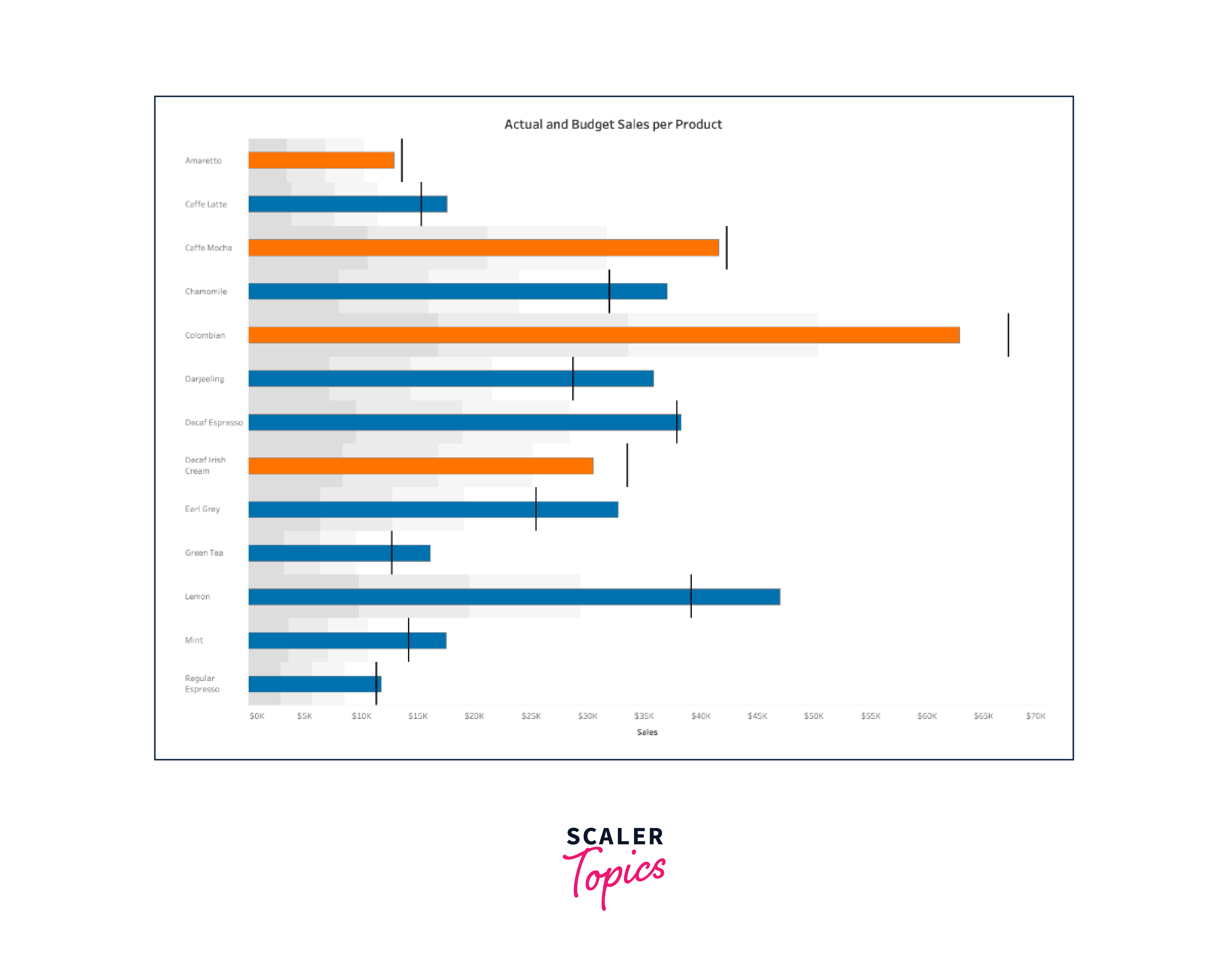
How to Create a Bullet Graph in Tableau:
- Data Preparation: Load your data into Tableau. A bullet graph requires the main measure, target value, and potentially other reference points.
- Drag and Drop: Place the dimension representing the data point on the "Columns" shelf and the main measure on the "Rows" shelf.
- Add Reference Lines: In the "Analytics" pane, add reference lines for the target value, benchmarks, or comparison values.
- Change Mark Type: Change the mark type to "Bullet Graph" in the "Marks" card. Tableau will generate the bullet graph based on the data and reference lines.
- Customization: Customize the appearance of the bullet graph, including colors, labels, and tooltips, to provide context and clarity.
- Interactivity: Enable interactivity by adding filters or parameters to allow users to view different data points or dimensions.
Use Cases and Benefits of Bullet Graphs:
- Performance Tracking: Monitor sales performance against monthly targets or compare actual results to budgeted amounts.
- KPI Monitoring: Track key performance indicators (KPIs) and their progress over time or across different categories.
- Project Status: Visualize the completion rates of project milestones and tasks.
Gantt Chart
A Gantt chart is a visual representation of a project schedule that displays tasks, their start and end dates, and the dependencies between them. Gantt charts are widely used in project management to plan, track, and communicate project timelines and progress.
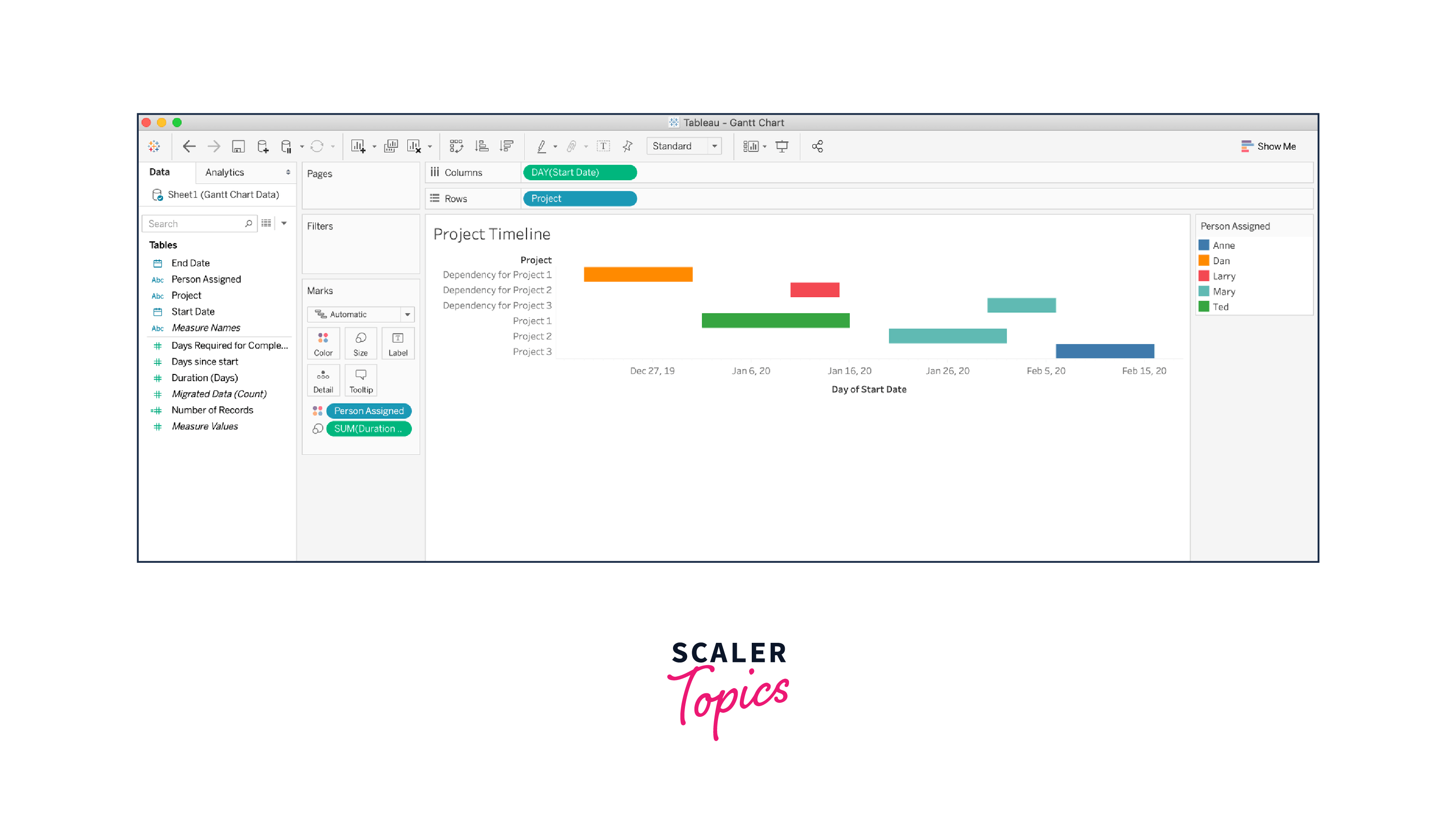
How to Create a Gantt Chart in Tableau:
- Data Preparation: Load your project data into Tableau, including tasks, start dates, end dates, and dependencies.
- Drag and Drop: Place the dimension representing the tasks on the "Columns" shelf and the start and end date measures on the "Rows" shelf.
- Add Dependencies: Use the "Connect" lines option in the "Analytics" pane to add dependency lines between tasks.
- Customization: Customize the appearance of the Gantt chart, such as colors for different tasks or milestones.
- Tooltip Information: Create informative tooltips that display task details, durations, and other relevant information.
- Interactivity: Enable interactivity by adding filters or parameters to allow users to focus on specific time periods or tasks.
Use Cases and Benefits of Gantt Charts:
- Project Management: Plan, visualize, and track project tasks and milestones over time.
- Resource Allocation: Allocate resources effectively by identifying overlapping tasks and potential bottlenecks.
- Timeline Communication: Communicate project timelines and progress to stakeholders in a clear and visual manner.
Conclusion
- Tableau's chart types enable precise representation of data, allowing users to convey complex information clearly and effectively.
- Different charts reveal specific data patterns, such as trends over time, comparisons, distributions, and correlations.
- Hierarchical data is best depicted through treemaps, showcasing categories and subcategories in a visually intuitive manner.
- Box plots provide a comprehensive view of data distribution, aiding in identifying outliers, quartiles, and central tendencies.
- Bullet graphs assist in tracking performance against benchmarks, highlighting achievements and areas for improvement.
- Gantt charts simplify project management by visualizing task schedules, dependencies, and progress.
- Pie charts and stacked bar charts are apt for showcasing parts of a whole, emphasizing proportions.
- Maps visualize geographic data, offering insights into regional trends, concentrations, and patterns.
- Heat maps highlight data density, helping identify hotspots and variations in large datasets.
- Line charts reveal trends and changes over time, crucial for time-series analysis.
