Tableau Data Visualization
Overview
Tableau is a powerful data visualization tool that is utilized by companies and organizations all around the world. It enables users to generate dynamic representations from their data quickly and efficiently without sophisticated technical knowledge.
Tableau allows users to connect to various data sources, such as spreadsheets, databases, and cloud-based services, and then transform that data into engaging visualizations, such as charts, graphs, and maps. Tableau's capacity to manage enormous volumes of data and produce intuitive and dynamic dashboards is one of its primary strengths.
Introduction
Tableau is a prominent data visualization application transforming how businesses and individuals examine and comprehend data. It allows users to build aesthetically attractive and interactive charts, graphs, maps, and other visualizations that assist them in making sense of their data and gaining important insights.
Tableau's user-friendly interface is one of its major advantages. By dragging and dropping data fields into the appropriate locations, even users with no prior data analysis or programming knowledge may easily generate stunning infographics. Tableau also supports many data sources, making connections to many sorts of data simple.
The visualization capabilities of Tableau are simply astounding. Users can construct dynamic dashboards and reports allowing real-time data exploration and collaboration using the large array of available tools and capabilities. In addition, Tableau's visualizations are visually appealing and provide a clear and succinct representation of data, allowing users to discover trends and patterns more readily.
What is Data Visualization?
Data visualization simplifies and visualizes complex data sets to make them easier to examine and understand. Data visualization, using charts, graphs, maps, and other visual elements, enables users to detect patterns, trends, and insights that may be difficult to discern from raw data alone.
Data visualization is effective in many areas, including business, healthcare, and government. It may be easier for decision-makers to recognize essential information and make educated judgments if data is presented visually. Furthermore, data visualization can aid in identifying areas of concern or potential for improvement.
Numerous data visualization tools and approaches are available, ranging from simple bar charts and complex graphs to interactive dashboards.
What are the Advantages and Disadvantages of Data Visualization?
Let us discuss the advantages and disadvantages of data visualization in detail.
Advantages
Some of the primary benefits of data visualization include the following:
- Better comprehension of data:
Visualization makes it simpler to notice patterns and trends that may be difficult to spot in raw data alone, allowing for a more in-depth grasp of the information. - Better communication:
Visualizations are a great approach to presenting complex information to others, providing a clear and simple way to discuss discoveries and thoughts. - Increased efficiency:
Data visualization can aid the analysis process by allowing users to identify essential information and make more educated decisions quickly. - Better decision-making:
Because visualizations provide a more thorough and detailed understanding of data, they can assist users in making more informed and successful decisions.
Apart from these, visualizing data in Tableau can make it easier to detect outliers for several reasons:
- Easy identification of extreme values:
Outliers are data points that are significantly different from other data points in a dataset. By visualizing data in Tableau, you can quickly identify extreme values that may be potential outliers by looking for data points that are far away from the rest of the data points. - Ability to analyze data across multiple dimensions:
Tableau allows you to visualize data across multiple dimensions, which can help you identify outliers that may be hidden in a single-dimension view. For example, you can visualize data across time, geography, and product lines to identify outliers that may be specific to a particular dimension.
Disadvantages
Some of the major disadvantages of data visualization include the following:
- Data misinterpretation:
If visualizations are not correctly developed or presented, they can be deceptive and lead to inaccurate conclusions. - Technical skills required:
Producing good visualizations necessitates a certain level of technical skill and knowledge, which may be difficult for some users. - Oversimplification:
Visualizations can oversimplify complex data sets, thereby missing key details. - Cost:
Data visualization can be expensive (due to high license cost), depending on the tools and software utilized, especially for small businesses or individuals. - Time-consuming:
Producing excellent visualizations takes time, especially for large or complicated data sets.
Why is Data Visualization Important?
Data visualization is a powerful tool for businesses and organizations to gain insights into their data and make informed decisions. It helps to present complex information clearly and concisely, making it easier for users to identify patterns, trends, and outliers. Tableau is one of the most popular data visualization tools that enable users to create interactive and visually appealing dashboards, charts, and graphs. Visualization can assist in identifying data points that deviate from the norm or are anomalies, allowing for identifying areas of concern or potential for improvement. Visualizations can also assist teams in working more cooperatively by allowing multiple stakeholders to view and analyze data simultaneously.
One of the key advantages of data visualization is that it allows users to communicate their findings and insights more effectively. This is because visualizations are more engaging than raw data and can convey information quickly and easily. In addition, data visualization can help to uncover hidden insights that may not be apparent when looking at raw data.
Tableau is a user-friendly tool that is designed to be accessible to users of all skill levels. It offers a wide range of features and customization options, allowing users to create visualizations that are tailored to their specific needs. Tableau also offers real-time data analysis, which enables users to make decisions based on the latest data.
We can conclude that data visualization and Tableau are essential tools for businesses and organizations that want to make sense of their data. By using these tools, users can gain insights into their data that would otherwise be difficult to uncover and make informed decisions that drive business growth and success.
Data Visualization and Big Data
Big data is an ever-expanding big set of data. Since the amount of data generated at an unparalleled rate continues to expand, data visualization has become an increasingly crucial tool for managing and making sense of big data. Data visualization can assist users in identifying patterns, trends, and insights that may be difficult to perceive from raw data alone due to its capacity to translate complex information into clear and readily understood visual representations.
One of the primary benefits of big data visualization is its ability to provide a full overview of vast and complex data sets. Users can rapidly discover critical information and delve into specific areas using interactive dashboards and other visualization tools.
Examples of Data Visualization
Data visualization is used in numerous sectors for many applications. Let us go over some of the instances where they are used.
Different Types of Visualizations
Let us learn about the various types of data visualizations.
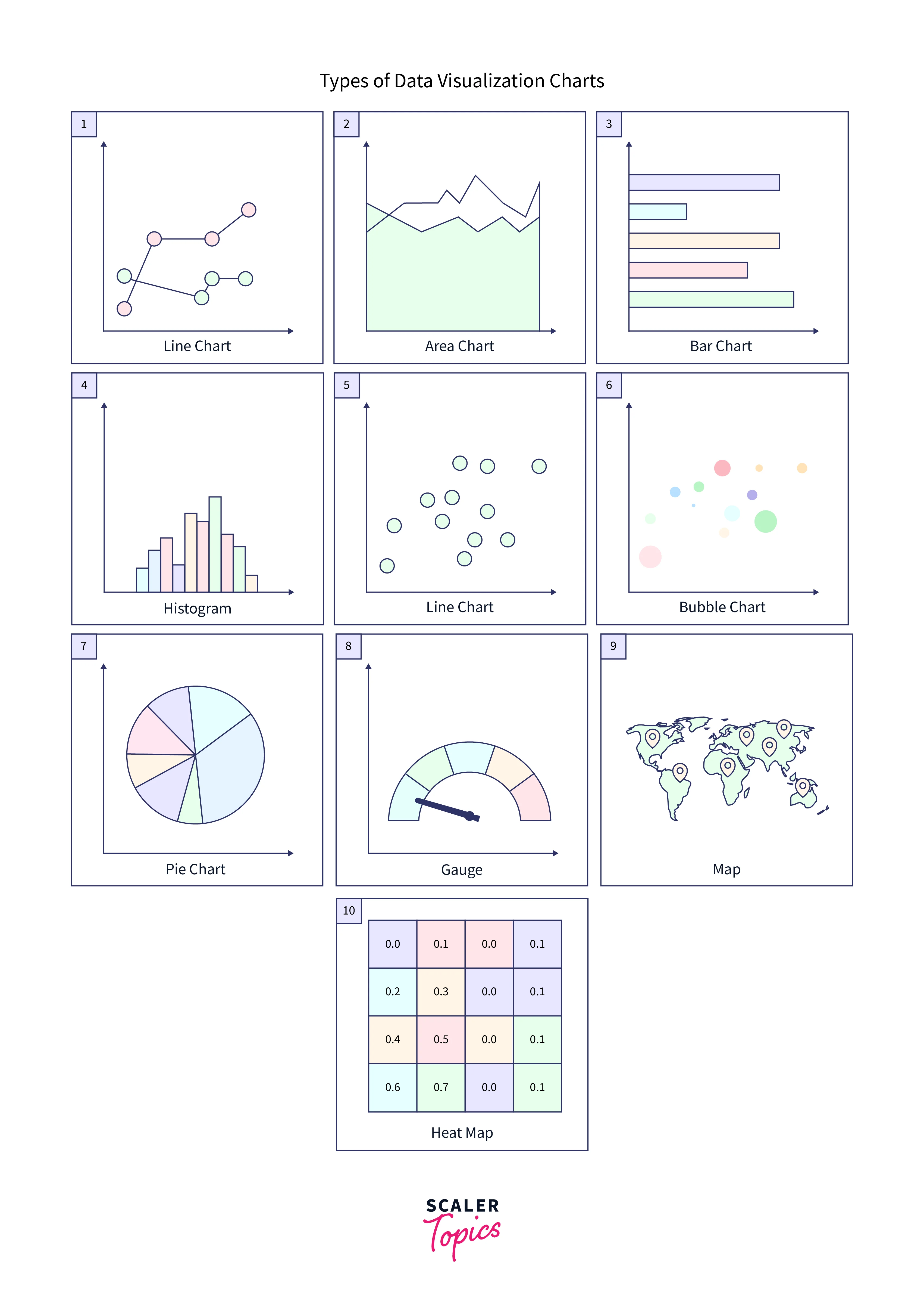
General Types of Visualizations:
We have mainly six types of data visualizations. Let us learn about each of them in detail.
-
Chart:
Charts are one of the most used visual elements in data visualization, as they provide a clear and succinct approach to displaying data sets and identifying relevant patterns and insights. Numerous charts are available, each with its own set of advantages and disadvantages depending on the data being presented and the audience being addressed. Bar charts, line charts, scatter plots, and pie charts are some of the most common forms of charts, and each may be used to depict different types of data in different ways. The sort of chart best suited to your needs will be determined by criteria such as the complexity of your data, the degree of detail necessary, and your research aims. -
Table:
Tables are another important data visualization component, providing a structured and organized approach to present vast volumes of data in a simple and easy-to-understand style. Tables, instead of charts, provide data in a tabular format, allowing for easy comparison and study of data points across numerous categories and factors. In addition, tables are useful for showing numerical or complex data sets containing several variables or data points. When creating tables for data visualization, keep the design simple and uncluttered, with clear headings and a logical structure that allows users to discover and understand the information they require easily. -
Graph:
Graphs are an effective tool for data visualization because they provide a visual representation of data that can aid in identifying patterns, trends, and relationships that may be difficult to detect from raw data alone. Graphs come in various shapes and sizes, including bar graphs, line graphs, scatter plots, and more, and can be used to depict various sorts of data in various ways. For example, graphs effectively present changing data or identify connections and links between multiple variables. -
Geospatial:
Geospatial data visualization is a subset that focuses on presenting information in a geographical context. This might range from maps and satellite photos to charts and graphs, including spatial data. Geospatial visualization is particularly beneficial for comprehending patterns and trends associated with specific areas or regions, such as population data or weather patterns. In addition, geospatial visualization can assist in identifying correlations and linkages that may be difficult to identify using typical data visualization techniques by overlaying data on a map or other geographic representation. -
Infographic:
Infographics are a common type of data visualization in which text, photos, and charts are used to display detailed information in a simple and aesthetically appealing manner. Infographics can represent a wide range of information, including statistics, data sets, timelines, and process diagrams. Infographics are very beneficial for presenting information understandably and memorably, making them perfect for instructional, marketing, and other forms of content. -
Dashboards:
Dashboards are a popular data visualization tool for providing a high-level overview of key metrics and data points in a simple interface. Dashboards often include various visual elements, including charts, graphs, and tables, to convey data clearly and understandably. Dashboards are particularly beneficial for recording and monitoring key performance indicators (KPIs). They provide users with real-time insights into business performance and enable them to discover patterns and abnormalities immediately.
Please refer to the image provided below for more clarity.
More Specific Examples
So far, we've seen a variety of data representations. Let's look at some of the most prevalent sorts of data visualizations.
-
Area Map:
An area map is a form of Tableau data visualization that employs color to depict data values across a geographic area. For example, an area map would be a map of India with each state colored differently depending on a certain data point, such as population or GDP.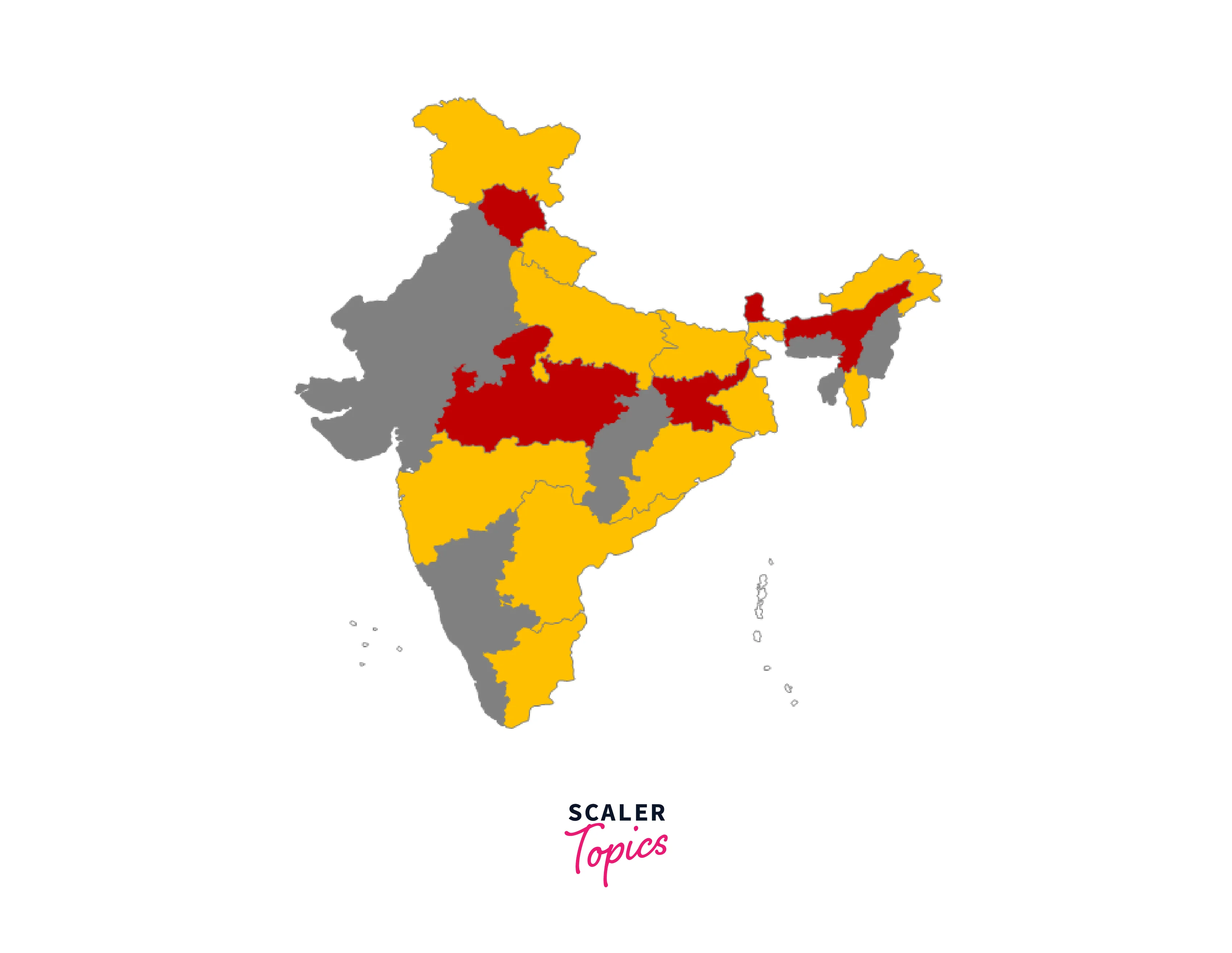
-
Bar Chart:
A Bar Chart is a form of Tableau data visualization style that uses horizontal or vertical bars to convey data. For example, a bar chart would be a chart that shows the sales income of various products over a certain period, with each product represented by a different colored bar.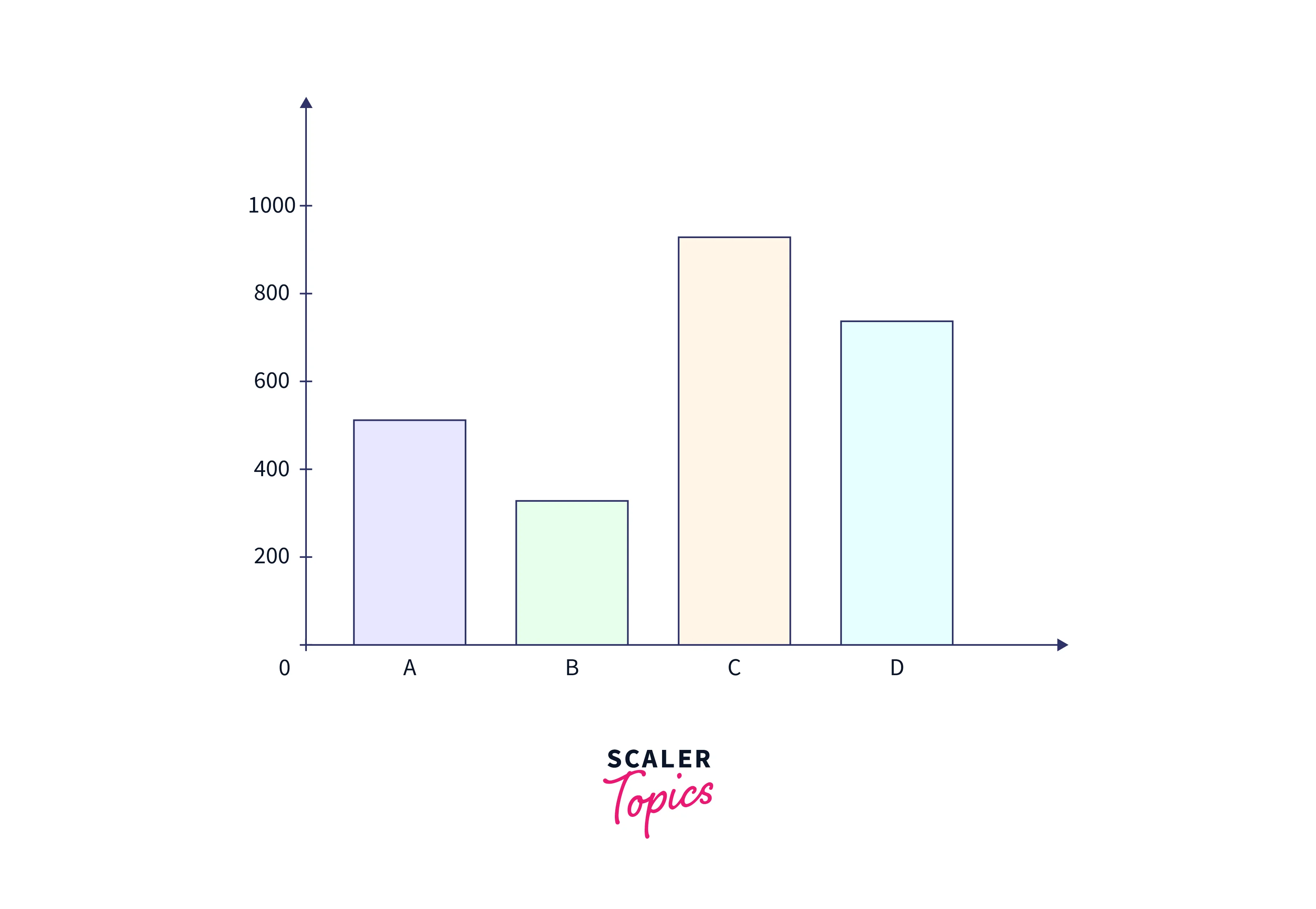
-
Box-and-whisker Plots:
A Box-and-whisker Plot is a form of Tableau data visualization that summarizes a set of data's distribution. For example, a box-and-whisker plot can show the distribution of test scores for a group of students, with the "box" representing the middle 50% of the data, the "whiskers" representing the minimum and maximum values, and any outliers represented individually.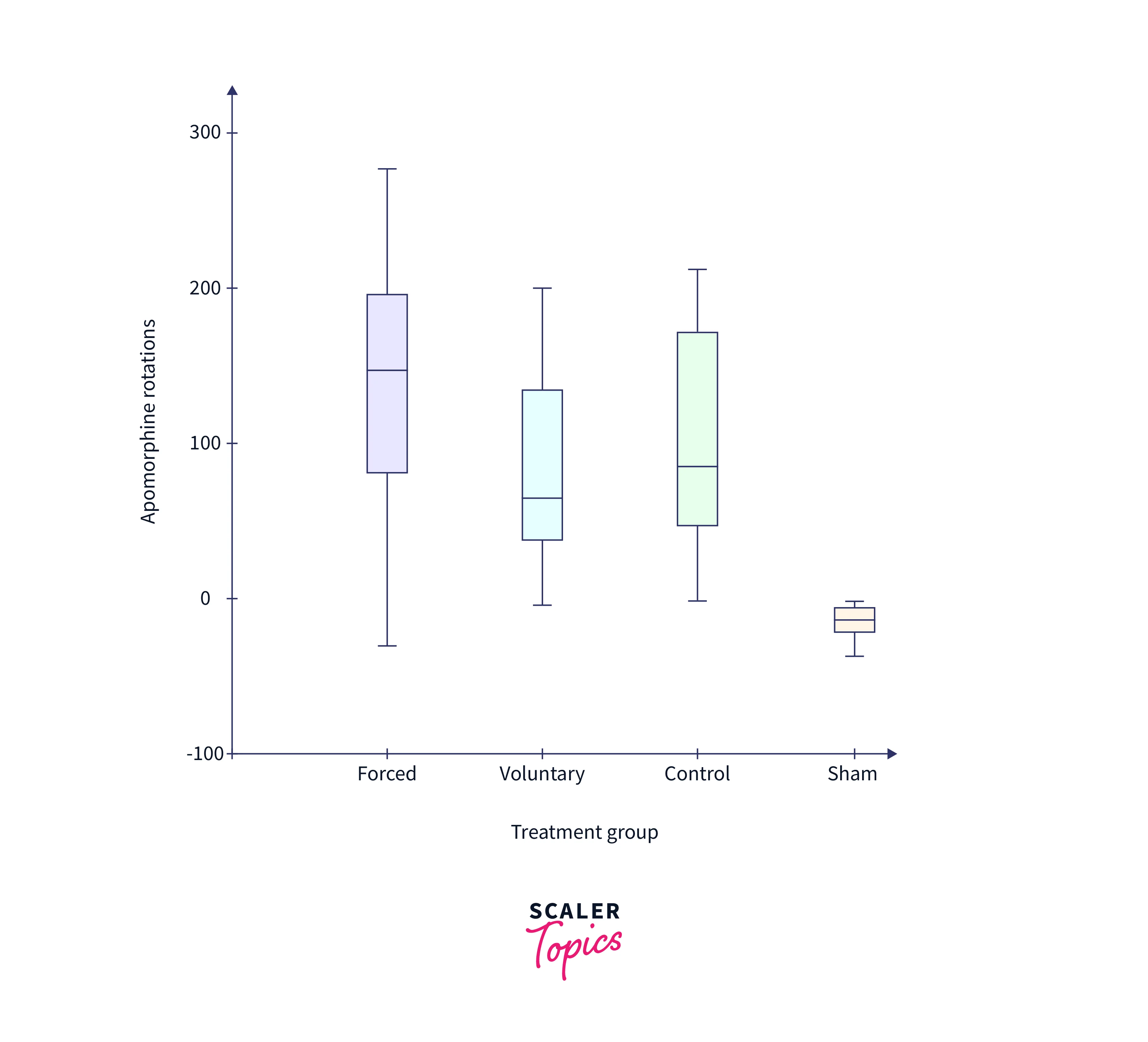
-
Bullet Graph:
A bullet graph is a form of Tableau data visualization used to show progress toward a goal. For example, a bullet graph might be a chart that shows sales income over time, with colored bars representing progress toward a monthly sales objective.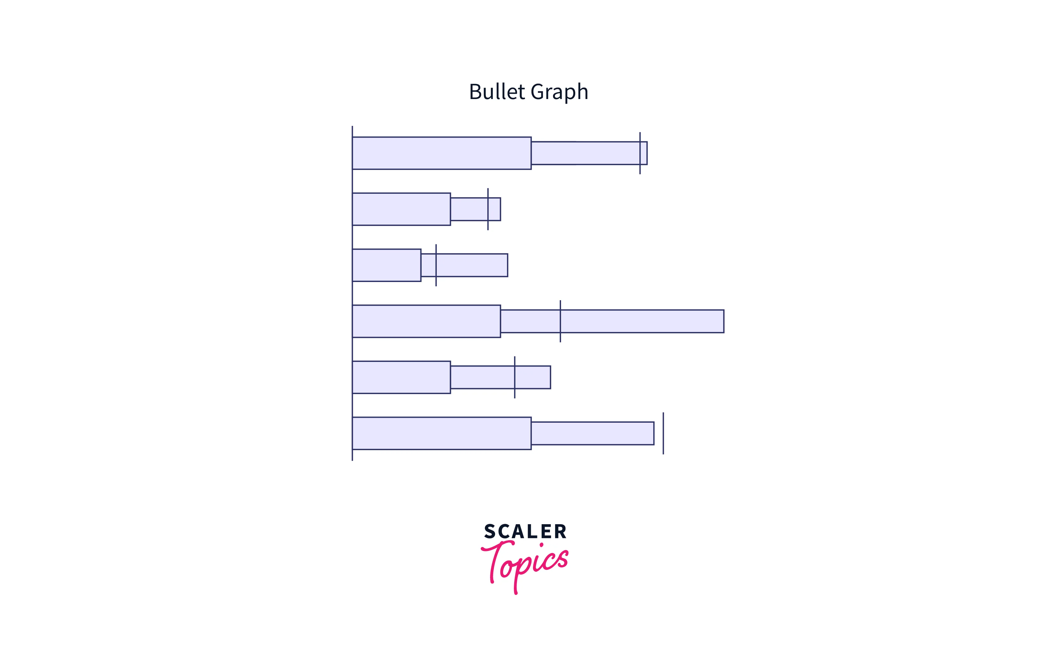
-
Gantt Chart:
A Gantt Chart is a form of Tableau data visualization which is used to show project timelines and timetables. A Gantt chart is a chart that shows the numerous activities and milestones in a project, with horizontal bars representing the time of each work and its dependencies. This lets viewers swiftly assess a project's progress and detect potential bottlenecks or delays.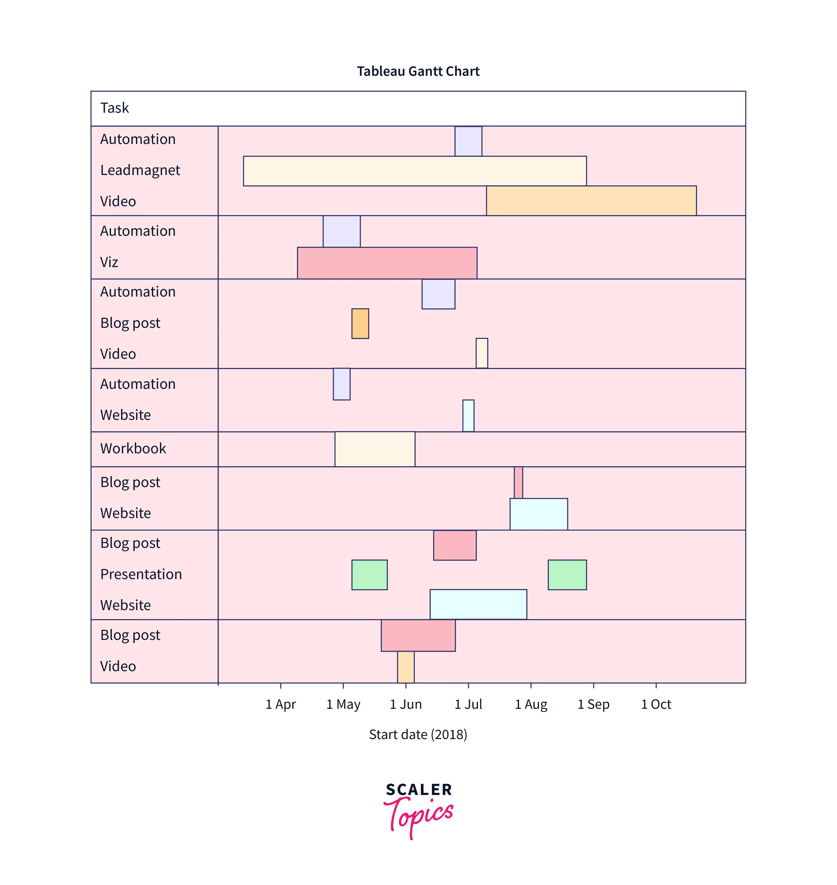
-
Heat Map:
A heat map is a form of Tableau data visualization in which different colors represent different degrees of data values. For example, a heat map can depict the concentration of population density throughout a geographic area, with warmer colors indicating more density and cooler colors indicating lower density. This enables viewers to immediately detect patterns and trends in the data and make informed decisions based on the findings.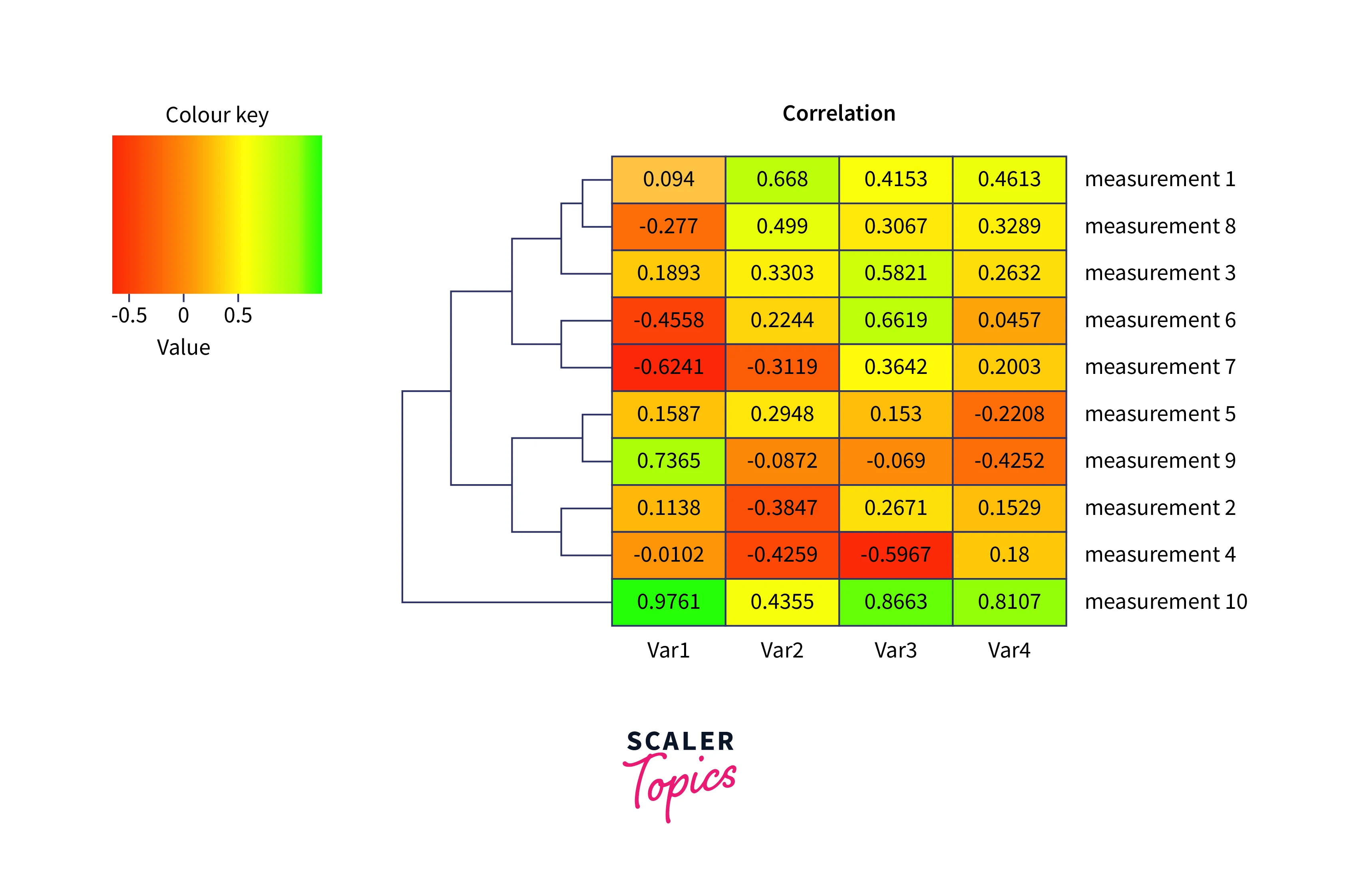
-
Highlight Table:
A highlight table is a form of Tableau data visualization that highlights key data points or values within a table in a different color or style. In a sales report, for example, a highlight table might emphasize the best-performing items or regions in green while highlighting the worst-performing ones in red. As a result, viewers may rapidly discover key information in a table and make data-driven decisions based on the insights presented. -
Histogram:
A histogram is a form of Tableau data visualization which is used to show how a dataset is distributed. It is an effective method for determining the underlying frequency distribution of numerical data. The data is arranged into intervals, or "bins" in a histogram, and each bar reflects the number of observations that fall within that bin. Each bar's height indicates the frequency or relative frequency of observations within that bin.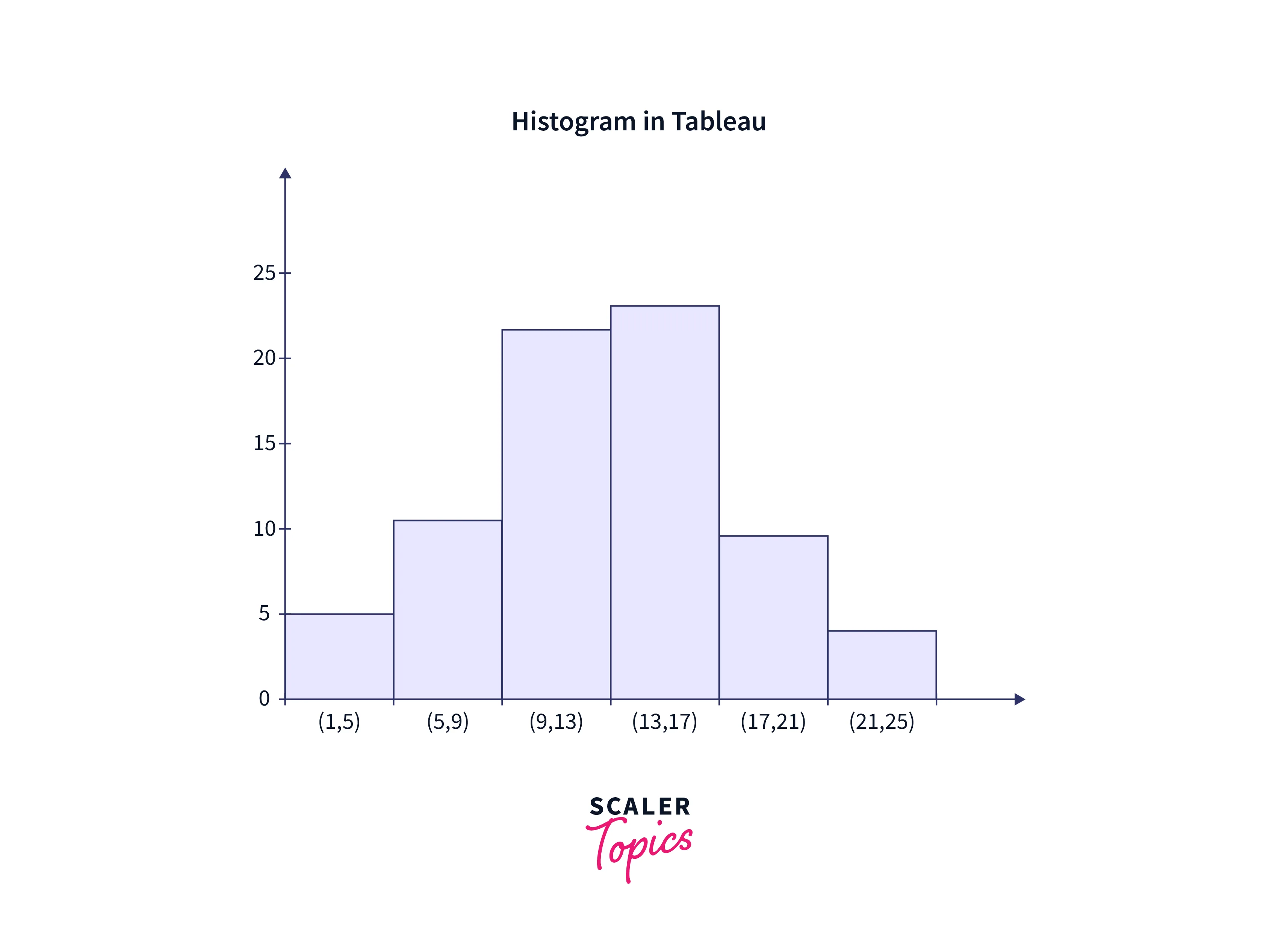
-
Pie Chart:
Pie charts are common Tableau data visualization techniques for representing proportions or percentages of a whole. They are effective for emphasizing the most important aspects of data, and their circular shape makes them simple to grasp at a glance. They should, however, be used only when the data is straightforward. This is because they can be difficult to read and understand effectively in more complex scenarios.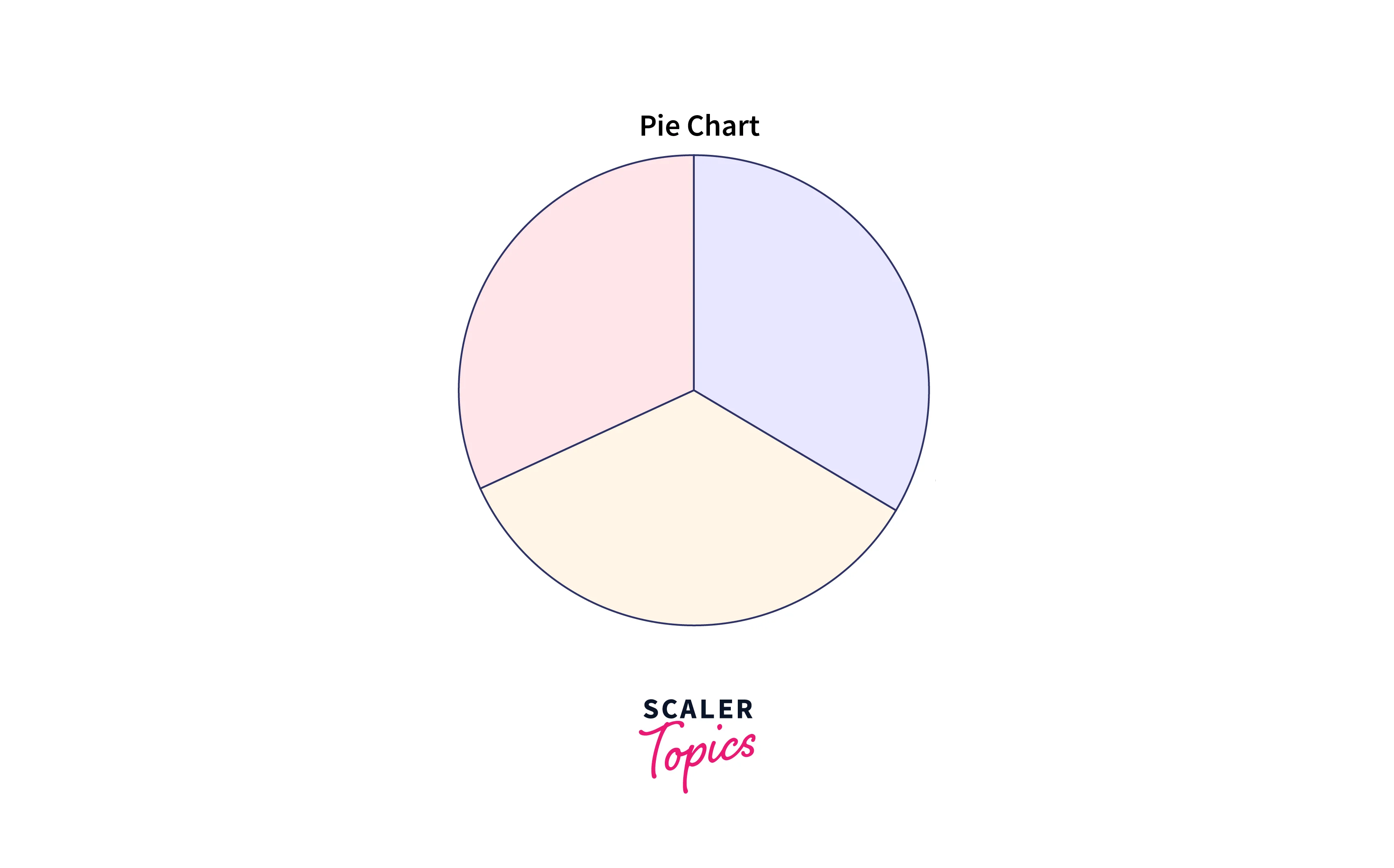
-
Treemap:
A treemap is a type of Tableau data visualization tool that presents hierarchical data in the form of stacked rectangles. It uses size and color coding to help users visualize the data distribution within the hierarchy. Each rectangle's size is related to the value of the displayed data, and its color can be used to represent another data variable. Treemaps can be useful for evaluating large data sets and discovering patterns and trends.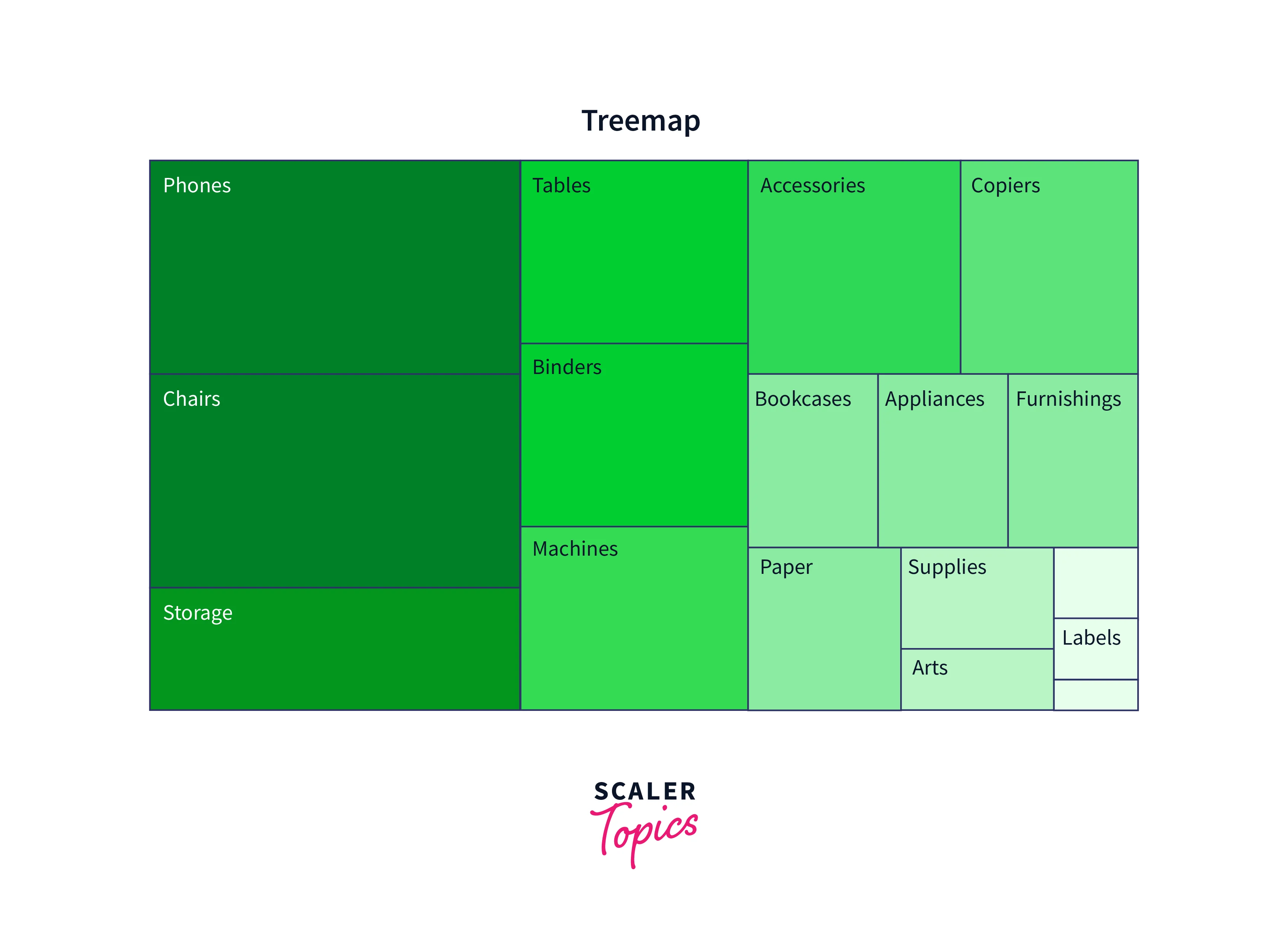
Visualization Tools and Software
Visualization software and tools are required to produce relevant and compelling visualizations that assist businesses and organizations in making data-driven choices. Numerous visualization tools are available, ranging from simple chart-creation software to complicated data analytics platforms. Tableau, Power BI, QlikView, Google Charts, D3.js, and Plotly are popular visualization tools. These tools enable users to rapidly generate visualizations, frequently with drag-and-drop capability and customizable templates. They also offer various services to assist consumers in making the most out of their data using interactive dashboards, real-time data connections, and data analysis tools.
Learn More About Data Visualizations
While we can use Tableau for Data Visualization without much programming knowledge due to its drag-and-drop functionality, we also have libraries present in languages like Python (Matplotlib library) to create charts & graphs through coding.
Please refer to the below Scaler Topics articles to learn more about it.
Conclusion
- Tableau is a powerful data visualization tool that enables users to quickly construct dynamic representations from their data without needing advanced technical knowledge, with the help of its drag-and-drop functionality.
- Tableau allows users to connect to various data sources, including spreadsheets, databases, and cloud-based services, and transform that data into visually appealing visualizations such as charts, graphs, and maps.
- One of Tableau's key strengths is its ability to manage massive amounts of data while producing intuitive and dynamic displays.
- Tableau's visualizations are visually appealing and provide a clear and concise representation of data, helping users to uncover trends and patterns more easily.
- Visualization software and tools are required to produce relevant and compelling visualizations that assist businesses and organizations in making data-driven choices.
- Some of the common forms of graphs used in Tableau Data Visualization are Area Map, Gantt Charts, Histogram, Bar Charts, Heat Map, Tree Map, Pie Chart, Highlight Table, Bullet Graph, etc.