CSS text-shadow Property
 FREE
FREE

Overview
The CSS text-shadow, as the name suggests, is a CSS property that applies different kinds of shadows to the content of an HTML element. You can include one or more types of text-shadow CSS effects using the text-shadow CSS property.
Syntax
The syntax of the text-shadow property is given below :
The above-given syntax of text-shadow means the values of horizontal-shadow, vertical-shadow, and blur-radius are mandatory. And the color parameter is optional, and can also be replaced by none, initial, or inherit.
Property Values
As shown in the syntax above, there are various parameters, or we can say values associated with the text-shadow CSS property. Let's discuss them one by one in detail.
h-shadow / horizontal-shadow / offset-x
This value of the text-shadow CSS property represents the distance of the shadow from the text in the horizontal distance. If the value of the offset-x is negative it means that the shadow is placed to the left of the text.
v-shadow / vertical-shadow / offset-y
The offset-y or vertical-shadow value of the text-shadow CSS property specifies the distance of the shadow from the text in the vertical direction. If the value of the offset-y is negative it means that the shadow is placed above the text.
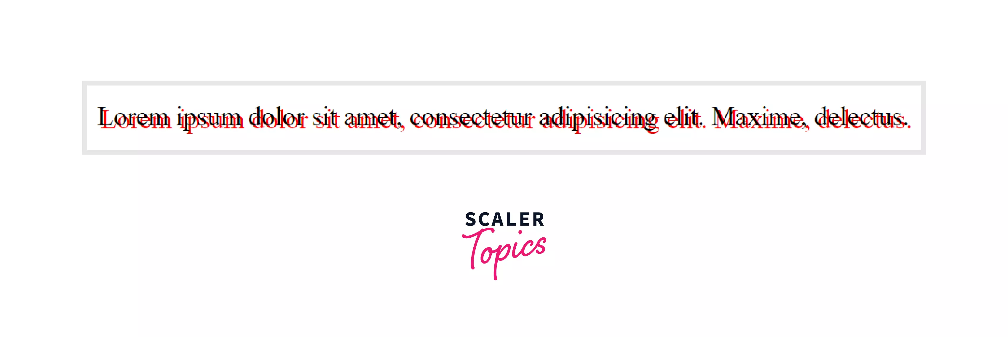
Example:
HTML Code :
CSS Code :
Output:
none
This is the default value of text-shadow CSS property. It means no shadow is present in the text.
initial
If you want the default value of the text-shadow property, then the initial value is used to set the text-shadow CSS property to its default value.
inherit
If the value of the text-shadow CSS property is set to inherit, then it will inherit the text-shadow property from its parent element.
color
It is an optional value. This specifies the color of the shadow.
blur-radius
This is also an optional value. If not specified, the default value is 0. The blur-radius value of the text-shadow CSS property specifies the length. The higher the length, the bigger the blur, i.e., as the value of the blur-radius increases, the shadow of the text becomes lighter and wider.
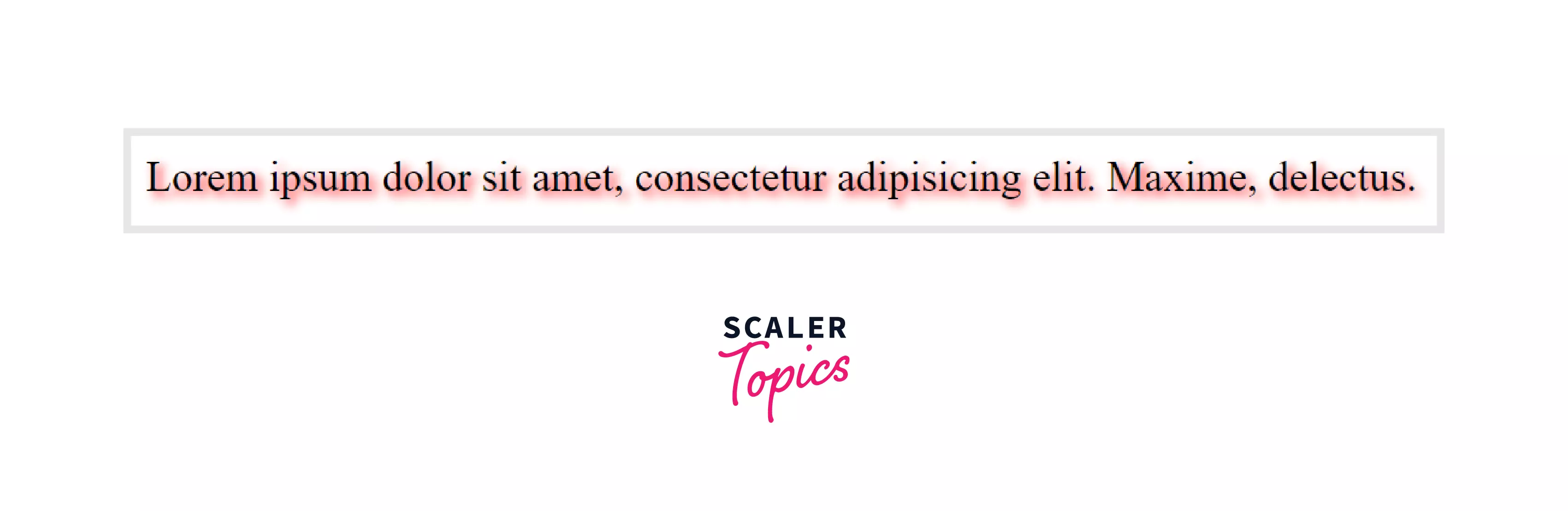
Example :
HTML Code :
CSS Code :
Output :
Examples
Now, let's take some examples to understand how the text-shadow CSS property works and how you can beautify the text with the help of this CSS property.
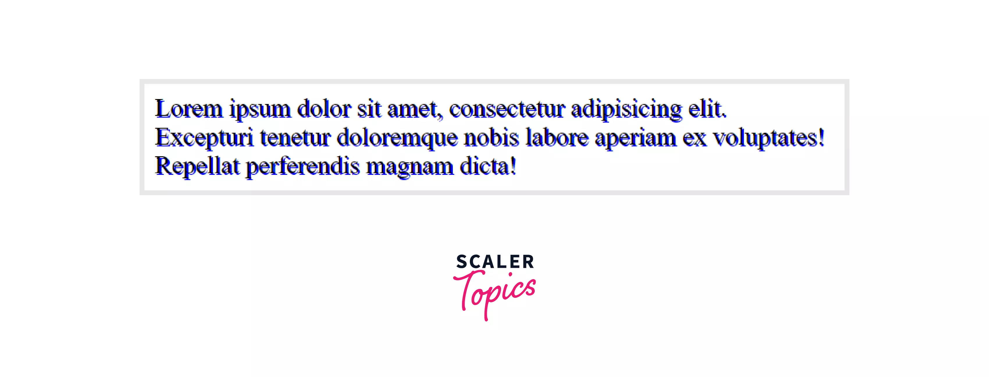
Example 1:
Output :
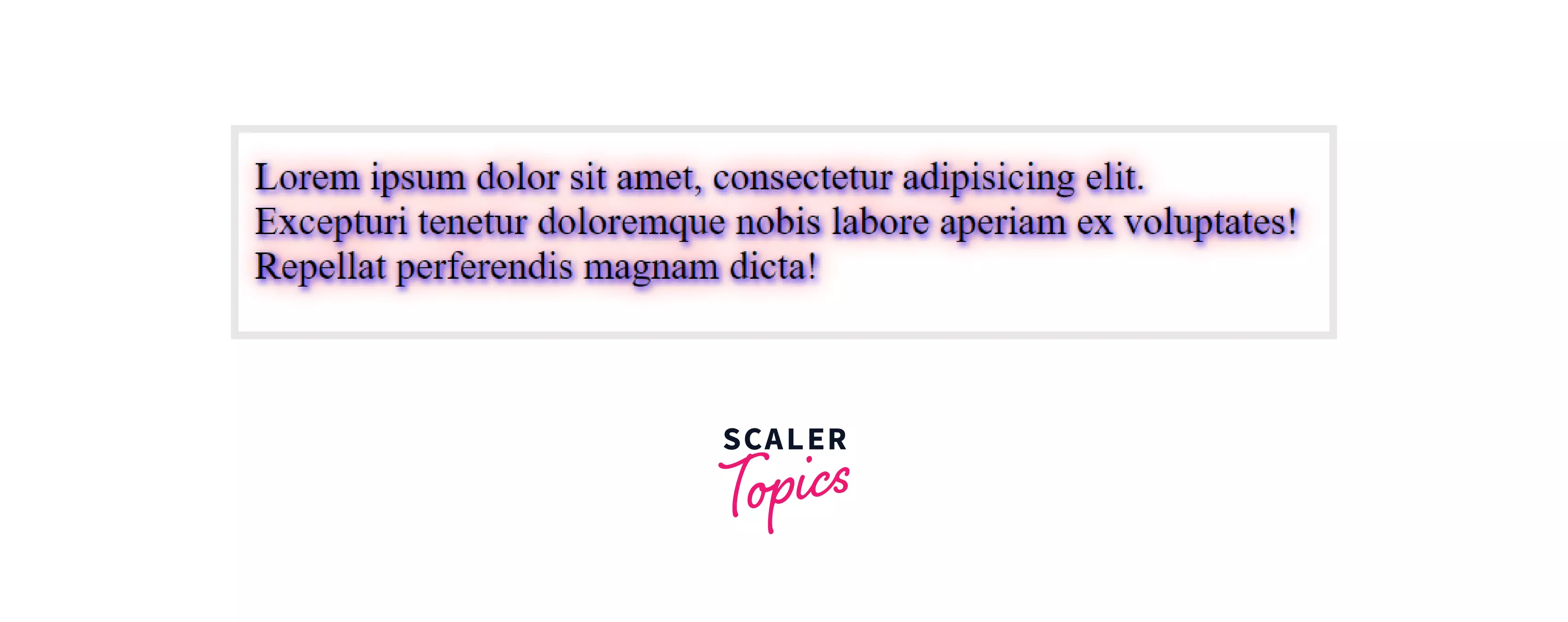
Example 2:
Output :
Browser Support
The below-given list of browsers supports the text-shadow CSS property.
| Browser | Yes / No |
|---|---|
| Chrome | Yes |
| Edge | Yes |
| Firefox | Yes |
| Opera | Yes |
| Safari | Yes |
| Internet Explorer | Yes |
Conclusion
- The text-shadow CSS property is used to apply the shadow to the HTML content or the text of an HTML element.
- Different values are associated with the text-shadow CSS property using which one can create numerous shadows of the text.
- To define the color of the blur, you can use the color value in the text-shadow CSS property and set the color of the shadow.
- The default value of the CSS text-shadow property is none, i.e., no shadow is applied by default.
- The blur-radius defines the length, i.e., if the value is higher, then the bigger blur is created, and hence it'll be lighter, and if the value is lower, then the blur will be darker.