How To Create a Toggle Button in Flutter?
Overview
In Flutter, a Toggle button allows the user to change a setting between two states. It's a common UI element used in various applications to provide toggling functionality. Creating a toggle button in Flutter is relatively simple and can be customized to match the design of your app. Whether it's a single toggle or a multi-selection toggle, Flutter provides the necessary tools to implement these features effortlessly
This article will guide you through the process of creating a toggle button in Flutter and provide examples of different toggle button configurations. We'll explore how to customize the toggle button and showcase its usage in various scenarios.
Introduction
Toggle buttons are a common user interface element in mobile applications, enabling users to switch between two states or options with a simple tap. In Flutter, developers have access to the ToggleButton widget, which provides a straightforward way to implement toggle buttons with various customization options.
The ToggleButton widget is part of the Flutter Material package, which provides a set of UI components following the Material Design guidelines. By using the ToggleButton widget, you can easily add toggle functionality to your Flutter app.
The ToggleButton widget in Flutter supports both single and multiple selections, providing flexibility to handle different scenarios and allowing developers to build applications, and logic flexibly.
One can customize the appearance of toggle buttons to match their app's design language by specifying icons, text, or any other widget as the toggle button's content. Additionally, Flutter offers built-in animation and transition effects, allowing smooth visual feedback when toggling between states.
One of the key aspects of toggle buttons is handling user interactions. Flutter provides the onPressed callback function, which is invoked when a button is tapped. Developers can implement logic based on the selected state of the toggle button within this callback.
The ToggleButton widget in Flutter can manage the state of each button. Developers can define a list of boolean values to determine which buttons are selected or deselected. This enables them to handle user interactions and update the application's state accordingly.
What is a Toggle Widget?
A Toggle Widget refers to a user interface element that allows users to switch between two states or options by tapping on it. It presents a visual representation of a binary choice, where the user can select either the "on" or "off" state.
Toggle widgets are commonly used to implement various features such as switching between light and dark modes, enabling or disabling specific settings, or toggling between different views or modes in an application.
To handle user interactions, the ToggleButton widget provides the onPressed callback function. This function is invoked when a button is tapped, allowing developers to implement logic based on the selected state of the toggle button. By managing the state of the toggle button flutter, developers can control the application's behaviour and update the user interface accordingly.
Furthermore, toggle widgets in Flutter can be customized to support accessibility features. By setting the semanticContainer property to true, developers can ensure that toggle buttons are properly interpreted by screen readers for users with visual impairments. This accessibility support enables a more inclusive user experience.
Customizing the Toggle Button
Defining the Button Content:
The ToggleButton widget allows developers to define the content of each button option using the children's property. Each child represents a button option and can be an Icon widget, Text widget, or any custom widget. For example, you can use Icon(Icons.check) and Icon(Icons.close) to represent two different states or options. This flexibility enables you to align the toggle button content with your application's design and requirements.
Styling the Button:
Flutter provides several properties to style toggle buttons. You can customize the button's background color, text color, border, and shape. The color property defines the background color when the button is selected, while selectedColor specifies the background color when the button is deselected. Similarly, textStyle allows you to define the style of the button's text, such as font size, font weight, and text color.
Button Padding and Spacing:
To control the spacing between buttons, you can use the buttonPadding property. It defines the padding around each button, ensuring consistent spacing across all buttons. Additionally, you can adjust the spacing between buttons using the buttonMargin property, which specifies the margin between adjacent buttons. These properties help achieve a visually appealing layout for toggle buttons flutter.
Handling Button Interactions:
Flutter provides the onPressed callback function, which is invoked when a toggle button is tapped. By defining the onPressed function, you can implement custom logic to handle button interactions. , For example,, you can update the state of the toggle button and trigger UI updates when a button is selected or deselected. This allows you to synchronize the button state with your application's state management system.
Animation and Transition Effects:
To enhance the user experience, Flutter offers animation and transition capabilities for toggle buttons. The animationDuration property allows you to specify the duration of animation effects when the button state changes. Additionally, the animationCurve property enables you to define the curve for the animation, controlling the speed and easing of the animation. By applying animation effects, you can create smooth transitions that visually indicate the change in the button state.
Accessibility Support:
Flutter supports accessibility features, ensuring that toggle buttons are usable for users with disabilities. By setting the semanticContainer property to true, toggle buttons are interpreted correctly by screen readers. This allows users with visual impairments to understand the purpose and state of the toggle buttons. Providing accessibility support in your toggle buttons promotes inclusivity and improves the overall user experience.
Dynamic Customization:
In addition to the static customization options, Flutter enables dynamic customization of toggle buttons to flutter. You can change the button's appearance based on the selected state by modifying properties like selectedColor, selectedBorderColor, or selectedTextStyle. This flexibility allows you to provide visual cues to users, highlighting the selected state and improving the clarity of the button's status.
Alternatively, you can use custom images or text labels as well.
Managing Toggle Button State
isSelected List: The ToggleButton widget utilizes the isSelected property, which accepts a list of boolean values. Each value corresponds to the selected state of the respective toggle button. Developers can manage this list to keep track of the button states and update the application's state accordingly.
Toggle widget Examples
By combining the ToggleButton widget with appropriate child widgets, initialization of the isSelected list, and definition of the onPressed callback, developers can create toggle buttons with different behaviours and requirements.
The below examples demonstrate the versatility of the ToggleButton widget in handling single and multiple selections while accommodating both mandatory and non-mandatory selection scenarios:
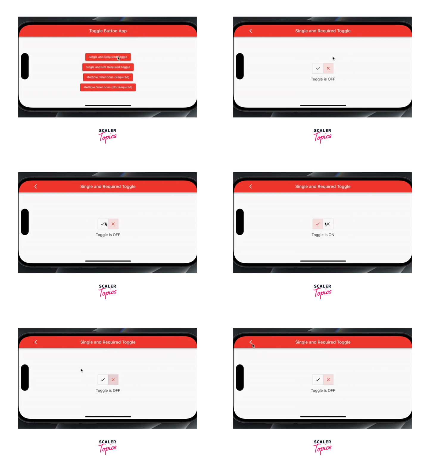
- Single and Required Toggle Switch: In this example, a single toggle switch is used to select between two options, and selecting one option becomes mandatory. It ensures that the user must choose one of the options before proceeding. To implement this, the ToggleButton widget is configured with two children representing the options. The isSelected list is initialized with two boolean values, one for each option. The onPressed callback is defined to update the isSelected list and enforce the requirement of selecting one option.
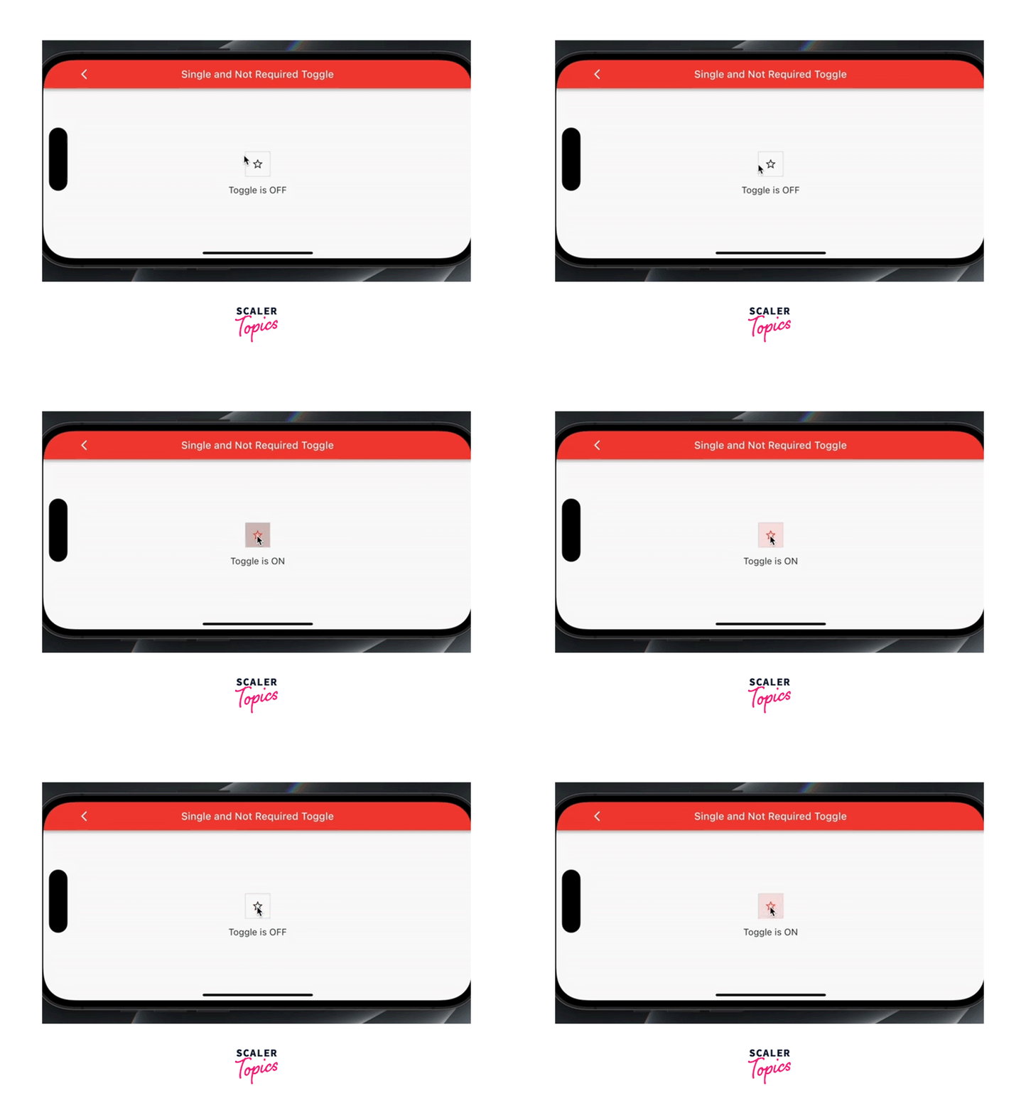
- Single and Not Required Toggle Switch: This example is similar to the previous one, but it does not enforce the selection of any option. The user has the choice to select one option or leave both options unselected. The ToggleButton widget is configured with two children representing the options, and the isSelected list is initialized accordingly. The onPressed callback allows toggling the selection state of the buttons without enforcing the requirement of selecting an option.
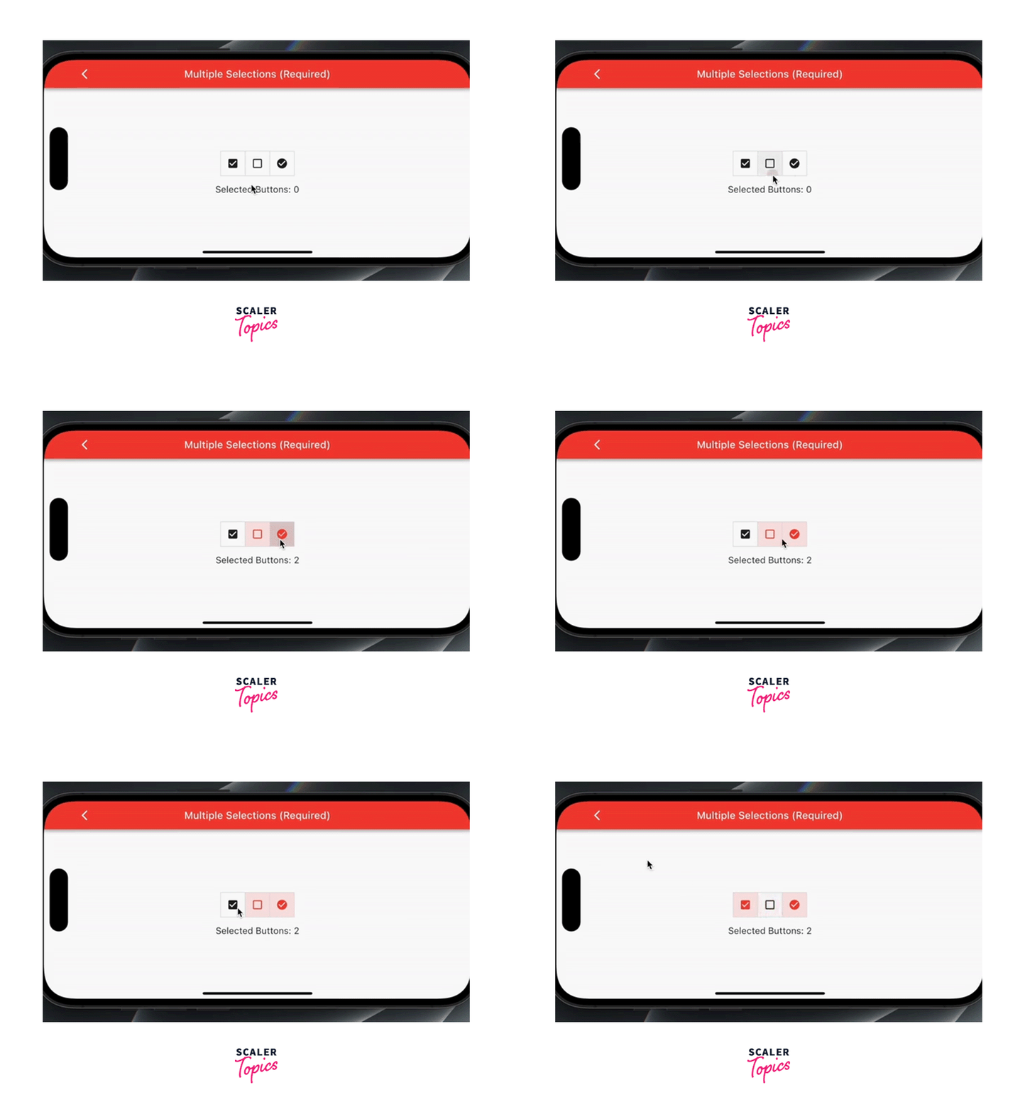
- Multiple Selections that are Required In scenarios where multiple options can be selected simultaneously, and selecting at least one option is mandatory, the ToggleButton widget can be used with multiple children representing the options. The isSelected list is initialized with boolean values for each option, indicating the initial selection state. The onPressed callback allows toggling the selection state of individual options while ensuring that at least one option remains selected at all times.
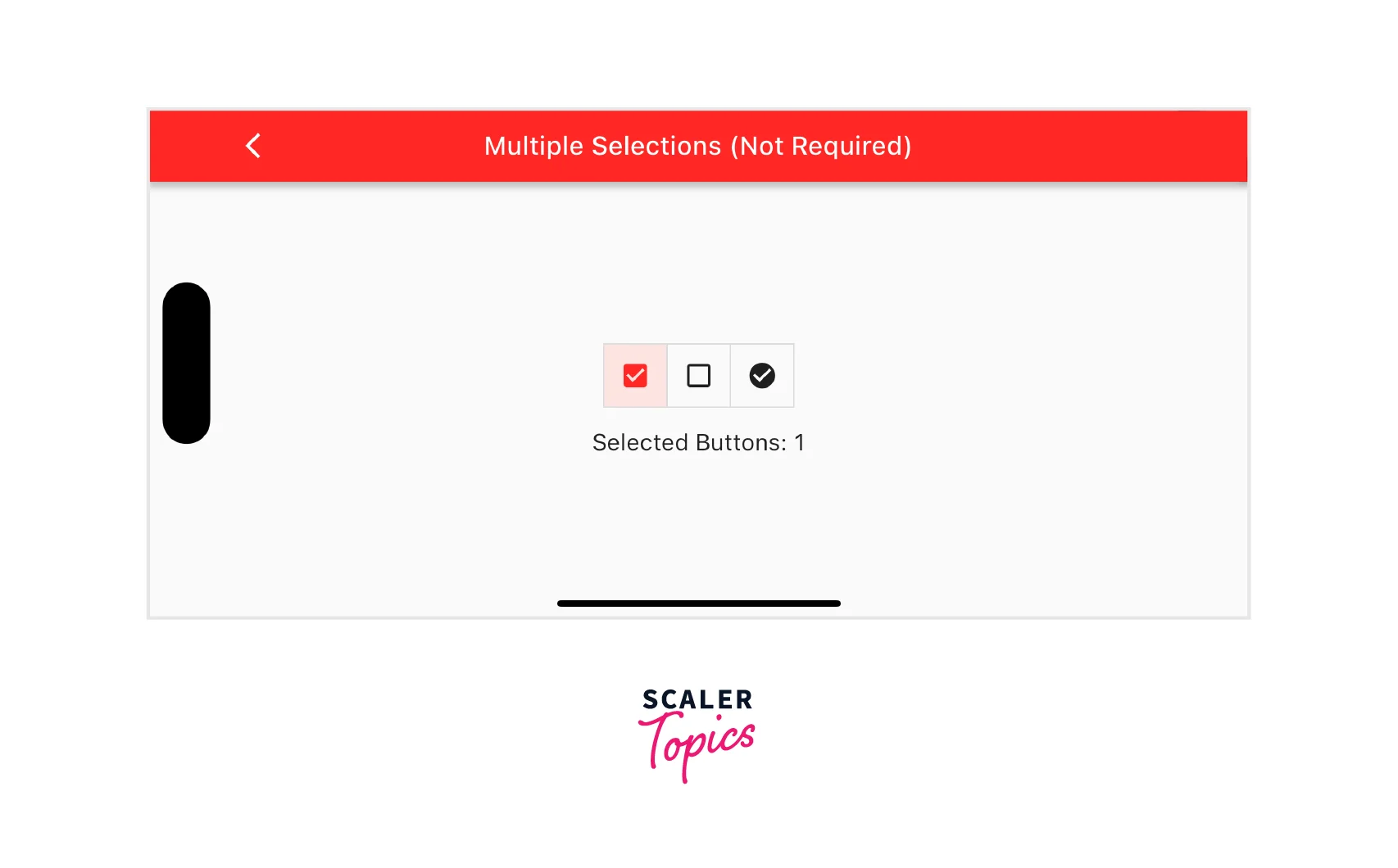
- Multiple Selections that are Not Required: This example allows users to select multiple options but does not enforce the selection of any option. The ToggleButton widget is configured with multiple children representing the options, and the isSelected list is initialized accordingly. The onPressed callback enables users to toggle the selection state of individual options freely without any mandatory selection requirement.
ExampleApp
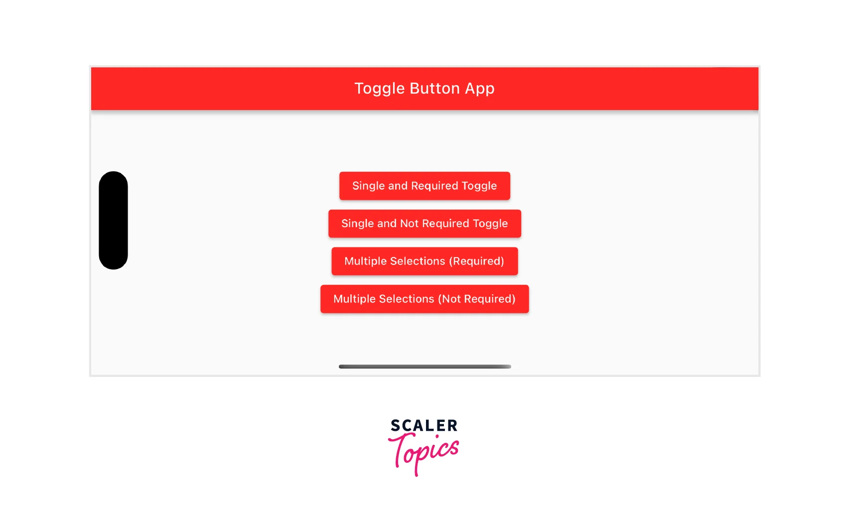
To showcase the different toggle button flutter examples mentioned above, let's create a simple Flutter app with four different pages, each demonstrating a different scenario(The output of the app will look like the images attached):
The homepage of the Demo app will look like this:
- Single and Required Toggle Switch: This page will display a toggle button that enables or disables a specific setting.
- Single and Not Required Toggle Switch: Here, we'll showcase a toggle button that is not required, allowing the user to leave the setting in an indeterminate state.
- Multiple Selections that are Required: This page will demonstrate a toggle button that allows multiple selections and requires the user to choose at least one option.
- Multiple Selections that are Not Required: Finally, we'll showcase a toggle button that allows multiple selections but does not require the user to choose any option.
The code for the app is as follows:
main.dart file:
Conclusion
- Toggle buttons are user interface elements that allow users to switch between two states or options.
- Flutter provides the ToggleButton widget for creating and managing toggle buttons.
- Toggle buttons can be customized with various content, including icons, text, or custom widgets.
- Styling options allow developers to customize the appearance of toggle buttons to match the application's design.
- Animation and transition effects can be applied to provide visual feedback when the state of the toggle button changes.
- Toggle buttons can be used for single or multiple selections, with or without mandatory selection requirements.
- The state of toggle buttons can be managed using the isSelected list, allowing developers to track and respond to user interactions.
- Toggle buttons can be made accessible by setting the semanticContainer property to true.
